Changing Appearances According to the Audience
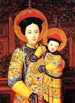
 When depicting Christ or Our Lady one always has to consider their individual characterics (handed down to us by tradition); but at the same time the artist will always consider modifying the appearance so that those who are likely to see the painting will identify with Him or her. Here are some paintings by Chinese Christians. The first, left, dates from the 14th century and the second from the turn of the last century.
Christ is the Everyman, the model for all humanity. When He (or indeed Our Lady and the saints) are painted, the image must also participate in a model of humanity that the audience can relate to. All sacred art is a balance of the general and the particular. If those who are going to see the painting are going to be almost exclusively Chinese, then it is a legitimate approach, I would argue, to portray Christ and Our Lady as Chinese.
This principle is used famously, in a different way, in the Isenheim altarpiece painted in the early 16th century in the gothic style by the German artist Matthias Grunewald. Christ is horribly disfigured, but not as he would have been disfigured by the passion. This painting was made for a hospital in which people were suffering from an illness caused by fungus in the rye grain used in the bread eaten locally. The cause was not known at the time and so the illness was incurable. The symptoms match exactly those that Christ has in the painting. This is clearly intended to offer solace to the patients to communicate to them that Christ is suffering with them and for them.
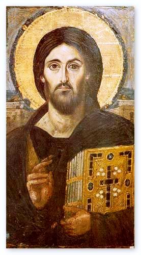
 There are many depictions of Christ by Western European artists that show him as Western European for the same reasons. When I showed my students the Christ pantocrator, below, many assumed that this was painted in Western Europe too, and were surprised to learn that it was from Mt Sinai in Egypt. I could only offer a speculation as to why his skin tone is paler than one would expect of a working man, a carpenter, in the Middle East, which would surely have been known to the Egytians who saw this image in the 6th century. I suggested that as this was in the iconographic form, the artist would shown the uncreated, heavenly light emanating from the person of Christ. So the lightening of the skin tone is linked, perhaps, along with the other familiar features such as the halo to the depiction of this. As usual I will be interested to see if there any readers who can enlighten us (if you’ll forgive the pun) on this matter.
Even if my suggestion is correct. It doesn’t apply universally. The last two are from Russia. So in this case the skin tone reflects neither the uncreated light, nor that of those who are likely to see the icon. I once had lessons from an icon painter in England who had been at one time a student of the famous Russian iconographer, Ouspensky. She told me to use predominantly the green-brown colour that we see there (called ‘avana ochre’) with highlights used sparingly in yellow ochre and white specifically because it matched the olive-brown Mediterranean complexion.
It seems that an artist has a choice in these matters. The governing principle is that he should aim to maximize his chances of communicating the person of Christ to those who are likely to see his work.
 Caravaggio's Flagellation of Christ


