Choosing Color: Should We Reject Modern Chemically-Created Pigments?
Some who do not paint might imagine that there is a range of colors available to artists that match everything you see in the world around us. So if you want to paint a landscape, for example, all you have to do is look at what you are painting, compare it with the range of tubes of paint available at the local art store, and select the match.
In fact, it is not as simple as that. The range of colors available as pigments in paint is limited. Paint pigments are inert minerals that are chosen because they are believed to be stable for hundreds of years (in sacred art the intention is that they will last until the Second Coming). The pigment should not react chemically with the binding medium, with air, with light, or with any other pigments that they come into contact with. In practice, there is virtually no pigment that fulfills these criteria perfectly - light especially degrades most colors - so it is always a compromise. So it isn't just a case of extracting the green that is in vegetation and making paint out of it. What might be beautifully colored in lush vegetation does not have the necessary physical properties to be pigment for paint.
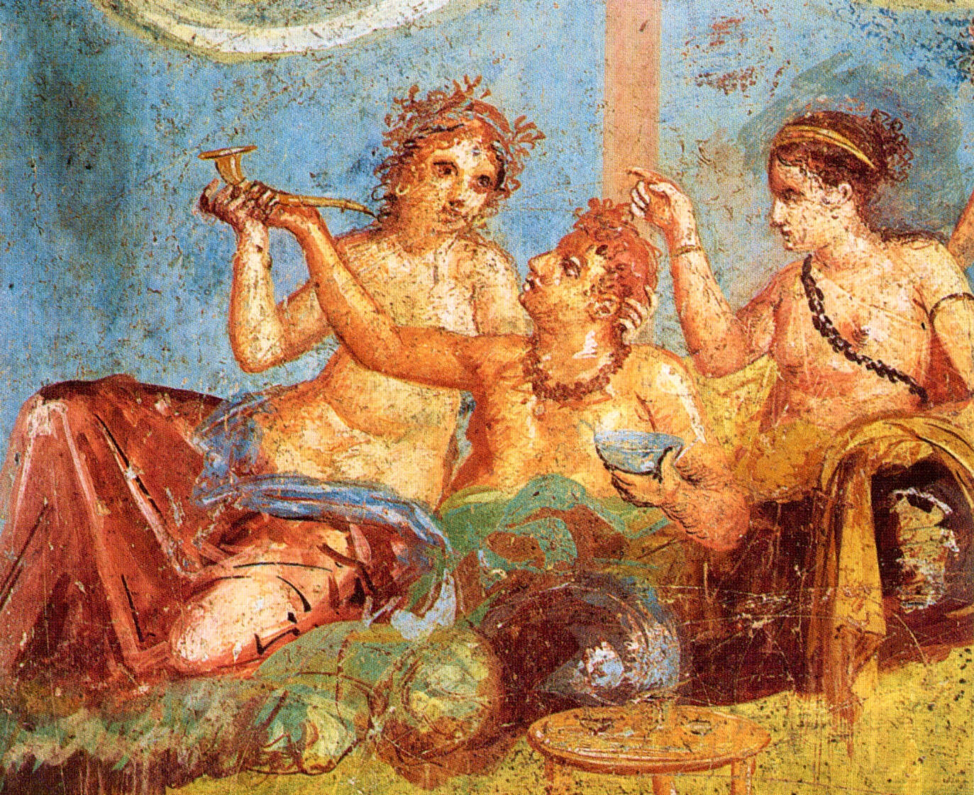
One test of whether or not a pigment will degrade with time is to look at its past use. So we can look at these frescoes in ancient Pompeii and see that these pigments have lasted. Even then there is some doubt because we don't always know for certain what the colors looked like when they were applied, colors do change and degrade over time.
Fresco in Pompeii, Italy, 1st century AD.
It is a sign of the scarcity of good pigments that occur naturally (and the value that was placed on good color in paintings in the past) that people were prepared to grind a scarce gemstone to create lapis lazuli blue, as we see in the robe of the Virgin Mary, here.
Ambrogio Lorenzetti, 1342-44, Siena, Italy
As with any situation in which demand exceeds supply to create scarcity, it creates a drive to find more to bring the cost down. This could involve looking for more natural deposits or chemically creating new compounds. One of the bi-products of the art of alchemy in the middle ages was the discovery of new compounds that were suitable for use as pigments. One example is mercuric sulfide - vermillion. The following video was created by the Getty museum. Vermillion is the orange-red color in the hand-held bowl in the picture below.
As the field of chemistry developed, especially in the 19th century, the pace at which new pigments were discovered increased. This is one of the things that allow bright colors in paintings of the Impressionists, for example. The blue produced by lapis lazuli was called 'ultramarine' meaning, 'beyond the sea' because it was mined in Afghanistan, beyond the farthest shores of the Mediterranian (relative to Italy). A chemically created imitation of the pigment was developed in France in 1826 and what is generally referred to as 'ultramarine blue' today is this artificial pigment.
Left to right: Lapis lazuli mineral; ground lapis lazuli; and artificial ultramarine blue
I do not use the word artificial here in a pejorative sense, but literally, as in the product of artifice, made by man. These new colors allowed for enhanced powers of artists to create beauty. The quantity of ultramarine blue in this Impressionist painting, for example, would have made the painting prohibitively expensive prior to the mass production of the blue pigment and no artist would have attempted such a landscape.
The Silver Veil and the Golden Gate, painted by Frederick Childe Hassam (American), 1914
However, as with all the powers of man, they can be directed either well or badly. What began, at least, as a search for the creation of colors that you see in nature has led to the creation of colors that you don't. In fact, unnatural coloration became a deliberate choice of artists. Fluorescent and overpowering colors became the norm in the 20th century.
I have no problem with such bright colors or unnatural colors in principle, but the difficulty is harmonizing other colors with them in order to create a sense of unity. A bright, fluorescent magenta will dominate a painting unless everything else is as brightly colored. Making everything fluorescent or unnaturally bright risks color clashes so strong that they will give those who see the combinations of headaches and spots in front of their eyes. Of course, it is often the intentions of artists today, formed by the Marxist theories that have dominated art schools since the Second World War, to seek ways of creating disorder, disharmony, and disturbance. Bright clashing colors suit this purpose well.
Aware of this, manufacturers today often deliberately emphasize the unnaturalness of their products by giving the colors chemical names such as Quinacridone Pink or Phthalocyanine Blue. As far as I am aware, it never occurred to the 19th-century manufacturers of the artificial lapis lazuli blue to market it under the name of 'Sodium-Silicate Blue' rather than ultramarine.
The value of trying to follow a natural pallette - using natural here to mean corresponding to colors seen in nature even if the pigment is artificial, is that just about any variety of color combinations can be used and they will not clash. It is like flowers in a garden.
The other point is that the use of a limited palette forces the artist to use visual tricks, such as the use of complementary or contrasting colors, to change our perception of color as seen in a painting. Easily available red pigments traditionally come from naturally occurring clays. These are not brilliant colors. However, rather than reaching for a chemically created bright red, as might have been used by an op-art modernist, an artist who is more traditionally-minded can make use of complementary and contrasting colors can enhance the perception of redness. Green is the complementary color of red and placing the two close together enhances our perception of both the redness and the greenness of each pigment. Also, next to a reddish-purple, a purer red will look redder still. Here I used both devices to enhance the sense of redness of a robe that is brown clay red. When an artist uses optical effects well, it enhances the beauty of the art for the mind delights in perceiving harmonious arrangements of the parts and perceiving the whole as a unity.
St Edna of Whitby, painted by David Clayton
So while I do think that the existence of artificial colors is a positive development for artists that if used well can provide greater freedom of expression. The danger, however, is that some chemically produced colors are so overpoweringly bright that they can dominate the painting detrimentally and destroy the unity of the whole. As a result, greater powers of discernment are asked of an artist if he is going to choose the palette well.
For most of us, therefore, who do not find creating color harmony in paintings easy, the maxim 'less is more' is worth remembering.


