Architecture — Blog — The Way of Beauty

Study the Master of Sacred Arts and the Theology Doctorate (Th.D.) at Pontifex University www.PontifexUniversity.

Architecture

GOP Rep. Jim Banks offers bill to prescribe traditional architectural styles for federal buildings

GOP Rep. Jim Banks offers bill to prescribe traditional architectural styles for federal buildings

Architecture by the people, for the people, and of the people; rather than serving the interests of elites who have disdain for them and push Brutalism. Brutalism says: ‘You may not like it, but you’re wrong - we know what is good for you.’The ‘"Beautifying Federal Civic Architecture Act" declares "traditional and classical" architectural styles to be preferred for new Federal government buildings. This sets the tone for a wider American culture of beauty and superabundance.

Engineering, Beauty, and a Longing for the Infinite

In July 2019, I embarked upon a six-day excursion across Italy with 14 undergraduate students and three professors from Princeton University. The trip was part of a six-week summer course titled “Two Millennia of Structural Architecture in Italy.” Given the title, it should come as no surprise that the instructors were professors, not of architecture or history but of civil engineering.

But the course, sponsored by Princeton’s Institute for International and Regional Studies Global Seminar Program, was about much more than understanding how buildings were, and are, constructed. Too often, STEM students are understimulated in wonder, beauty, awe—the kind of childlike curiosity and enthusiasm for discovery that can incite great innovations in science and engineering. Studying beauty in the university has too long been relegated to departments of art or music or literature—but Sigrid Adriaenssens, Maria Garlock and Branko Glisic recognized the need to educate engineering students, too, about history, culture, people and art.

What was I—someone whose work lies at the intersection of sociology, theology and philosophy—doing on this trip? Our modern world is driven by a view of the person that sees us as essentially driven to dominate others, acquire endless personal gain or develop powerful technological skills. The aesthetic dimension of the human person—our desire for beauty—often seems to get left out of not only business and engineering but also much of the social sciences. Our disciplines present an implicit model of the human person as essentially a social product, a profit-maximizer or a great big machine.

But is that all we are?

Humans are born with a desire for beauty, but that desire, like any desire, needs to be nurtured—cultivated like a garden. Any good education must include an education in beauty; likewise, any field of knowledge that is stripped of the beauty of its object, whether that be a machine, a book or a person’s life, will be stripped of its mystery. As made clear in the experiences of famous scientists captured in the book by Marco Bersanelli and Mario Gargantini, From Galileo to Gell-Mann: The Wonder that Inspired the Greatest Scientists of All Time: In Their Own Words, studying the natural world sparks awe and wonder.

My training in the social sciences implicitly borrows methods of positivism or empiricism that do not just correspond to the human person in an integral fashion. Social sciences collect empirical data, but they also need and philosophy, theology and a language of beauty, wonder, awe and love. We are creatures who do things, but we are also creatures who contemplate things. We can’t live a flourishing life simply by satisfying our basic needs (even the need for surviving a motorcycle crash). Engineers and other specialists need to work together to build the products that serve our human nature, including our desire for awe and wonder.

One of the reasons universities structure learning across disciplines is that different ways of looking at the world train our minds in different ways: reading a text; proving a theorem in math; closely observing an object in its surrounding; pondering the meaning expressed by a piece of art; and building a bridge all require different types of cognitive skills, which need to be honed, tested and pruned.

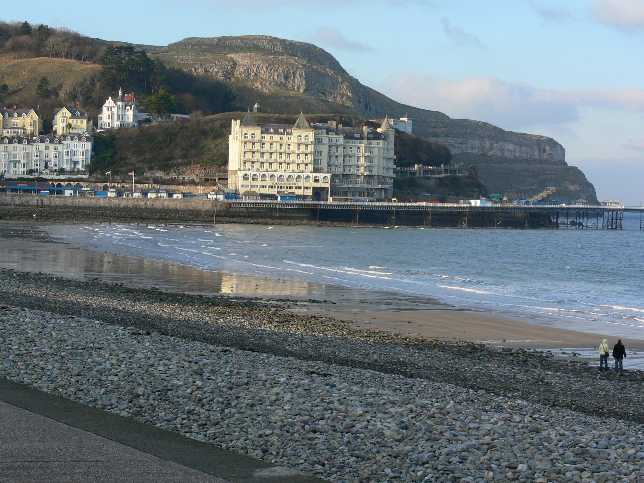
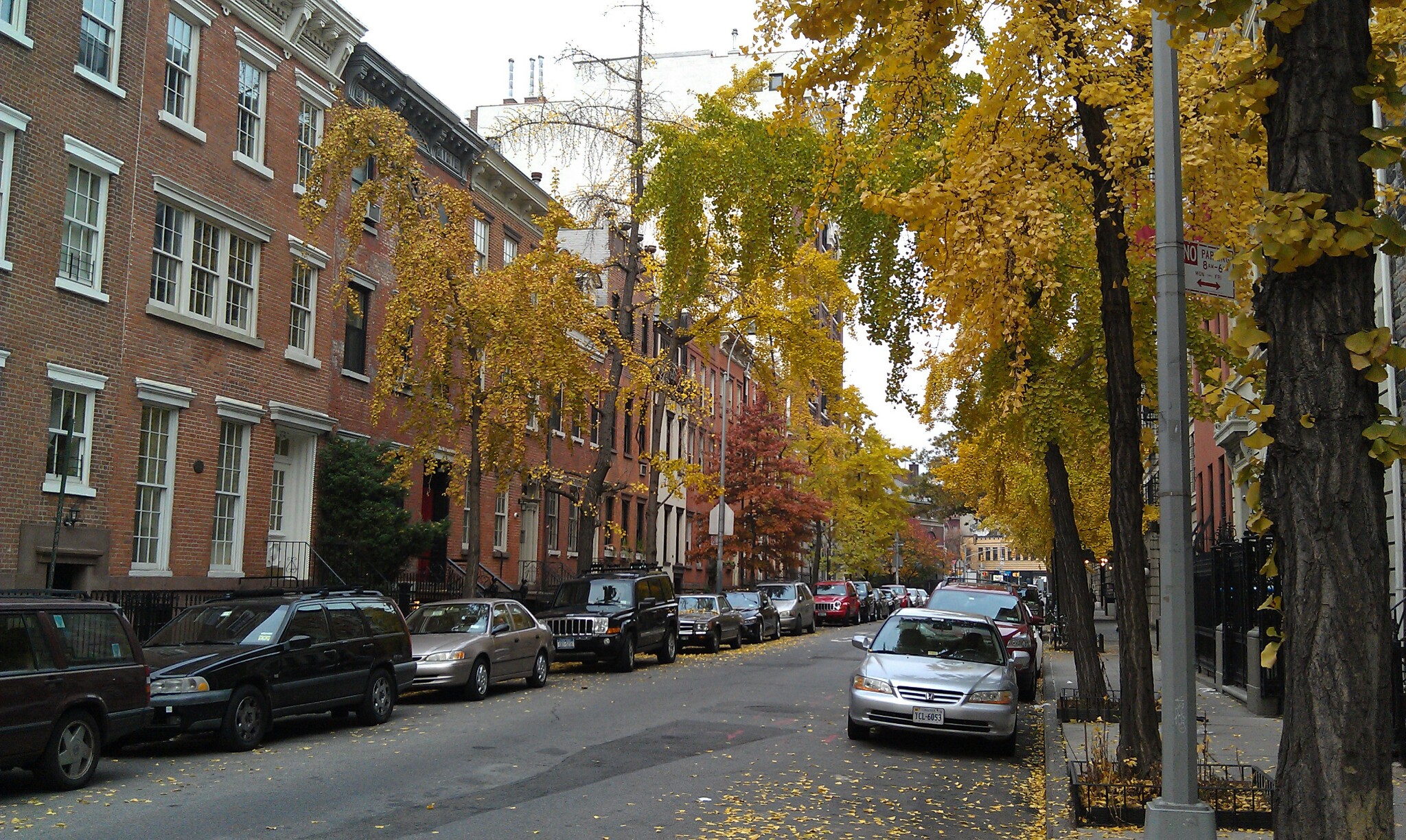
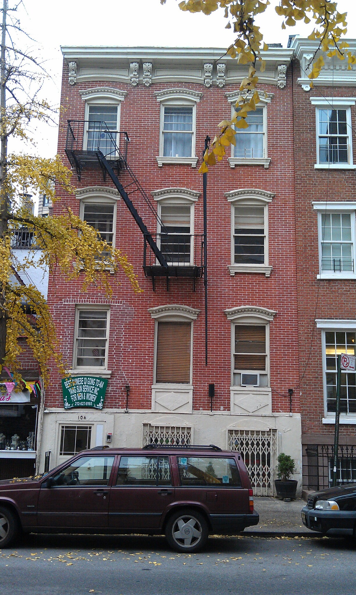
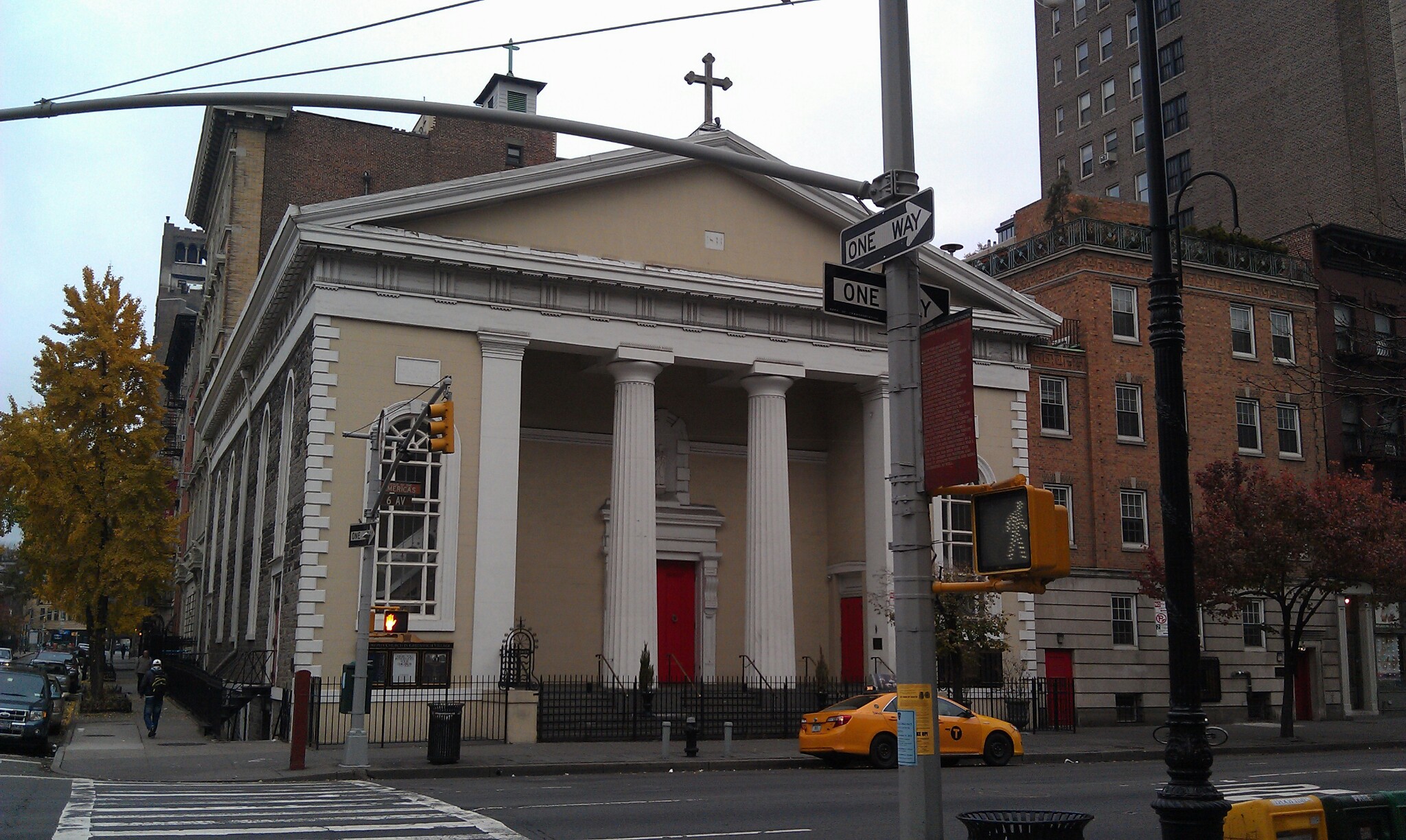
And that was why we were in Italy. During the excursion, students learned about Italian architects including designers and icons of design: Brunelleschi, Canova, Ducati, Dainese, Nervi, Michelangelo, Palladio and Pisano. For six days, the students, professors, guides and I were immersed in the beauty of educating ourselves on the genius, risk-taking, and leaps of faith that create amazingly useful products—including motorcycles that dazzle us with their speed; airbags that protect us if we fall; churches that have inspired centuries of worshippers; and tobacco factories that were once abandoned but which are being repurposed for the technology of a new age.

During the many stops in our whirlwind tour of Bologna, Vicenza, Venice and Florence, we studied varied objects with the aid of experts. In Vicenza, for example, the art historian Guido Beltramini, an expert on the architect Andrea Palladio, took us to villas, bridges and a theater Palladio designed. We walked along the shop floor of the Ducati motorcycle factory, then met with Andrea Ferraresi, Ducati’s Design Director. The businessman Federico Minoli, who has been the CEO of Ducati, spent several days with the students, explaining what it takes to bring a great invention to the market.

We also visited the Dainese Archive, and met Lino Dainese, founder of the company and inventor of beautiful, comfortable and very safe motorcycle jackets, boots and even an exploding jacket airbag. Dainese, whose patented inventions have saved hundreds if not thousands of lives, insisted to the students that he’s not an engineer or a designer, which are fields he has not formally studied. But he is a lover of beauty and a lover of people. His passion is to save the lives of those so fascinated by the mystery of the infinite they would ride a motorcycle at 350 kilometers an hour, or up a treacherous mountain peak.

He made it clear that technological scientific discoveries are often made by people whose hearts long for the infinite. And along with the others we met, he showed us that the buildings, objects of art and machines we use every day came about through a creative genius that integrates beauty and function. But learning the biography of great inventors further showed the class that no creative genius exists in a vacuum. Even they make mistakes and need help from others.

Trips such as this provide a much-needed opportunity to bring together all the ways our minds work and to learn from each other’s observations. Watching professors “geek out” about all the complex mathematics that went into building the structures we visited was a person-to-person way of communicating the joy of scientific innovation.

As Branko Glisic kept pointing out, something can’t be beautiful if it doesn’t work. A bridge that looks nice and collapses never was beautiful in the first place. Students found beauty not only in perfection, but in an abandoned tobacco factory built by Pier Luigi Nervi in Bologna now being repurposed as a meteorological center. Seeing the millennia of structures being made out of earlier structures from classical, Renaissance and, now, modern architecture inspired wonder in us at human ingenuity that can preserve traditions of beauty while also adapting existing structures to new purposes.

Without educating all forms of knowledge toward mutual coherence, without standing in a tradition of thinking and being, our varied emotions, thoughts, expressions and even the things we create in a laboratory don’t add up to anything more than noise. Fleeting sensory pleasures or tools that badly fit the needs of humans don’t lead to human flourishing.

Connecting STEM and the liberal arts is crucial for the simple reason that, as one student wrote, “whether created as monuments to God, places to live and entertain, or ways to travel, structures are inevitably built for humans to enjoy.”

A liberal arts education is supposed to make us free. Modern education can’t just be focused on productivity but must engage with the core questions of truth, beauty and the good across all fields. Universities exist to help the young understand the past, preserve what’s good from it, discover new forms of knowledge and know how to apply that knowledge for the human good. Integrating the study of engineering and beauty will not only help students be more creative and take risks; it will help them resist the reduction of the human person to merely an object buffered from the transcendent.

Education in all fields of knowledge—including science and engineering—should be understood as part of educating the universal human longing for the infinite.

This article was originally published at the Scientific American.

The Good, and the Bad and Ugly: Harmony and Cacophony In Wales and Princeton

The Good, and the Bad and Ugly: Harmony and Cacophony In Wales and Princeton

Order is the sign of God and speaks to all. Disorder alienates all and connects with no one. Even if functionally sound, in some respects, will disorient people spiritually, and therefore in not fully functional. This is the art and architecture of desolation and a world without God.

Five Reasons the Modern World is Ugly

I wrote a couple of weeks ago about the iconoclasm of the leftist protestors in our cities. There is one tragedy in this phenomenon that I didn't mention. That is, that on the whole, they are destroying beauty, and creating ugliness and disorder (the two are intimately connected).

As if to make the point, here is a video from Alain de Botton at the School of Life entitled 5 Reasons the Modern World is Ugly (h'/t Pontifex University student, Ron Gaudio). I have one or two quibbles with his arguments, but broadly, I agree with the arguments he makes, although I am perhaps less inclined to make classicism the main cause of beauty in the West, I would say that classicism's integration with Judeo-Christian values is the driving force, with Christianity being the primary driver. 

In this, he clearly lays the blame on 'modernists' such as the Austrian architectural theorist Adolf Loos, who, as de Botton puts it 'forget human nature'. 

Adolf Loos' essay, Ornament and Crime was influential in pushing modernism into architecture

Adolf Loos' essay, Ornament and Crime was influential in pushing modernism into architecture

This is charitable, I suggest that they do not forget human nature, rather they deny it. At its root is the same materialist worldview that drives the leftists. He also points out how the ideas of the elites were seized upon by property developers who took the opportunity not to have to worry about building beautifully while being immune from criticism. The tragedy is that in their search for a ‘pure’ utility, they couldn’t even guarantee that. A modernist, flat-roofed building is more likely to let in the rain than a modern design.

Ironically, as he points out, this has led to the situation that only the old buildings are beautiful, and the demand for them is so high that only the elites, such as university intellectuals and property developers who can afford to live in them.

What is gratifying about this video is that de Botton is using rational arguments to support a traditional culture of beauty, but is not to my knowledge Christian or a believer in God (this is, perhaps the reason for his tendency to overemphasize, as I see it, ancient Greece and Rome as the primary driver of traditional beauty rather than Christianity). It suggests a growing clamor for an end to our sterile, grey city centers. 

A cursory look at the School of Life, which produced this and a whole range of other videos has the following stated aims:

At The School of Life, we're devoted to helping people lead calmer and more resilient lives. We share ideas on how to understand ourselves better, improve our relationships, take stock of our careers, and deepen our social connections - as well as find serenity and grow more confident in facing challenges.

It seems that when human happiness - which is essentially what they are seeking - is the goal then, as de Botton puts it, beauty is 'as much as a necessity as a functional roof'.

The corollary is also true when the goal is discord, violence, and misery, - as it is for Marxists - then ugliness is as much a necessity as a dysfunctional roof.

Annotation 2020-07-30 111455.png


Pictures from the Way of Beauty explained: Attingham House, Shropshire

A perfect exemplar of traditional harmonious proportion. And how modern research supports the traditional consensus for what is beautiful. 1024px-The_Mansion_at_Attingham_Park


This is a picture that is only referred to in the book. For various reasons we were unable to include it in the book. I visited Attingham park in Shropshire in the Midlands area of England with my icon painting teacher Aidan Hart. We went primarily to enjoy the extensive grounds which are beautifully landscaped. I always thought that it was made in the 17th century, but in fact I notice now that it was build in the late 18th century.

It is a National Trust property, which means that it is owned by  the state and considered a place of outstanding interest and beauty. When I was there I noticed the proportional layout of the main house, as seen in this view above. What makes this particularly worthy of study is how simple the design, yet how beautiful. If it were not for the Palladian style portico (the grand columned porch that leads to the entrance of the building) the main house would be just a square block. One might argue that there was very little in terms of design to differentiate it from a modern housing block.

no10


Both have windows and doors in a rectangular facade. Yet the modern building is no tourist attraction. In fact it was described in the website where I saw it as one of the seven most notorious housing projects in the US.

What gives Attingham House its beauty is the proportion? Proportion is the consonant relationship between three or more objects of different size. You cannot have pleasing proportion when everything is the same size as in the modern building shown. The basis for theories of harmonious proportion are consensus - people have observed since the ancient Greeks how most people react psychologically to different proportions. The Attingham House proportions are made apparent by the different window sizes associated with the three stories. If you count the panes of glass there are 6 in the lower floor, 4 in the second floor and 2 in the upper floor windows. The proportion would be expressed mathematically as 3:2:1. This corresponds exactly to the traditional proportions based upon the lengths of pipes that produce pleasing combinations of musical notes developed by the ancient Greek philosopher, Pythagoras (who we talked about in the last of these features, here.)

It seems that modern science is beginning to catch up. Someone recently contacted me to tell me about this book by Colin Ellard, Places of the Heart in which a psychologist conducts studies to see how different designs affect the mood of people.

1024px-The_Mansion_at_Attingham_Park

If the designers of modern housing projects had made use of such proportions, even such mass housing could elevate the spirit in the same, way.


Denis McNamara on the Meaning of Beauty and its Importance in Church Architecture

In this short video  Denis McNamara talks about the nature of beauty and then talks about it in the context of sacred architecture (scroll to the bottom if you want to go straight to it and avoid my comments!). Denis is on the faculty of the Liturgical Institute, Mundelein; and his book is Catholic Church Architecture and the Spirit of the Liturgy.This is the second in the series of 10 which I will be featuring in coming weeks.

In this video, Denis points out that beauty is not simply 'in the eye of the beholder' but is a property of the object itself, the thing that we are judging to be beautiful. He is asserting the the principle of objective beauty - it is in the object percieved; and objecting (if you'll forgive the pun) to the opposite principle, the idea of subjective beauty - which would be to say that it is simply a matter of personal taste of the person - the subject - who is seeing the object.

He defines beauty as a property of something that 'reveals its ontological being'. Another way of putting this was given to me by Dr Caroline Farey of the School of the Annunciation in Devon, England. She defined beauty as the 'splendour of being'. Both definitions are telling us that beauty is a property of something that reveals to us what  it is. So in the context of this talk, to be beautiful a church must look like church. It must appeal to our sense of what a church is.

As a bit of supporting anecdotal evidence for the definition that Denis gives: when I was a high school physics teacher in England many years ago, at the end of term I used to present the class with a piece of mechanical equipment made in Victorian times. It had cogs and moving parts exquisitely machined in polished brass. No one in the building knew what it was for, and we couldn't tell from looking at it what its purpose was (I never found out). Nevertheless, the precision and harmony of the motion its parts when turned were such that all assumed that it must have one. I would bring this into the classroom and without comment place it down on the table in front of them; I would let them look at it for a few moments. Then I would ask the question: 'Do you think this is beautiful?' Every time the response of the students was the same. They didn't answer yes or no, the always asked: 'What is it?' These were 17 and 18 year olds who had never studied aesthetics and and it was a school in London that had no particular Catholic or even Christian connections. Yet these students knew instintively that they could not answer the question, 'is it beautiful?' without knowing what the object was.

As I see it, this establishment of principles of beauty should not be interpreted as a way of proving (or disproving) that something is beautiful. Any attempts to create 'rules of beauty' to that end will always fall flat in this regard. That is not to say that there are not guiding principles, but that these are better thought of in the same way as the rules of harmony and counterpoint in music. All beautiful music makes good use of them; but not all music that obeys the rules of harmony and counterpoint is beautiful. There is always a intuitive element that relates to how they are employed that cannot be accounted for definitively when creating beauty - this is what marks the good composer from someone who just has technical understanding.

In the appreciation of beauty, there is always a subjective element present. This does not compromise the principle of objective beauty, however: some people are able to recognise beauty and some are not. Ultimately we don't know for certain who has this ability and who doesn't. This lack of an ultimate and perfect authority to whom we can appeal means that in the end we rely on the best authority we have, tradition. Tradition, in this context can be thought of as a consensus of the opinions of many people over generations as to what is beautiful and what is not. It is not a perfect guide, and clearly is less reliable the more recent the work of art we are judging, but it is the best we have.


https://youtu.be/-c3JWNZSrDI


Denis McNamara on the Theology of Architecture

Here is the first of a series of 10 short videos (about six minutes each) presented by the architectural historian Denis McNamara of the Liturgical Institute in Mundelein. I had the pleasure of meeting him recently and sitting in on one or two of his classes. They were excellent.

These talks introduce succinctly and well, I feel, some of the themes that I heard him talk about in his classes. He is a good and entertaining teacher and speaker and this comes across in the videos. You can find more detail of the subject matter in his book, Catholic Church Architecture and the Spirit of the Liturgy.

What was of great interest to me was to see how he tackled issues for which there are parallel problems in sacred art. For example, how do you reconnect with tradition without falling in the error of historicism? Historicism is an undiscerning respect for the past that says, in simple terms: 'Old is always good; new is always bad.'

The corrollary of this has to be considered too: to what degree should we use aspects of contemporary architecture? How can we ensure that the form we are using connects with people today, while ensuring that we don't compromise the timeless principles that are essential to make it appropriate for its sacred purpose? You might say that what we want to do is to be able to innovate if necessary while avoiding the errors of modernism ('new always good; old always bad') or post- modernism ('anything is good if I think it is').

When I was considering just these questions in art, the only way I could respond was to try to look for a theology of form that connected the material form to the truths that the artist was trying to convey. If we understood this, I thought, then it would give us the freedom to innovate without stepping outside the authentic traditions of liturgical art. (A large part of my book, the Way of Beauty is devoted to consideration of this.)

It seems to me that this is just the conclusion that Denis has drawn too. In this video he introduces the idea of the theology of form for architecture by which the church building becomes a symbol of the mystical body of Christ. You might say the church manifests the Church in material form and in microcosm, He refers to this as a 'sacramental theology' of architecture.

In the nine videos that follow (which I will be posting weekly with a short introduction each time) he unpacks some important parts of this theology for us. If you are impatient to see them, you'll find them on YouTube!

https://youtu.be/2PDWXMMgy9c?list=PLmb-kTzyYnt5i14gShUc1ZYNPGTqG7P6p

Proportion Adds Value to Property in Boston

We can make a Beacon Hill anywhere This past weekend I drove down to Boston from southern New Hampshire to meet a friend who was visiting for the weekend.  As we walked around town we wandered into the Beacon Hill area. This is the old heart of the town and full of elegant 18th-century terraced homes. They are built in a variation of the style that in England we would call Georgian. I’m not sure what it is called here, perhaps ‘colonial’ style? These are right at the top end of the price range for property in Boston. Why are they so sought after? Well location will have a lot to do with it certainly. You would probably pay a fortune for the ugliest shoebox here if it could take a bed. But I would say also that their beauty is a big factor too. Beauty adds value because it stimulates greater demand and pushes the price tag up. And why are they beautiuful? Two hundred years of New England weather softening the edges on the red-brick or cobblestone forms probably adds something. But it is more than this. The main reason, I suggest, is their harmonious proportions.

What struck me about these houses is how simple and reproducible their design is. They have a simple symmetrical arrangement of windows, one above the other, and a pointy roof.  There is some decorative work around the doors and the windows, but it could never be called flamboyant. If I knew about building materials then I reckon I could design one myself. Yet despite their simplicity they look good and it is as a result of the traditional proportionality.

Given this simplicity and the value that beauty adds to buildings, I am surprised that it hasn't occurred to more developers and architects to study traditional proportion and use it, if only for economic reasons.

Look at the photos in this article. Notice how in every case the window size varies, storey to storey, so that the first is to the second as the second is the third and so on. When this rhythmical progression corresponds to the traditional pattern then the result is elegance. Sometimes the order changed around slightly so that it is not always the largest at the bottom. The dimensions of the first and second might be changed so the biggest storey is always the main living area. These architects didn't play tricks - they put things where you expected them to be, so that the outward signs give an indication of the internal purpose. Similarly, the main door is always more prominent than the servants' entrance. (You can't count on this now. I was at an art gallery recently, which was a modern building made completely of reflective glass and the doorway was indistinguishable from any other panel. There was no indication through the external design where the door was. In fact it was placed offset to one side in a counter-intuitive position, presumably deliberately. I had to wait until I saw someone coming out before I knew where I could get in!)

Coming back to Beacon Hill, I am convinced that these houses  looked just about as good the day they were built and if anyone chose to conform to these basic patterns today, then it would look good and sell at a high price. This has to be the simplest way for an architect to add greatest value for minimal investment of time and money. There is no need for pastiche – we are not bound slavishly to follow the decorative style of the period in every way, but provided the principles are adhered to, then here is way for modern architect to stand out from the crowd. The mathematics is relatively simple but largely unknown.

So come on architects and town developers. Here’s your chance to make a killing. So let’s see a new Beacon Hill in the US!

Incidentally, the Prince of Wales built an experimental new town on the outskirts of Dorchester in England that conformed to traditional proportions, called Poundbury (right, click to enlarge). The experience there was that although they were slightly more expensive to build, their beauty made demand so high that their price on the open market made the modest extra investment more than worthwhile. You can see more of Poundbury here.

We can build Jerusalem amongst the Satanic housing projects of our inner cities

Even mass housing can be made uplifting by using traditional proportions What makes a beautiful building? I would say that traditional proportionality is one vital component that is virtually ignored by all modern architects. The new online course of the Way of Beauty (see the page of that name on this blog) gives the most detailed answer to this question yet. It's all about traditional proportion and harmony which was principle, derived from the patterns of the liturgy, that was used to govern the whole of the culture. All of time and space, not just the beautiful buildings of the past, were ordered according to its principles.

This is why the building above left, built in the 18th century, is not only still standing, but is also a listed building and is sought after by professionals in the North of England as a fashionable place to live; but many of the equivalent mass housing projects of the 20 century, like the one show below, are already being knocked down. The one shown was Rockwell Gardens which was demolished in 2003 and didn't even last 50 years.

Rockwell Gardens, Chicago. Demolished 2003.

The traditional idea is that certain combinations of dimensions of a building speak to us more clearly than others because they are more beautiful. The modern idea, in contrast, is that there is an infinite range of ratios and proportionalities to choose from and one is no more valid than any other, it’s just a matter of opinion.

The Christian tradition says that certain proportions are beautiful because they reflect the divine order; and the Creator hardwired us to recognize them. When we see something as beautiful in the natural world for example, it is this is divine order – the thumbprint of the Creator in His work – is what we are responding to. The work of man can reflect this as well, with God’s grace and humility and good sense on the part of man. These proportions were used in architecture almost without question through to the end of the 19th century. (To get more information take the online course from this blog or sign on direct here.) By the end of the 19th century, its use seems to have been disconnected from the Christian understanding. When traditional taste was challenged, those who wished to resist the destruction of the old methods were not equipped with underlying principles to defent their case. The Bauhaus movement in Austria at the turn of the last century, for example, vigorously challenged tradition. they defined themselves as much by what they were not, as by what they were. The challenge was effective and by the period after the Second World War barely any architects used the traditional proportions.

I have picked out some examples to illustrate my points. Consider first the elegant housing, right, in upmarket South Kensington in London dating from the Victorian period. Notice how each storey is has a different dimension. There is a rhythmical progression: the first is to the second as the second is to the third and so on. We pick this up naturally and the effect is pleasing, but those harmonies will have been carefully calculated by the architect.

In the ideal there will be a minimum of three stories. A single relationship is created by two parties. In the context of dimensions two lengths together this relationship is called a ‘ratio’. In order to get a measure of the ratio we need another to compare it to. So a minimum of three stories is needed to create two ratios. That is, the first is to the second, as the second is to the first. A ‘proportion’ is a relationship between two or more ratios. So when the two ratios combine well, we have harmonious ‘proportion’. Consider a musical analogy. While combinations of two notes can be pleasing as harmonious intervals, the chord structure is generally based upon combinations of three notes. This was housing made for the well-to-do in Victorian England. If more than three stories are required, then the architect might continue to diminish the size of each successive storey, repeating the progression each time (as we see in these South Kensington houses). Alternatively, they repeat the dimension of the second for all storeys except the last. So the effect is of a large stable base, a number of storeys of even size, and then a cap which is the smaller than the other two. We see this in the 19th century mill building shown below: Salt's Mill in Yorkshire, England.

Contrast it with modern apartments which were built for a today’s smart set in Chelsea Harbour, right. When this development was built the talk was of the film stars who bought the upper level apartments with the views of London's River Thames. Lady Diana used to work out at the fashionable gym here. Yet I think they were short changed on style. Immediately one can see how each storey is identically spaced and the effect, to my eye, is one of sterility and dullness in comparison with the earlier structures. The point here is that the architects, if they had the knowledge, could just as easily have conformed to the harmonious proportion. If they had, my guess is that the value of these houses would be much higher, because they would be more sought after.

With the establishment of railways in Victorian Britain, seaside town grew up as day trip or holiday destinations a train ride from the main population centres. I grew up in the northwest of England, near the cities of Liverpool and Manchester. Llandudno, on the coast of North Wales is such a resort that grew to serve these populations. The buildings shown left are seafront hotels and one can see the same variation in the stories as we saw in South Kensington. Just to give people a sense of the place (and because it reminds me of home and like to look at them) I have included at the bottom some more photos. They are taken. Even the pier has octagonal geometric art, which looks as though its straight from Islamic Marrakesh on the cast iron railings (complete with seagull).


I would like to make an appeal to architects to start reincorporating these proportional ideas into their designs. How much better might the environment of our inner cities be if even mass housing conformed to them?  And just to inspire you, here is mass housing from the 19th century. These workers cottages, shown at the top and below left, were built by a mill owner, Titus Salt in Yorkshire in northern England. The mill he made, shown left and above, is so beautiful that it is now an art gallery and this and the village he built for the workers is designated a World Heritage Site. The end terrace at the top of this article is one such home. Those that have only two stories are the cheapest housing and smallest homes. Nevertheless, the architects still went to the trouble of varying the storey size  according to traditional ideas. And they are appealing enough to be desirable homes if placed on today's open market. These simply followed design rules not only improve the environment, they add value!

The entrepreneurial spirit of 19th century Britain tends to get a bad press nowadays. No doubt the conditions of Titus Salt’s mill workers would not have been the same as those of today, but these houses do not speak of a mill owner who is seeking to exploit his workforce.

William Blake wrote in a much quoted line of England’s ‘dark, satanic, mills’. I would prefer to think that the end of the poem is more accurate and that Jerusalem was ‘builded here’. Furthermore, Titus Salt is an example that we can follow and try to build Jerusalem today.

The Way of Beauty course costs $99 for 25 hours continuing education credit from Thomas More College of Liberal Arts, read more about it on the Online Course page of this blog or sign on direct by following the link here.


Greenwich Village, New York City

14 - 11Here are some photos of Greenwich Village in Manhatten. I took the photos when I went to NYC to give a talk before Christmas. What is interesting is how all the buildings shown incorporate traditional proportion. Usually this is reflected in different sized windows as you go up the building, with the smallest at the top. Proportion reflects the natural harmony of music in which combinations of threes predominate. So, even if there are far more floors than three, the architects have grouped together the floors into three sections, with a large ground floor, then a string of floors that are the same size, but smaller than the first, and then the top floor or floors smallest. Using decorative features, the architect connects each section visually. This usually means that in multistorey buildings, the middle section is the largest. Then when one views the building from a distance, these three sections (each subdivided) obey the rules of traditional proportion. Much of NYC, even the great skyscrapers built before the second world war, follows this traditional proportion and it is one of the reasons that I love to visit. I also like the fact that these are lived in and worked in buildings. If I was going to point an architect to how a city can be elegant and have all the ordinary activities of city life going on, I would be as inclined to point people here, rather than to the centre of any European city that has become a preserved museum of gift shops and cafes only.


14 - 4


14 - 6


14 - 11


14 - 1


14 - 2


While I was here I was staying at the Dominican church, St Joseph's (below, where I was very well looked after by the friars!). Here is the exterior of their church with its Palladian facade. This part of NYC shows how using proportion allows for a tremendous variety in design. They all sit happily together because they participate in the same standard - which is the beauty of the cosmos, and which ultimately points to the same invisible standard, the beauty of heaven. So we can say, perhaps, that Jerusalem was builded here, amongst these city houses and offices.

14 - 8

A Pretty 19th Century Church in Vermont

IMAG0269I recently spent some time on holiday in a state adjoining New Hampshire, Vermont. We were staying close to at town called Killington (when the deep snow arrives it is a ski resort). Nearby, as we drove home, we saw a hamlet which consisted of an early 19th century stone church and connected buildings. We pulled over and took some quick photographs. Called the Episcopalian Church of Our Saviour,  it is in a Romanesque style but is of its time too (think of Pope Francis and Evangelii Gaudium). Once again, I think it shows what we could do today if we wished to, by respect the past and build on past traditions and 'building on them'.  The pitched roof is perfect for the snowy Vermont winters.

I will let the photographs speak for themselves:

IMAG0269


IMAG0270


IMAG0264


IMAG0268


IMAG0263


How the Ancient Sarum Rite Formed the Art and Architecture of a Tiny Country Church in Devon, England

Here are some photos of a tiny church in Devon. The tour of the church was given to myself and the rest of the class on the Maryvale's Art Beauty and Inspiration course that was taking place at Buckfast Abbey in Devon. As part of this, we asked Michael Vian Clark, who taught chant to the monks at the abbey, and who is a keen local historian to talk to us about one of the local churches. He is now based in Rome where has has recently begun his studies as a seminarian (for the Diocese of Plymouth). Michael is a keen student of the Sarum Rite and chanted for us in the church (teaching us to accompany him with an organum drone) as he explained how this was the music that would have resonated throughout this church prior to the reformation.

Michael has written a description for NLM readers, which I give below. There are some aspects of this that particularly strike me. When Fr Lang of the London Oratory spoke about church architecture this summer at Sacra Liturgia 2013 in Rome, he stressed the importance of thresholds that clearly separate the temple, the place of worship from the outside world. The porch or the cloister, in grander churches, become especially important in this respect in churches that are designed for the Sarum Rite. This rite has many processions that emphasise the earthly pilgrimage from the City of Man to the City of God. This point of pilgrimage by which even in this life we can by degrees be transformed and participate in the divine nature through participation in the sacred liturgy, is a feature of gothic art, which stylistically spans the divide between the shadowy fallen world of the baroque; and the heavenly state of eschatological man as revealed by the icon. As Jean Corbon describes in his book the Wellspring of Worship, by being part of the mystical body of Christ, his Church, we can participate in the transfigured Light.


A book has recently been published that looks at the design of Salisbury Cathedral in the 13th Century, here, relating to the regular processions that took place. We see similar influences even in this little country church and its humble porch. As Michael puts it:: 'The porch had particular significance in the Ritual of the Use of Sarum, which involved more regular processions outside of the Church building than other expressions of the Roman Rite. Indeed there were exceptional processions on Feasts such as Candlemas, Palm Sunday, Easter, Ascension, Pentecost, Corpus Christi and Rogation Days which included a station outside at the 'Palm Cross' - a stone structure in the churchyard with ascending steps. Here at Ashton the base of the Palm Cross is still visible, directly opposite the porch with its image niche above the main portal. The porch was the place where the Rite of Baptism, Holy Matrimony and the Churching of Women actually began - the books describe the location ante ostium Ecclesiae. The threshold of the Church was therefore more than mere weatherproofing. It had its own liturgical function.'

These painting probably survived because the church is so remote and there would have been strong local sentiment to keep them. There is a pale fresco on the wall which was revealed when a painting that had previously hung on that section of the wall for centuries was removed.

What we see here is an indication of just how colourful and ornate even a small country church would have been during the period when this gothic church, in the English perpendicular style, though very simplified, was built. There is an ornate rude screen. The floor, which immediately caught my eye because of its geometric patterned form is probably a Victorian renovation, Michael told me.

Here are some thoughts that Michael has put down for us in connection with this church:

''The Church of St John the Baptist is dramatically situated on a rocky outcrop overlooking the Teign Valley in Devon, England. It was, and still is, quite remote: accessible only by high-sided lanes. It is part of a family of churches in this valley that share similar architectural features: one may reasonably speculate the hand of the same masons, carpenters and glass painters.

'Like so many Devonian churches, the details (that is to say the window tracery, screenwork and fragments of painted glass) are generally of the late fourteenth to early fifteenth century, but at Ashton, as elsewhere, this disguises much more ancient fabric into which such details were inserted as part of a widespread programme of enhancement and beautification of liturgical spaces right up to the Reformation. The most striking addition to the typical dual-cell structure of a post-Conquest church is the North aisle, separate by slender and elegant Beer stone arcades that may derive inspiration from the late thirteenth century design of Exeter Cathedral. This aisle was built to house a secondary altar, the sanctuary of which later became the 'family pew' of the Chudleigh family, giving a strong clue as to its original benefactors.

'Later, a porch was also added - a feature that had particular significance in the Ritual of the Use of Sarum, [as mentioned]. The glory of Ashton is no doubt the beautifully preserved Rood Screen and Parclose Screen that respectively separate Nave from Chancel and the two altars one from the other. Rood Screens were a particularly favoured devotional expression in England as a consequence of the division of legal responsibility for the Church fabric itself: Chancels were the responsibility of the Living whereas Naves were the responsibility of the Parish.

'The Rood Screen marked the boundary and parishes are known to have been anxious to ensure their screen and Rood were as impressive as possible (and more impressive than their neighbours.) Typically a Screen has three components: a Dado with images of the Saints; Tracery work that permits a view of the High Altar and above this a Loft which gave access to the Rood itself (composed of a large image of the Crucified Lord flanked either side by His Mother and the Beloved Disciple) which was the dominating feature of the people's part of the Church.

'At Ashton the Screen was sensitively restored by Harry Hems of Exeter in the early twentieth century and the Rood itself has been restored, albeit in unpainted wood. The image sequence is a mixture of the local and universal and sometimes grouped in logical sequence - e.g. Doctors, Evangelists, Martyrs, Holy Helpers; sometimes not. An interesting feature is that of local saint, Sativola or Sidwell who features with the scythe of her martyrdom both on the screen and in glass at Ashton, demonstrating the strength of her cult in the former diocese of Exeter. The connections with mainstream (and very Roman) Catholicism are also clear: here are depicted Popes, Cardinals, Bishops and international saints, such as Zita of Lucca and Anthony of Egypt as well as saints such as Ursula and, possibly Thomas of Canterbury and Boniface that connected Britain with Continental Europe.

'Admittedly the quality of the artistry is not especially high - note that the faces of the saints are essentially the same, however this Screen has even more to reveal. Perhaps the most interesting feature is the sequence of catechetical paintings on the reverse of the Screen in the Chudleigh chapel (which survive) and the Sanctuary (which are faint outlines only) which seem to have been added later. The panels of the Annunciation and Visitation are conventional enough, but texts for the Transfiguration (a later Feast for the Universal Church) demonstrate a dynamic concern to keep up to date liturgically, even in this remote corner of Devon. Other features of note include a rather faded but nonetheless striking figure of the Lord showing his wounds, after the manner of the Mass of St Gregory. Unlike the extant Sculpture of the same theme in Exeter Cathedral, here this does not form a reredos, but is instead a devotional painting. Fragments of glass, including figure painting of exceptionally high quality survives in the North aisle, notably the figure of St Sidwell mentioned above and St Gabriel holding a scroll bearing the text of the Annunciation. In summary, this is a remarkable Church not only for the survival of the liturgical apparatus of the Use of Sarum, but also for the quality of the workmanship on display. A Church worth a detour of many miles to see.''


In this view down the ailse, the second altar Michael refers to is just barely visible to the left, we seen the section inside that portion of the screen later on.

This is the area at the front of the church that contains the second altar.

 The fresco below was revealed when a more recent wall hanging was removed.