The universal elements of good Christian traditional art both reflect and in turn guide the natural desire of all men for supernatural fulfillment in the Common Good; while the local and temporal variations, which are more superficial but nevertheless also necessary, reflect more individual responses to that call as affected by local cultures.
The Good, and the Bad and Ugly: Harmony and Cacophony In Wales and Princeton
Reclaiming the Gothic: Solemnity of the Annunciation of the Lord
The Sherborne Missal and the 14th-Century Artist Who Suffered for His Art
Embroidered Chalice Pall in Style of the 12th-Century St Albans Psalter
Parisian Stained Glass from St Chappelle and St Denis...In A Church in England!
The Theology of Taking Your Clothes Off in Class and Painting Naked People
Contrary to what many people think, and in accordance with Christian tradition, John Paul II was conservative in his approach to the portrayal of the nude in art. He told us that it is only appropriate to portray man naked when shining the with the uncreated light of Christ. In short if we can't show man clothed in glory, show him clothed...in clothes!
Iconostasis, Rood Screen, Communion Rail, or Shag-Pile Carpetted Step
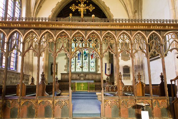 Are we creating a holy place, or fitting out the living room?
The nature of the dividing line between sanctuary and nave in a church has been a hot topic over the years. I raise the subject today not to spill yet more ink in complaining about the removal of altar rails in churches over the last 50 years or so, although it is something I do feel strongly about. Rather, I am interested in trying to establish how, with due regard for tradition, we might encourage in the Roman Rite a renewed engagement with art in the liturgy, in the such a way that it deepens our participation, rather than distracts from it.
One thing that always strikes me when I go to an Eastern Rite Catholic Church, (recently I have been attending St Elias Melkite Church in Los Gatos, California,) is how much more naturally priest, deacon, cantor and congregation engage with the icons during the liturgy. In contrast, in the Roman Rite, even in traditional congregations, apart from perhaps the crucifix and altarpiece, the choice of art seems to be governed more by the priest’s personal devotion than liturgical considerations, and there appears to be very little engagement with it during the liturgy itself. At best, sacred art provides a decorative backdrop that helps set an appropriate mood for the worship of God with direct engagement in the liturgy itself, which is largely a hands-clasped and eyes-closed activity.
First a quick presentation of different options available to us.
According to my research, the original division in both East and West was more like today’s altar rail, with gaps or doors for processing. The typical “transenna” might have looked as this one at Sant’ Apollinarre in Ravenna, which I understand was restored in the 20th century.
Another example from the 12th century, at San Clemente in Rome, which seems to follow the early traditional style......
To read the rest of this article, go to blog.pontifex.university
Do We Need A New Christian Symbolism in Art - Aren't Pelicans and Peacocks Redundant?
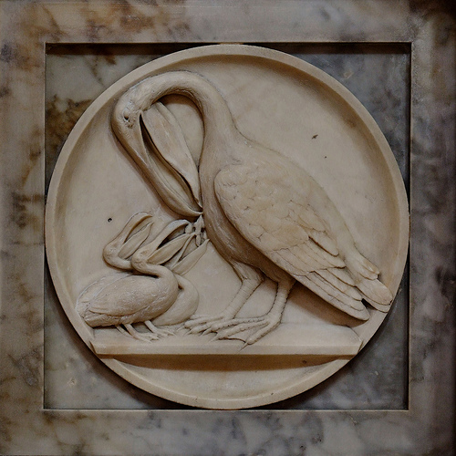 Should we resurrect the old Christian symbolism? Or are pelicans and peacocks just nonesense, like cabbages and kings.
Is there a danger that trying to reestablish traditional Christian symbols in art would sow confusion rather that clarity? Lots of talks and articles about traditional Christian art I see discuss the symbolism of the iconographic content; for example, the meaning of the acacia bush (the immortality of the soul) or the peacock (again, immortality). This is useful if we have a printed (or perhaps for a few of you an original) Old Master in church or a prayer corner as it will enhance our prayer life when contemplating the image. But is this something that we ought to be aiming to reinstate the same symbolism in what we produce today? Should we seek to educate artists to include this symbolic language in their art?  If symbols are meant to communicate and clarify, they should be readily understood by those who see them. This might have been the case when they were introduced – very likely they reflected aspects of the culture at the time – and afterwards when the tradition was still living and so knowledge of this was handed on. But for most it isn’t true now. How many would recognize the characteristics of an acacia bush, never mind what it symbolizes? If you ask someone today who has not been educated in traditional Christian symbolism in art what the peacock means, my guess is that they are more likely to suggest pride, referring to the expression, ‘as proud as peacock’. So the use of the peacock would not clarify, in fact it would do worse than mystify, it might actually mislead. (The reason for the use of the peacock as a symbol of immortality, as I understand it, is the ancient belief that its flesh was incorruptible). So to reestablish this sign language would be a huge task. We would not only have to educate the artists, but also educate everyone for whom the art was intended to read the symbolism. If this is the case, why bother at all, it doesn’t seem to helping very much, and in the end it will always exclude those who are not part of the cognoscenti . This is exactly the opposite of what is desired: for the greater number, it would not draw them into contemplation of the Truth, but push them out. I think that the answer is that some symbols are worth persevering with, and some should be abandoned. First, it is part of our nature to ‘read’ invisible truths through what is visible. This does not only apply to painting. The whole of Creation is made by God as an outward ‘sign’ that points to something beyond itself to Him, the Creator. Blessed John Henry Newman put it in his sermon Nature and Supernature as follows: "The visible world is the instrument, yet the veil, of the world invisible – the veil, yet still partially the symbol and index; so that all that exists or happens visibly, conceals and yet suggests, and above all subserves, a system of persons, facts, and events beyond itself.” It is important to both to make use of this faculty that exists in us for just this purpose; and to develop it, increasing our instincts for reading the book of nature and in turn, our faith.
  However, coming back to the context of art again, some discernment should be used, I suggest. I would not be in favour of creating an arbitrarily self-consistent symbolism. The symbol must be rooted in truth. The symbolism in the iconographic tradition is very good at following this principle. This is best illustrated by considering the example of the halo. This is very well known as the symbol of sanctity in sacred art. There are very good reasons for this. The golden disc is a stylized representation of a glow of uncreated, divine light, shining out of the person. Even if this were not already a widely known symbol, it would be worth educating people about the meaning of it, because in doing so something more is revealed. When however, the representation of a halo develops into a disc floating above the head of the saint, as in Cosme Tura’s St Jerome, or even a hoop, as in Annibale Caracci’s Dead Christ Mourned, (both shown) then it seems to me that the symbol has become detached from its root. Neither could be seen as a representation of uncreated light. These latter two forms, therefore, should be discouraged.
Similarly, those symbols that are rooted in the gospels or in the actual lives of the saints should be encouraged and the effort should be made, I think, to preserve or, if necessary, reestablish them. The tongs and coal of the prophet Isaias relate to the biblical accounts of his life. The inclusion of these, will generate a healthy curiosity in those who don’t know it, and so might direct them to investigate scripture. The picture shown, is one of my own icons.

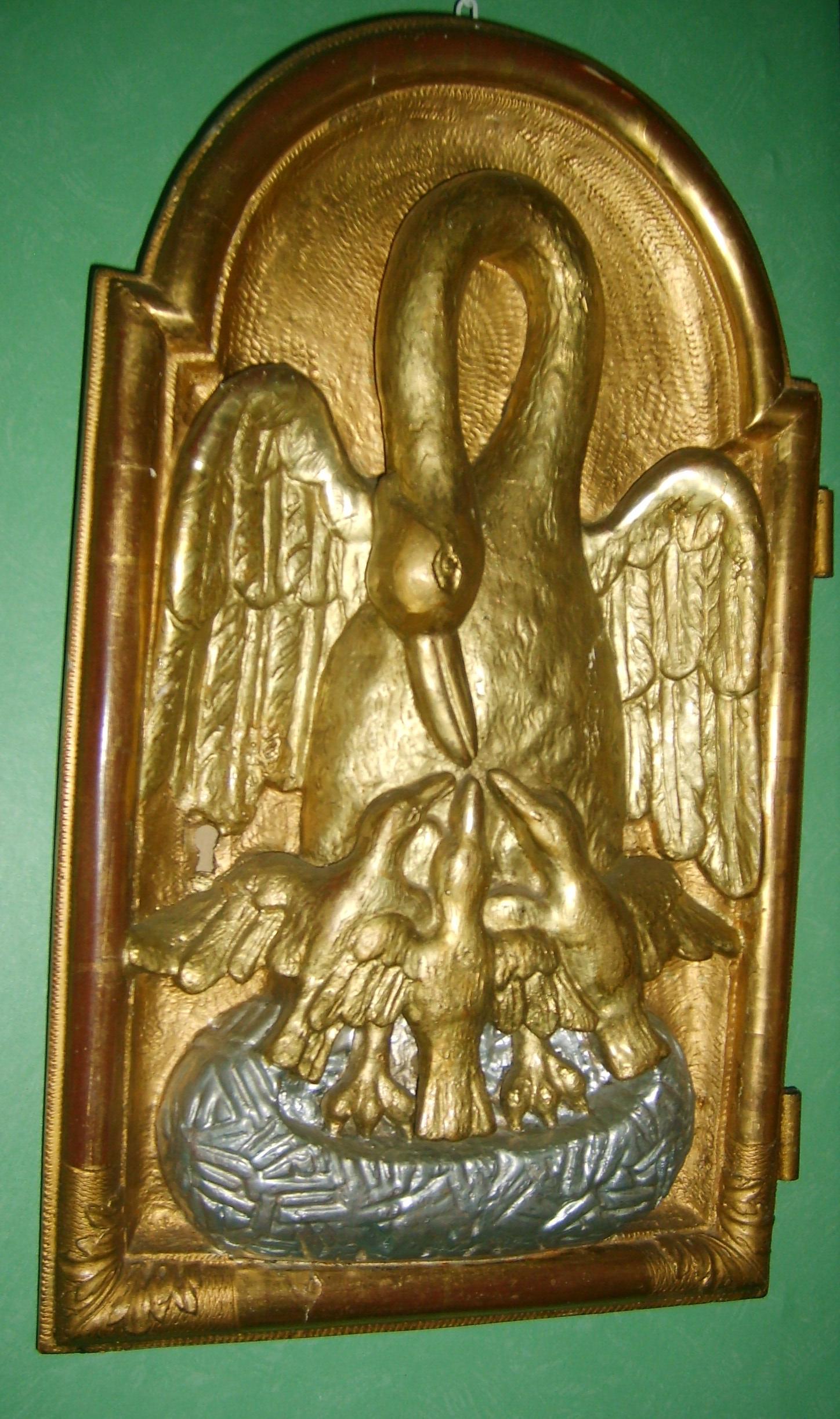
In contrast consider the peacock and the pelican. The peacock, as already mentioned, does not, we now know, have incorruptible flesh. The pelican is a symbol of the Eucharist based upon the erroneous belief in former times that pelicans feed their young with their own flesh. My first though is that these symbols should not be used should not be used, because the reason for their symbolism in invalid, given that we no longer believe it to be true. However, I will admit that I am torn by the fact that both of these are beautiful and striking images, even if based in myth. Also, it might be argued, and this is particularly true for the pelican, that to use it is not resurrecting an obscure medieval symbol. It is an ancient symbol certainly - and St Thomas Aquinas's hymn to the Eucharist, Adore te devote called Christ the 'pelican of mercy'. But it lasted well beyond that. It was very widely understood even 50 years ago. Awareness of it is still common nowadays amongst those who are interested in liturgy and sacred art. Perhaps an argument could be made that even when the reason for the use of symbol is based in myth, if that is known and understood, and when that symbol recognition is still widespread enough to be considered part of the tradition, it should be retained. We should also remember that modern science is not infallible, and we moderns could be those who are mistaken about the pelican! My Googling research (admittedly even less reliable than modern science) revealed that the coat of arms of Cardinal George Pell has the image of the pelican. If this is so, I imagine he would have something to say about the issue also!
Liturgical Form Manifested in the Mundane - the Famous K2 Telephone Box
 I recently visited the OQ Farm near Woodstock in rural Vermont. It is a retreat center which is connected to The Sword and Spoon Foundation, an ecumenical group interested in promoting a Christian culture of faith and beauty. The occasion was a gathering of Christian artists, musicians, and filmmakers, who gave talks about their work and shared ideas about the transformation of the culture.
I was curious to see this place that is quietly become a hub for artistic renewal. If you look at the program of events over the summer, for example, there are two workshops by internationally known Russian iconographers, Anton and Ekaterina Daineko, who are coming from Russia to teach here. Also, the highly respected Catholic playwright and screenplay writer Buzz McClaughlin is offering a a workshop on story development. I first met Buzz about 10 years ago, and read his book on the structure of story narrative; I have kept in touch with him ever since, because his ideas regarding engagement with the culture, in the context of film, are in harmony with my own. The organizer of these events for the OQ Farm is Keri Wiederspahn, who is herself an accomplished icon painter and teacher in the Russian tradition.
One evening while I was at this event, as the sun was going down, I took a walk around the property and a particular detail caught my eye, a red English telephone box sitting between the farmhouse and the barn. This was a nice coincidence, since the K2 telephone box was described in a book I had just read, Roger Scruton’s excellent How to Be A Conservative (a review of which will appear on this blog shortly).
I asked about this and was told that it had been at the farm for some years, placed there by previous owners, but the current management had decided to keep it.
Why would someone have gone to the trouble of importing a heavy chunk of painted steel at a cost of what must have run to thousands of dollars in the first place?
I suggest that the story of the K2 telephone box can explain why, in many ways a humble piece of street furniture could become an icon of what we are seeking in cultural renewal, and how, unlikely as it may seem, the liturgy is connected to this.
This begins with the Victorian Neo-Gothic movement in architecture, which had its roots in the mid-18th century, but became popular in the first part of the 19th with the rise of High Anglicanism and the legalization of Catholicism in Britain. One of the most influential figures during its rise in popularity was the Catholic convert, architect A.W. Pugin.
It has been said that “historically, all the great art movements began on the altar,” and this includes Neo-Gothic architecture. A style which began as the model for new churches then became a standard for civic buildings and homes in Victorian England. Many of these English architects were hired by Americans, and introduced the Neo-Gothic to cities int he United States. In the eastern part of the country in particular, there are many wonderful churches, colleges, and civic buildings in this style.
Some time ago, I featured on the NLM a small Neo-Gothic church in Maine, St Andrew’s, which was designed by the English architect Henry Vaughan. He was involved in the design of many grand churches in New England, and also one of the architects of the Episcopal Washington National Cathedral.
St Patrick’s Cathedral in Manhattan is another famous American Neo-Gothic church, built in the middle of the 19th century.
 |
With these liturgical buildings as their archetype, we see architects bringing the Neo-Gothic style out into the civic buildings of the city. As a result, their form is derived from, and points to, that which is connected to and in harmony with the liturgy.
Here is St Pancras Station hotel in London designed in the 1850s by George Gilbert Scott, exterior and interior:
 |
 |
It was George’s son, Sir Giles Gilbert Scott, who designed the last completed Gothic church in England, Liverpool Anglican Cathedral. This was started in the early years of the 20th century and completed in 1978, when it was opened by the Queen. I was a schoolboy living about 10 miles from Liverpool at the time, and I can remember being awestruck when I visited it. We were told stories at school of stonemasons who had worked on this one building for their whole working lives, just as in medieval times.
Contrast the above with Liverpool's Catholic Cathedral, started and finished in the 1960s. It is known by the locals as 'Paddy's wigwam'.
 |
| Image from Wikipedia by John Driscoll |
Moving on as quickly as we can from the concrete teepee, we can consider another civic building that is derived from the liturgical style, one of the most famous buildings in the UK. Westminster Palace, including the Houses of Parliament, was designed by Sir Charles Barry. The iconic Elizabeth Tower, as it was re-named in honour of our present Queen, which houses Big Ben, was designed by Pugin, who was working under Barry on the project.
And now, in the foreground we see the familiar site of the red telephone box, looking at home in its urban surroundings.
The telephone box was designed by the same man who designed Liverpool Anglican Cathedral, Sir Giles Gilbert Scott. Although this designer was steeped in Neo-Gothic architectural design, the inspiration for this came from the architecture of the 18th century Neo-Classical architect, Sir John Soane, whose in London house is a famous museum. At the time of the design competition for the K2 in the early 1920s, Giles Gilbert Scott was a trustee of the Soane museum; his telephone box is influenced by the mausoleum which Soane himself designed. This is in the gardens of St Pancras Old Church, just around the corner from the railway station in London.
Scott designed the K2 and the subsequent modifications including the most common, the K6 designed by him in 1935. This telephone box sits as happily in the city, in the shadow of the Houses of Parliament, as it does beside the rural colonial architecture of America (which, incidentally, has its roots in Neo-Classical, Palladian architecture, but that’s another story.)
Scott’s sense of proportion is influenced by his training as an architect. The basic proportional scheme is common to both styles, and broadly speaking, to all traditional Western architecture prior to about the Second World War, going back to the ancient Greeks.
I think that it is interesting that one of the leading architects in the nation took the design of a piece of street furniture so seriously the he applied to it all the skill and experience that he might also employ in designing a cathedral, while realizing that one uses greater restraint and simplicity in designing a phone box than one would in designing a cathedral.
The design of the phone box directs us intuitively to the liturgical architecture that traditionally the design of the civic buildings participates in, in all styles, not just the Neo-Gothic. Ideally, this crystallizes in exemplary fashion in the place of worship, which contains the heartbeat of the city. As the tabernacle and altar should be the focal points of the church design, so the cathedral should be the focal point of the city.
The numerical source of traditional proportional schemes was originally derived in the pre-Christian classical world from the observation and analysis of the order of the cosmos, which it was believed gave rise to its beauty. These were adopted by Christian culture, and employed by architects as a matter of course until the period between the wars in the last century. Because it conforms to this cosmic beauty, this little telephone box, like a village church, looks at home in the rural beauty of both an English village and a Vermont farm. It is a simpler design than a cathedral, or a hotel, or even a farmhouse, but that is as it should be; after all, one of the attributes of beauty is due proportion - it is appropriate to its place in the hierarchy of human activity.
While the ultimate expression of this beauty will ideally be in the place of worship, this is not the end, for the beauty of the cosmos and the beauty of the culture direct us to heavenly beauty, and ultimately, to the beauty of the Creator Himself, who left His mark on Creation and inspired the culture of beauty created by man.
Here are some more pictures of phone boxes in English villages. They are so beloved that even in this age of mobile phones, when the need for them has long since past, people keep them as familiar and beautiful icons in the scenery. Sometimes they find an alternative use for them, such as a miniature lending library.
The Vermont phone box is one of many that have been transported to the US, because of their beauty. Here is one on the campus of the University of Oklahoma:
This is the first photograph so far in which the box looks somewhat incongruous in its setting. The imposter in this scene is not the phone box, however. Rather, it is the featureless brick wall of a building, which dominates as a result of its size and aggressive ugliness. This is the building that dissents from a participation in cosmic beauty.
You might ask why the box is K2, and not K1? The answer is that the K1 design was rejected by the phone company because they couldn’t persuade the London boroughs to allow it on their streets because of its ugly design. So they ran a competition for a new design which, they hoped, would be appealing enough to persuade the local governments to adopt this new, cutting edge technology. One wishes that today’s utility companies would go to similar lengths in the design of such things as electricity pylons or wind turbines!
This is the reason why the OQ Farm is appropriate as an artistic retreat. It’s the countryside, the buildings, and even the telephone box all speaking to us of the cosmic beauty, which in turn directs us to Beauty itself, giving us, as Benedict XVI puts it, an insight into the “mind of the Creator!” This is an inspiration for all hoping to create beauty for the greater glory of God!
The Ghent Altarpiece - What Makes it So Suited for the Liturgy?
One of the greatest masterpieces ever painted, the Ghent Altarpiece (also known as the “Adoration of the Mystic Lamb”) was created in the 15th century by Flemish brothers Hubert and Jan Van Eyck. While broad appeal is not the only necessary indicator of merit, it is, in my opinion, one of them. This being so, the Adoration of the Lamb passes the test with flying colors - it is the second most visited and viewed work of art in history (after the Mona Lisa).
My consideration of it was prompted by the publication of a book about the altarpiece. Called the Adoration of the Mystic Lamb it is published by Ignatius Press and Magnificat (the one that produces a portable Liturgy of the Hours, sent out monthly). The book is excellent resource with large (12in x 12in) reproductions of details, which are as sumptuous as I have ever seen. The commentary, written by French art historian Frabrice Hadjadj is excellent in its description of the historical background, provenance; and in the details of the content, viewing it as a pedagogical tool. Every figure is identified and every Latin inscription is translated.
In this article I want to consider additional elements that come into consideration of the altarpiece as a piece of liturgical art, focusing especially on how its design, use of medium and gothic style are in harmony with its purpose of promoting the right worship of God. These are the things that an artist, or patron need to be aware of if creating news works of liturgical art suited to their purpose.
I was invited by Chris Carstens, the new editor of Adoremus Bulletin to write a review of the book, and what I present here is an adaptation of what I wrote for him. I would recommend, by the way that this is read in conjunction with Chris's excellent accompanying piece contained in the bulletin, called Mystagogy of the Lamb in which he explains in detail the meaning of symbol of the lamb for Christians.
Looking now at the famous reredos: when the panels are closed we see, painted largely in monochrome, white and graded tones of sepia through to black, a depiction of the Annunciation watched by a congregation of figures, including two Sybils, the prophets Zachariah and Micah, John the Baptist and John the Evangelist. Also making an anachronistic appearance in the scene are the Van Eycks’ patrons, Joos and Isabelle Vijd. To include one’s patrons in a work of art is a typical device for honoring those whose generosity helped make the work of art possible. The figures of the two Johns are of statues in stone, lifeless as well as colorless.
When the doors are opened the scene is, in contrast, in glorious and bright color. It is dominated by the two largest central panels. The lower of the two is the image which gives the whole piece its name, the Adoration of the Mystic Lamb in which the heavenly hosts adore the Lamb of God – Christ – standing ‘as if slain’ (as it is cryptically described by the Book of Revelation (Rev 5:6)). Above this is the figure of God enthroned who looks down blessing us with his right hand.
There is some ambiguity as to whether this figure is intended to be the Son or the Father (I will discuss this later). He is flanked on the left by Our Lady, as Queen of Heaven and, in contrast to the monochrome rendering of her in the Annunciation scene, in this depiction she is painted in gorgeous blue.
On the right of the enthroned figure of God is John the Baptist, now painted in living color and clothed in apple-green robes.
On each upper extreme, the stand the figures of Adam on the left and Eve on the right, looking inwards at the event in history that began the redemption of the Fall which they caused. Our first parents are depicted by the Van Eycks after the Fall, hiding their full nudity with hands and fig leaves, and in deep shadow. In accordance with tradition, the redeemed saints in the scene (not Adam and Eve), are the source of their own saintly light which means that there is minimal cast shadow around them.
The Van Eycks’ manipulation of contrasting shadow, light and color conforms to the tradition in which shadow represents the presence of evil and suffering in a fallen world, and Light represents ‘overcoming the darkness’.
Also, the lack of vegetation and life in the image when the panels are closed points us to a time prior to the historical event of the life, death and resurrection of Christ; this is contrasted with the lush garden of Paradise restored in the interior image (when the panels are opened) with plants in full bloom.
The commentary in the book tells us of the prophesies of the prophets and of the Sybils (who are present incidentally, because their prophesies in classical Roman literature were seen by the Church Fathers as anticipating the coming of the Messiah).
The themes are strongly Eucharistic (most obviously evoking the phrase of John the Baptist, ‘Behold the Lamb of God’ and connecting this phrase to the Eucharist). Nevertheless, even greater emphasis could have been placed on some more broadly liturgical aspects of the work as a whole.
Liturgical art is not intended primarily as decoration or even to teach us about the underlying theology, although it does fulfill these functions. Rather, as architectural historian Denis McNamara pointed out in his recorded presentation on this site, the liturgical art is a part of the liturgy itself, and reveals those aspects of the ritual that we cannot immediately perceive. For example, when the panels of this work are opened we are seeing the heavenly hosts who join us here on earth, in reality, through the sacred liturgy in their perpetual worship of God. At that moment ours is a temporal participation in this eternal reality.
Despite the title, the Ghent altarpiece is not only about the adoration of the Lamb, but also about the worship of the Father, through the Son – the Lamb of God - in the Spirit. When we worship God in the liturgy we are drawn into the mystery of the Trinity. The altarpiece reinforces this point.
This focus on God the Father explains also, perhaps, the ambiguity in regard to the identity of the central figure of God. As Hadjadj explains, in some respects the figure of God has the characteristics of the Son – his youth for one thing - and in other respects, for example his attire and his crown, the figure has attributes generally associated with the symbolism of God the Father.
Upon further consideration, this ambiguity seems intentional. It appears to be a depiction of the Father seen through our understanding the Son. Perhaps we are meant to take the figure as both Father and Son at once. Other things in the painting seem to point to the Trinitarian mystery. For instance,the sun is rising in the East above the horizon, which is the symbol of the risen Christ, Christ in glory. But the viewer only sees half of the sun. Its upper half is replaced by an image which is, perhaps, the Son enthroned but which we are meant to see as the ‘visible image of the invisible God’. Through Christ, the Ghent piece seems to want to make clear, we see the Father.
But further details of that semi-sun also reward study. Within the image of the risen semi-sun there is a dove, which represents the Holy Spirit. So, not only do we see the Father, through the Son, but we see him in the Spirit. To emphasize this point, we see rays of light, lines of gold leaf emanating from the Spirit that touch all of those who are gathered. We, who participate in the earthly liturgy are part of the mystical Body of Christ too, and so, like the adoring saints and angels in the painting, are in reality touched by the uncreated light of divinity.
In the Eastern Church the dominating image in a liturgical setting is that of the glorified Christ. (The suffering Christ on the cross will be there too, but less prominent). However, when the faithful address the Father in prayer, they will pray to the image of the Son, because those who ‘see the Son see the Father’. Years ago I was struck by how the family of my icon painting teacher, who is Orthodox, sang the Our Father: the entire family would turn and face an image of the risen Son as they prayed.
We do not know the exact intention of the artist here in regard to this visual personification of God, but if I was painting it, I don’t think I would allow for such ambiguity. I feel somewhat uneasy with the visual conflation of two divine persons into one. Rather, as Eastern Catholics and the Orthodox do I would have an unambiguous image of the Son through whom I could address the Father. The alternative, as the Western tradition allows, is to have two contrasting yet complementary images: one of the Christ in Glory and the other a traditional symbolic image of the Father (such as the grey-bearded Ancient of Days in the Sistine Chapel painted by Michelangelo).
How would congregations at the time of Van Eyck have engaged with this painting in the liturgy itself? The Ghent altarpiece is a reredos,a painting or program of images installed behind the altar. According to some liturgical historians, the reredos developed in the Roman Rite in the Middle Ages because of the growing liturgical emphasis on the visible elevation of the host and chalice by the priest. As a backdrop to this event, the reredos is intended to draw our attention to the elevation and to increase our understanding of what is happening.
Therefore, an artist who paints a reredos should be aware of two things in particular: first at this critical point in the Mass, the images behind the visible elevated host should illuminate the fact that Christ is really present with us. Second, the portion of the reredos which serves as backdrop for the elevated host ought to allow us to see the small white circular wafer in clear relief against the reredos. Which part of the Ghent image is designed to serve as a backdrop for the host, I wonder? Is it designed, for example, to be contrasted with the green of the foliage or with the red on the face of the altar. I like to think that the Van Eycks designed their altar so that at the elevated host appears directly in front of the rising sun, straddling the conjunction of the two panels the one featuring the sacrifical Lamb and the other, the glorified Christ/the Father. It is exciting to think that at the point of elevation the congregation would see the golden rays of the semi-sun as if they were emanating from the host itself.
Because the reredos is no longer in it’s original location but in a side chapel and no longer services the liturgy, we do not know exactly what worshipers would have seen. We also have no information about when the reredos panels would have been opened or closed in the course of ordinary use. It was common in the middle ages for monochrome images to be be used during the penitential seasons of Advent and Lent; and then brightly colored for Easter and the rest of the year. If this was the case for the Adoration of the Lamb in Ghent, then during these periods prior to Christmas and Easter, the panels would have been closed so that congregations saw the Annunciation scene. This scene would be doubly appropriate because Advent and Lent are also periods of anticipation of the coming of Christ, and this anticipation would have been enhanced by portraying the biblical scene which inaugurated the incarnation. Nevertheless, without precise information in regard to this particular painting it is difficult for us to say exactly how the painting helped those attending Mass relate to the actual celebration of the liturgy.
It is interesting to note that the Ghent altar’s scheme contains no image of the crucifixion. But since this reredos was very likely not the only image in the church, it was probably painted to be seen in relation to all other images that were present – including that of a crucifixion elsewhere in the church. During the middle ages, altar rails were customarily expanded upwards into a chancel screen or ‘rood’ screen – which consisted of transparent tracery and was perhaps carved in wood. This screen would often be surmounted by a sculptural representation of the crucifixion (the word ‘rood’ is an old English word for cross). If there was something similar in Ghent cathedral, then the congregation would have been able to see all three: the Lamb, the enthroned figure of God and the crucifixion simultaneously. After the Council of Trent, the call for greater visibility of the celebration of the Mass resulted in many chancel screens being removed (although in fact they weren’t condemned explicitly). I believe Ghent underwent this same sort of revision.
As for the methods of the artists: the Van Eyck painted in glazes and never used painted whites. The white we see is the polished white gesso ground (a powdered chalk, or something similar, set in an animal glue) showing through. This technique is unusual for oil painters – but is similar to the way that a contemporary watercolor artist might integrate the white of the paper into the painting.
The Van Eycks built up multiple glazes of color, giving the finished product a deep, jewel-like luster with deep pearlescent colors. In order to understand how this works it is worth considering first just what paint is.
No matter which medium an artist uses, the color in all paintings is always derived from the same inert pigment. For instance in yellow ochre, the yellow comes from iron oxide dug up from the ground. In order to get the pigment to stick to the surface, the artist must apply it after suspending it in some sort of medium which can be brushed on as a liquid, is viscous enough to adhere to the surface and capable of solidifying so that the paint has permanence. If the paint is egg tempera, the medium is egg yolk; if it is oil paint, then the medium is linseed oil or some other commonly available vegetable oil; in watercolour the medium is gum arabic. It should be noted that the oil paint used by the Van Eycks was not the tube oil paint found in art shops today. In the 19th century artists mixed the oil medium with wax to give it bulk and the physical properties that would allow manufacturers to mass produce the paint in factories by putting it in tubes that might sit on shop shelves for long periods of time without degenerating.
This change in the quality of the paint – which before this would have been mixed by the artist in his studio - affected how artists painted. It is much easier for artists such as Monet or Van Gogh to use thickly brushed opaque layers of waxy oil paint in a style called impasto. In contrast, the oil paint that the Van Eycks used would have had a much more fluid quality to it than more recent sorts of oil paint; it would have been a genuinely ‘oil like’ paint. Therefore the paint used in the Ghent altarpiece had been worked into very thin, smooth and transparent layers called glazes. The deep colors that we see in this work would have been created not by a single application but by having perhaps as many as 15 or 20 layers each just a few microns thick.
Artists favored this method because it achieved a certain special optical effect. As the light hits the surface of the painting, some of the light is reflected and takes on the color of the paint and some is transmitted through the first layer of paint until it hits the interface between the second and third layers, where the process is repeated. If a strong light, such as flickering candlelight, shines onto the painting, it creates an especially jewel-like richness on the smooth surface, as if the painting itself were the light’s source, the light rays emerging from deep within its surface. The artist who knows what he is doing manipulates this effect by subtly changing the relative tone and the precise colour of each layer. It is no accident that this effect is called ‘pearlescent’. In pearls the same optical effect is created by many layers of the transluscent deposit, put down by the oyster around a irritating piece of grit.
If you read the art history books, Van Eyck’s painting style is described as part of the ‘Northern Renaissance’. Whatever we call his style, it is to my mind more a culmination of the gothic that preceeded it than it is an anticipation of the High Renaissance that followed it. Certainly it is highly naturalistic and it has this in common with the Renaissance style. But this increased interest in natural appearances and curiosity about the natural world did not begin with the Renaissance nor with Van Eyck, but began over two hundred years before (due to the influence of the newly rediscovered philosophy of Aristotle among other things).
What links Van Eyck to the Gothic stylistically is the sense of emotional distance between the figure and the observer. The whole gothic movement has this same sense of emotional distance in common with the iconographic styles that preceded them. Although sometimes we do observe some emotion in the figures, these emotions do not engage us directly; we are still in some way detached, observing from a distance.
This placement of the figures at a distance - in the middle ground rather than in the foreground - affects the dynamic of the observer’s interaction with the image. The beauty of the painting draws us in and we want to engage, but we cannot because that distance is inherent within the composition and style. It is there even if we have our noses pressed against the panel. Our desire to be part of what we see then takes our attention beyond the painting itself to the reality that it portrays, which is heaven. So the painting first pulls us in and then it sends us up to heaven. This dynamic of prayer is built into the style of the painting and is part of what makes it a skillful execution of the artist’s skills; and stylistically appropriate for the liturgy.
A Christian artist must paint man so that he is recognizably human – in short, the image must look like a person. At the same time the artist must indicate those invisible truths by deviating from a strict adherence to physical appearances. It is through a controlled partial abstraction that the artist reveals a fuller truth about the human person. It is in the way that an artist executes this abstraction,we recognize characteristic styles.
Such styles can be done well or badly. The three authentic liturgical traditions – iconographic, gothic and baroque - are described by Pope Benedict XVI as communicating this balance of naturalism and abstraction well. Good Christian art is always a controlled balance between the representation of the physical appearances of the person, and partial abstraction by which, symbolically, the soul is revealed. (Any artists or lovers of art who are interested in knowing more about this process and how Christian artists have done accomplished it in the past should read my book, the Way of Beauty.)
The process of balancing naturalism and abstraction is done badly by swinging too far in one direction or another. Either the artist renders an excessive naturalism on the one hand, or he neglects appearances, leading to a grave distortion on the other hand. While there is always room for new and fresh art, to be Christian art it must reflect this balance. Pius XII said as much in Mediator Dei (195): “Modern art should be given free scope in the due and reverent service of the church and the sacred rites, provided that they preserve a correct balance between styles tending neither to extreme realism nor to excessive "symbolism," and that the needs of the Christian community are taken into consideration rather than the particular taste or talent of the individual artist.”
The 20th century artists named painted in styles that reflected a worldview that is governed by a dualism in which the spiritual aspects of man are exaggerated at the expense of the physical. These modern artists were not reflecting a Christian anthropology, and furthermore they knew it – the explicit aim of abstract expressionists exhibited by Newman and Rothko was to represent man as pure disembodied spirit. The corollary to this is the style known as photorealism in which there is total neglect of the spiritual and only the material aspects of man are considered and represented.
As far as our understanding of the Ghent altarpiece is concerned, Van Eyck work was both naturalistic and also incorporated a symbolic element. While the surface of each object he paints is represented in exquisite and minute detail, the overall form of what he paints, the substrate to which all that detail is fused, is distorted according to gothic sensibilities so as to give a sense of the sacred.
One of these gothic aspects is compositional - that portrayal of the figures in the middle distance, (already described above) which creates a particular dynamic of interaction with the observer, especially in the context of prayer. Another gothic aspect is found in the form of the figures. In many ways the gothic is a naturalized form of the iconographic tradition that began in the early Church. You can see this gradual increase in the naturalism of surface appearances of figures if you follow a path historically from the late Romanesque/early gothic art of the 13th century (as in this illumination from the Westminster Psalter (link to example here) through later gothic art, such as the work of Duccio (link to examples here) and culminating in Flemish artists such as the Van Eycks and Van Der Weyden (below is Last Judgement altarpiece, from about 1440)
and a detail of the central section...
Gothic naturalism is very different from the naturalism of the High Renaissance which followed Van Eyck. In the High Renaissance, the figures were painted in the foreground and engage with the observer much more directly than in gothic depictions. The High Renaissance’s underlying form (to which this naturalistic surface detail is fused) is a copy of Greek and Roman (i.e. classical) art. From the High Renaissance onwards and through to the 19th century, artists such as Leonardo, Michelangelo and Raphael copied Greek and Roman statues as part of their training, which in turn affected their style profoundly. So when the baroque artist Rubens painted Theresa of Avila in prayer in the 17th century, the stylistic difference we see in his work emerged from his training for thousands of hours by copying Greek and Roman statues.
The Van Eycks’ did not train by copying classical statues, and so stylistically were influenced much more by the art forms that they saw around them, which were earlier gothic and Romanesque. Despite the fact this this painting is over 500 years old, the glory of what is true and good is radiating out the Van Eyck’s work, even today. When we perceive this quality in art, or anything else for that matter, we call it beautiful. And that beauty is irresistible. This is the message of John Paul II’s Letter or Artists and the numerous writing about the via pulchritudinis - the Way of Beauty - by Benedict XVI.
Thus, the lesson that artists today can learn from Van Eyck is that if people are not climbing over each other in their eagerness to see our work, the reason is simple. It is not beautiful enough. For proof of this truth, I suggest we need look no further than the Adoration of the Lamb. Hundreds of years after it was painted, this altarpiece is still the second most viewed painting in history. Modern man has voted with his feet – or to be more precise, with adoration.
Should We Paint God the Father?
 One of the most famous pieces of sacred art that exists is Michelangelo’s fresco, in the Sistine Chapel, of God giving the spark of life to Adam. Despite its popularity and familiarity, I had often wondered about the validity of representing God the Father.
My own instincts run against the idea of portraying God the Father in a painting at all, even when I was a child (I always thought that the white-whiskered God looked more like God the Grandfather, than God the Father). Later on in life, this was reinforced by the fact that my icon painting training led me to believe that it was wrong. I was pretty sure, but not certain, that it was not part of the tradition. Certainly, I have never painted an icon of God the Father. Furthermore, the theology of Theodore the Studite in regard to sacred imagery, which is accepted by both Eastern and Western Churches, bases the argument for the creation of any figurative art upon the fact that we can portray the person of Christ as man. The person of God the Father is a spiritual being and most certainly not man. This would seem to suggest that we should not portray the Father as man either.
 I quietly suspected that the white-bearded God of Michelangelo or William Blake or even my favourite baroque artist Velazquez were all in error, his Crowning of the Virgin by the Trinity is to the right. I wasn't too worried about Blake, an eccentric non-Catholic, but Michelangelo and Velazquez?
I was approached recently to do a commission that involves the portrayal of the Father. Rather than reject it out of hand, I thought I had better find out where the Church stands on this.
Here’s what my first investigations have revealed. For the first thousand years or so of Christianity, East and West, there was little portrayal of the Father figuratively. Then images started to appear in both the Eastern and Western traditions, though it was more common in the West.
There are two simple arguments that I have found for the representation of the Father: the first is that Christ said in John 14:9 that whoever has seen me has seen the Father. This would seem to open up to a representation of the Father as the Son. So, one could say, seeing an image of the Sacred Heart of Jesus is also seeing one of the Sacred Heart of the Father, with the heart of the Father understood as a symbol of His love.
![]() The second is that the white-bearded figure, which we are all familiar with is the Ancient of Days in the book of Daniel (7:9, 13, 22). This is the source of so many familiar portrayals of the Father. In the East there is a tradition known as the New Testament Trinity. This title would distinguish it from the Hospitality of Abraham (in which three angelic strangers represent the three persons of the Trinity). Right is a Greek Orthodox New Testament Trinity from the ceiling of the entrance Vatopedion Monastery at Agion Oros (Mount Athos), Greece. The Catholic Church, allows for the interpretation of the Ancient of Days as the Father, which justifies the portrayal of the Father. (I have been told that Pope Benedict XIV [fourteenth, not sixteenth!] in 1745 pronounced this, though beyond a Wikipedia reference I have not been able to validate this). It also allows for the interpretation of the Ancient of Days as Christ. The Russian Orthodox Church, since the synod of Moscow in 1667 has forbidden the portrayal of God the Father as a man. Consistent with this it interprets the Ancient of Days strictly as the Son. It is this decision of the pronouncement by the Russian church that gave me the idea, wrongly, that it had never been part of the Eastern tradition and that the whole present Eastern Church forbids it.
The second is that the white-bearded figure, which we are all familiar with is the Ancient of Days in the book of Daniel (7:9, 13, 22). This is the source of so many familiar portrayals of the Father. In the East there is a tradition known as the New Testament Trinity. This title would distinguish it from the Hospitality of Abraham (in which three angelic strangers represent the three persons of the Trinity). Right is a Greek Orthodox New Testament Trinity from the ceiling of the entrance Vatopedion Monastery at Agion Oros (Mount Athos), Greece. The Catholic Church, allows for the interpretation of the Ancient of Days as the Father, which justifies the portrayal of the Father. (I have been told that Pope Benedict XIV [fourteenth, not sixteenth!] in 1745 pronounced this, though beyond a Wikipedia reference I have not been able to validate this). It also allows for the interpretation of the Ancient of Days as Christ. The Russian Orthodox Church, since the synod of Moscow in 1667 has forbidden the portrayal of God the Father as a man. Consistent with this it interprets the Ancient of Days strictly as the Son. It is this decision of the pronouncement by the Russian church that gave me the idea, wrongly, that it had never been part of the Eastern tradition and that the whole present Eastern Church forbids it.
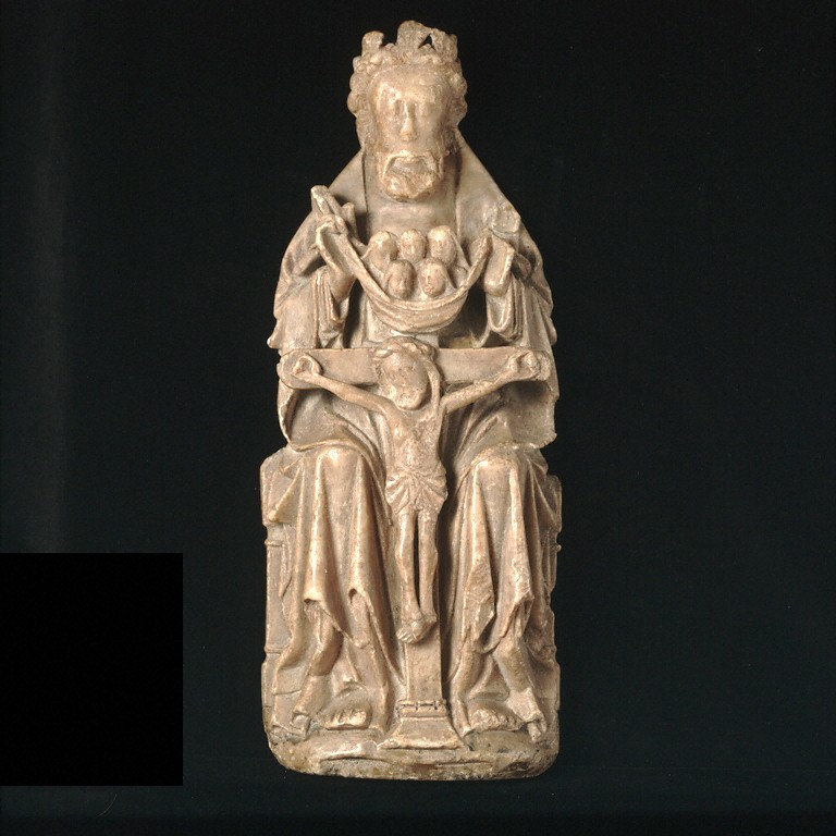
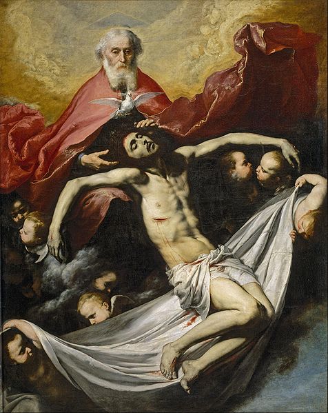
 There is a Western tradition of portrayal of the trinity in a type known as the Throne of Mercy, in which the Father sits on his throne and presents his crucified son to the viewer while a dove rests on the cross or hovers just above it. It was this that was explicitly mentioned by Benedict XIV. A 16th century German version is shown left. This tradition goes right back the Medieval times in the Western Church and we have this continued even into the 20th century with Eric Gill in England doing woodcut of this image in a modern gothic style.
So where do I stand on this now? Clearly the portrayal of the Father as a grey-haired man is permitted. I would feel on safest ground following the traditional presentations, such as the Mercy Throne image. Outside that, I would be consider images, but would be cautious, unwilling to promote, as Caroline Farey of the School of the Annunciation put it to me, ‘any trend of anthropomorphizing God the Father in case the transcendence of God is further compromised in people's imaginations.’
It is worth pointing out also, that when God is portrayed as a single person in the form of the Ancient of Days, we cannot be sure that it is the Father who is portrayed. The artist might, quite justifiably, have the intention of representing the Son. I have not, for example, been able to find an authoritative text that tells us precisely which person of the Trinity either Michelangelo or Blake intended us to be looking at (I would welcome comments from readers on this point).
Below: an early gothic Mercy Throne; a 20th century version by the Englishman, Eric Gill; an early gothic pieta in which God the Father supports the son; a baroque Mercy Throne by Ribera, 17th century; and William Blake's Ancient of Days.
15th Century Wall Paintings Uncovered in a Small Welsh Church
I am indebted to reader Gina Switzer. for bringing to my notice this story of the uncovering of wall paintings in St Cadoc's, Llancarfan in the Vale of Glamorgan, south Wales. Experts were called in after the architect noticed a single red line high up close to the rafters on a wall where a tiny patch of an estimated 27 layers of whitewash had fallen away from the plaster underneath. Gradually the whitewash was removed to reveal on one side of the church a large, floor-to-ceiling painting of St George and the dragon, and pictorial portrayals of the seven deadly sins. The church was found on the site of a monastery around 1200 and these painting are thought to date from the late 15th century, largely because of the dress of the figures which is contemporary to that period. The photo top left is of avarice and the other details are of St George and the princess.
As usual, what strikes me about this is how during this gothic period the whole church was covered with imagery.
BBC Wales has a video describing the restoration here.
Above: the exterior of the church and, below, the interior before, during and after restoration
The Need for Chivalry in Modern Age, and an Example of Such a Modern Knight
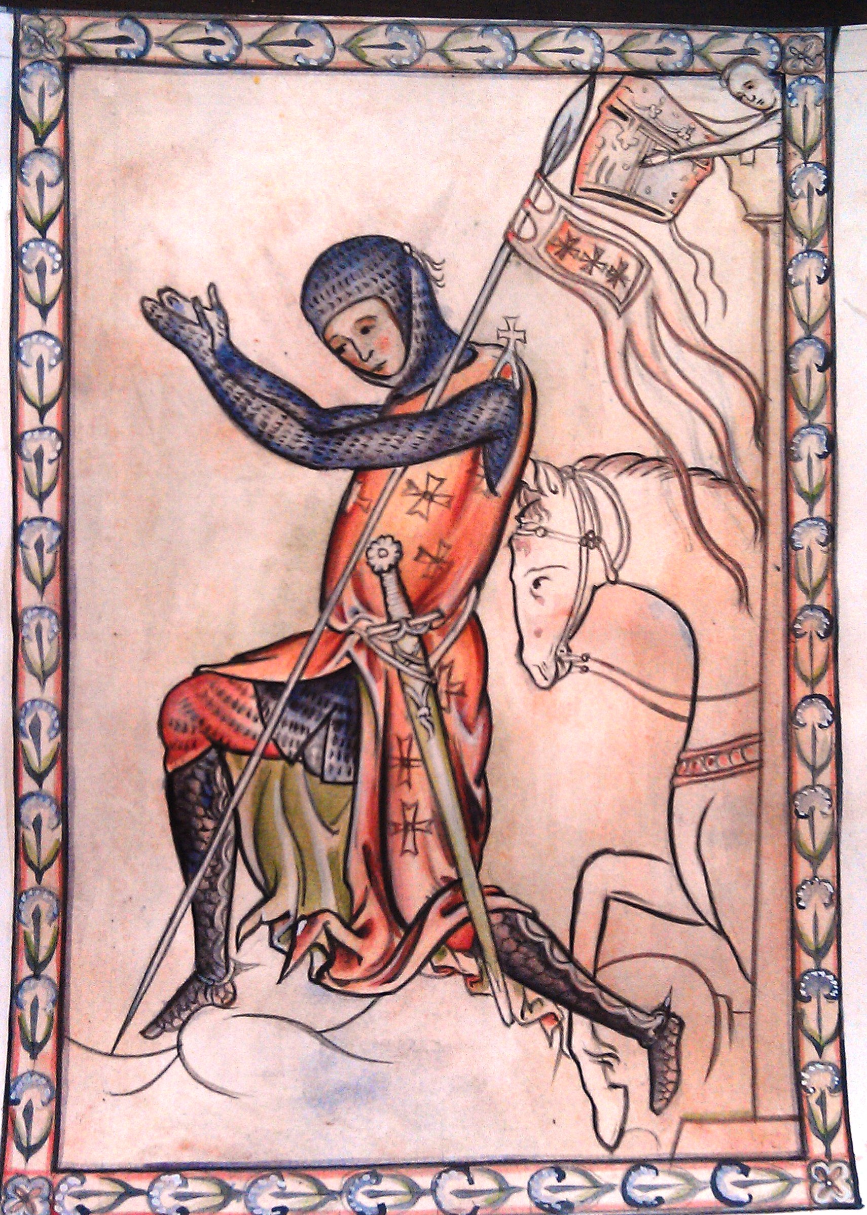 My friend Stratford Caldecott died very recently of cancer. I heard the news at a time that I was was reading his newly published book, Not as the World Gives: the Way of Creative Justice.
Contained within the book, which focusses for a large part on Catholic social teaching, especially in the light of Pope Benedict's Caritas in Veritate, he has a chapter on the evangelization of the culture. Within this, in turn, he makes a call for a new chivalry (p145):
'The Crusaders, with whom we associate the first Christendom - and who in fact represent one of its greatest failures - made the mistake of confusing and interior and spiritual struggle with an earthly and political one. The most important struggle is within. [This] suggests a way in which the ideal (if not the historical example) of medieval chivalry remains valid even today.'
He then quotes Hans Urs von Balthasar from his who felt that the West was built on the spirit of chivalry: 'Francis was a knight of Christ, as was Ignatius in turn while Newman's refinement resists every temptation to take things easy. Knighthood changes its form, but it does not change its soul...The glorification of the body of knights is no backward looking romanticism, no ancien régime that turns its face aside from the march of time, but the only effective equipment with which the Christian can meet the present day.' This body of knights, he says, 'is the fellowship under obligation to the King of Kings,' in which each strives for an inner peace, a personal transformation and then take that peace out to the world through his interactions with others; for 'how is the world to be healed, how are the peoples to be reconciled, if not through such a new body of knights which is nothing other than carrying out the will of Jesus Christ, here and now, in this time?'
It is from this body of knights that the economic social change, political change and cultural change in its broadest understanding will occur. For each person so transformed can contribute to the change of the world. 'In other words, the Evangelization of the culture takes place first in the encounter of one person with another before it affects governments or organisations.'
I think that few who have ever met Strat would deny he was one of those knights, brandishing the sword of the spirit and through each personal encounter transmitting the love of Christ. RIP
Afterword: the past two weeks I have been teaching art classes in which students learn the style of the English gothic illuminators from the period of the 13th century, especially Matthew Parris. Our classes had been discussing the relevance of painting a medieval knight today because our model for study was an image from the Westminster Psalter of a knight kneeling, see below. We discussed it and felt that the age of chivalry is not dead, or at least it shouldn't be; and assigned our knight the symbolism of the chivalrous Christian who is strong in virtue and who carries the light of Christ out into the world. For want of anything better, we called him the knight of the New Evangelization.
It was just yesterday that I discovered that in fact he is portrayed kneeling before an unknown king.
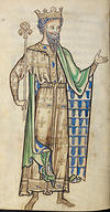 It was pure coincidence that this is the image that we were studying when I heard of Strat's death and then happened to read the above passage in his book.
The picture that I painted of this knight, top left and below, is my Christian Knight. When I painted it I thought of him as accepting his call from God to take up his personal vocation in life. But now I see him paying homage, as Strat described in his book, to the King of Kings, seeking personal transformation in Christ and accepting his role as a walking icon of Christ in the world.
Stations of the Cross - Some New Images in the Gothic Style
 On Good Friday, here are some images for the season. A reader has directed my attention to the paintings of this London based Catholic painter. She bases here style on the 14th century Italian gothic style. I am encouraged that she is developing so well a voice, so to speak, that is characteristic of the Western tradition. I am reminded of the Florentine painter Lorenzo Monaco, whose paintings I used to see regularly in the National Gallery in London when I lived there. The link for the full set on her website is here; and to her notes on the commission here.
These new Stations were blessed by the Bishop of Norwich at Wymondham Abbey on Laetare Sunday.
There is one point of consideration here and that is the choice of painting the buildings in the style of 14th century Italy and some of the figures dressed in clothes contemporary to that period (we see that in the 5th station particularly. When painted, these were echoes of what the world around them looked like at that time. One might argue that today, if we were to adopt the same principle, we would be showing modern buildings and modern clothes painted in a gothic style. It is difficult to imagine, but it is the job of the artist to imagine for us. This is the talking point that I brought up recently in connection with my own work in the style of the English School of St Albans. I painted a pious knight in chainmail and wondered if I should have been painting a pious Wall Street trader in pinstripe suit as a modern equivalent!
On the other hand it might be argued that although not historically accurate representation of Palestine of 2000 years ago is nevertheless convincing to the modern viewer in regard to sacred art. We are not concerned with strict historical representation provided the principles that we do wish to convey are communicated, and the style is certainly the right balance of naturalism and abstraction that one would want to see. One could argue therefore, that it evokes another age sufficiently for us to acknowledge that this event took place historically in the past and then we move past that and on to the spiritual lessons.
Christ meets his mother
Christ's Second Fall
Christ is nailed to the cross
Teaching the Western Tradition - Work from My Students at a Recent Painting Course in Kansas
 This summer we held a painting course in Kansas City, Kansas at the Savior Pastoral Center Kansas. I taught it and it was sponsored by the Diocese of Kansas City, Kansas which runs the center. I thought I would show some of the work done by students. This is unusual in that we focussed on 13th century gothic illuminated manuscripts from the School of St Albans. This one is a St Christopher painted by a master of the school called Matthew Paris.
The students, Paul Jentz and his mother Christi (who kindly took and sent me the photographs) worked from the image shown top left. They constructed a grid as a help but drew the design by hand. While giving them guidance, I gave each freedom to vary the border and the colour schemes. I think you'll agree that they did a good job.
We have already booked up to do two more courses next summer, so those who are interested might even contact the center now. This year the places went quickly and we could have filled the class more than twice over. The center website is here.
At group of about a dozen adults attended the course and the level of experience varied. Some were themselves teachers of icon painting classes (who were interested in learning about the gothic style); and some were complete beginners. What was exciting for me was that all took to this western form of sacred art very naturally and were enthusiastic to keep doing it and develop this as a tradition for today.
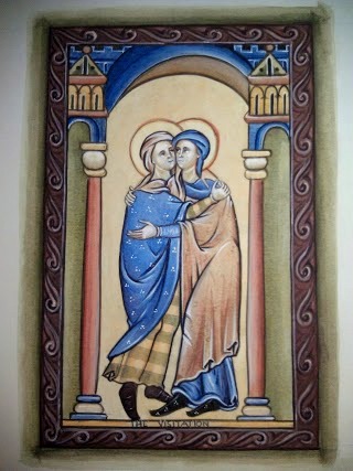
Next month I will feature work by other students who worked on the Visitation.

Work from a Painting Class Teaching the Style of the gothic School of St Albans
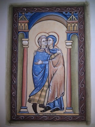 I have recently finished a course in Kansas City, Kansas and in some ways it was an experiment. I was teaching not icons, but the style of the gothic manuscripts such as the Westminster Psalter. These images are commonly attributed to Matthew Paris and the school of St Albans in the 13th century. This is the first time I have taught this style to mature students (that is those who are not undergraduates at Thomas More College). The experience proved very positive. Many of the students who came had experience of Byzantine icon painting classes and some were even teaching others. Even though these people were familiar with the Eastern styles of icons, they took to the Western form very quickly and enjoyed learning it. I cannot prove it, but my feeling is that this is because we were all of the Roman Church and these belong to our tradition. As we are doing illuminated manuscripts we painted in egg tempera on high quality paper. One brought velum. It was encouraging that there seems to be a demand for this style - we could have filled the class twice over and have already booked to do two classes next summer in Kansas, at the Savior Pastoral Center which is run by the diocese of Kansas City, Kansas.
In a posting that will follow in the next week, I will show you the work of the students. First I present here the painting I did during the class as the demonstration piece, along with a photo of the original..
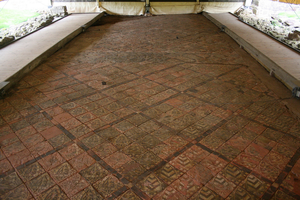
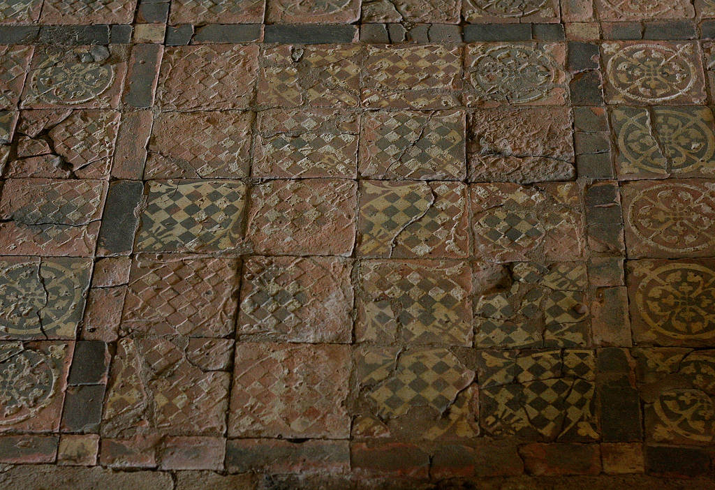
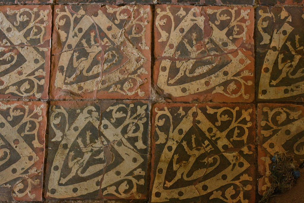
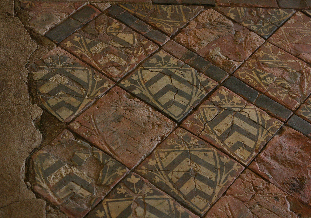
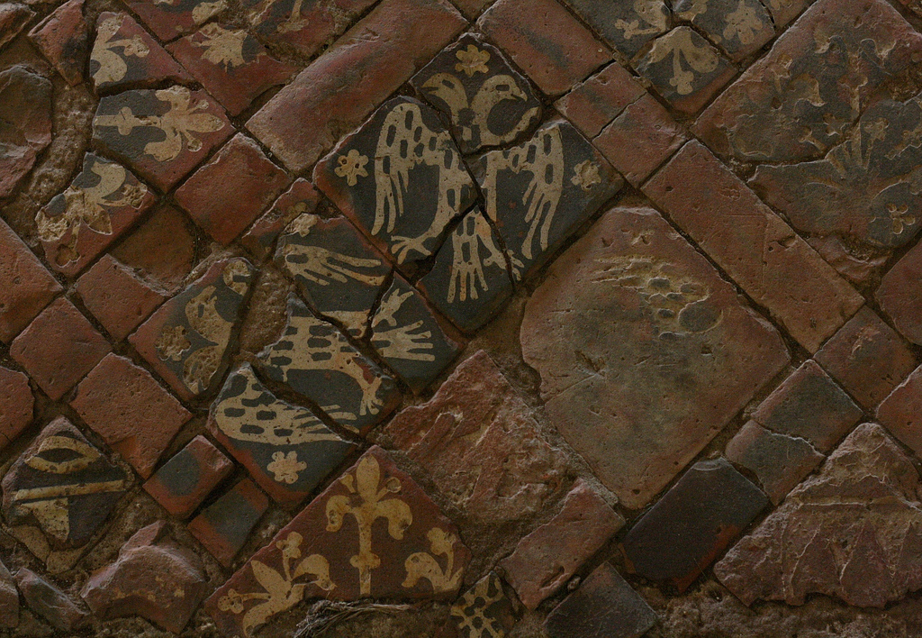
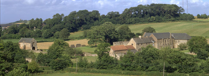
Floor Tiles from Cleve Abbey in Somerset, England
 Here are some pictures of 13th century tiles from Cleeve Abbey in England. They are a combination of geometric and pictorial designs. The latter employing heraldic and literary themes rather than scriptural. The form will be familiar to some through the Victorian neo-gothic tiles that are more common today, and which were based on designs from this period. I am admirer of the later forms as well, incidentally. I view as an authentic re-establishment of a past tradition and worth looking at not only for the architecture and tiles of the period, but also as case study on how to look to the past in a constructive way.
Thanks to Deacon Iacono of the Fra Angelico Institute of Sacred Art who brought them to my attention by referring me to an historical account given in the L'Historien Errant blog.
Above: the abbey church floor; and below: the refectory floor. The others are details of the refectory.
Lessons from Our Lady of Sorrows on our Response to the Suffering of those we Love
 The model of loving compassion for others who are suffering. September the 15th was the Feast of Our Lady of Sorrows. I found the liturgy of the Church on this day very instructive and inspirational. The message I get from this is for me, powerful, vigorous and inspiring. The writing of St Paul and St Bernard on the matter speaks of virtue in the fullest sense of the word.
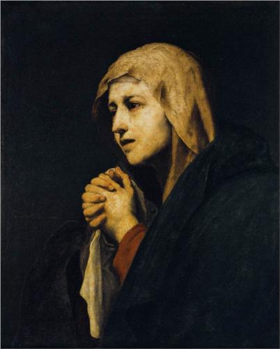
It is interesting to me that so much modern devotional art of Our Lady of Sorrows - Mater Dolorosa - is, to my eye, almost all sentimental and weak. The Spanish baroque and the Flemish gothic masters are for me the model of portraying negative emotion transcended with joy that is powerful yet calm.
One of the most difficult things to deal with in life is the grief we feel when someone whom we love is suffering and we are powerless to do anything about it.
My experience tells me that this can have two components. That born of self-centredness, which is a bad feeling; and one born of love, which is opens the door to intense joy. It is this latter point that has come home to me through the liturgy on this feast day by pointing to the model of Our Lady.
When I am driven by self-centredness, I look at the person who is suffering and I feel sorry for myself. This self-pity can be intense and almost unbearable as long as I see the other's suffering as the cause of my anguish. The cause is my personal response, and I have some control over that. It is easy to decieve myself and think that this is an expression of love, but such empathy can very easily be rooted in self-centredness and be profoundly destructive to my life, while doing nothing to help the other person either. If I put myself in the other person's shoes through my imagination, I might do this so vividly that I feel sorry for myself. At a mild level this is why I feel embarrassed for someone if he makes a fool of himself in front of many people. I am not so much concerned for him, but rather imagining myself in his position so that I feel the self-pity that I would feel if I were in his shoes. Hence the discomfort.
At a deeper level, when someone we love is the author of his own suffering, perhaps an alcoholic or a drug addict, then our suffering can be driven not so much by the loving reaction of ‘how can you do this to yourself?’ but rather, ‘how can you do this to me?’. If there is a sense that the suffering is as a result of fate, then we can find ourselves directing that resentful complaint to God.
One way of dealing with this that I have heard of is to stop the habit of imagining ourselves in the shoes of the other. This is not always a good thing. A cold, uncaring detachment is heartless and shuts out all joy in our lives too. It is a response that lacks both empathy and sympathy.
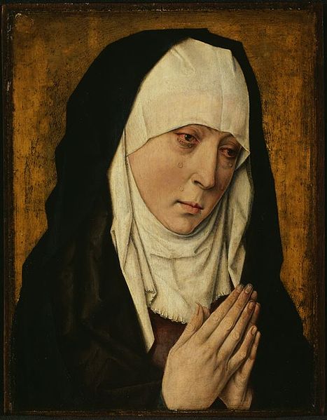 There is a different sort of detachment in which we do not empathise, but we do sympathise with the suffering and act with love. So we act lovingly towards the other, but do not share in the emotions that they are experiencing as we do it. I have heard this described by some as ‘detaching with love’. Certainly this is greatly preferable to the self-centred anguish that causes us to feel sorry for ourselves when others are suffering. For many of us this may be the best approach for us to aim for, particularly if we are trying to break out of the bad habit of an instinctive reaction of a self-pity – empathy based upon self-centredness - to the suffering of others. When we become aware of the root of our emotions, it is certainly possible to develop an habitual attitude of mind that corresponds to this. In the ideal however, this would be a route to another, higher response which is one of a loving empathy. This is where Our Lady is the model.
The highest response to the suffering of others is a compassionate grief; and this one that is transcended by joy. This is the grief felt by Our Lady at the foot of the cross as she gazed at her suffering Son. It is an anguish born of love and as with all that arises from love it opens our hearts so that we can have a fuller union with God and experience an even greater joy.
In order for me to try to understand this, I had first to consider the situation when I am the one who is suffering directly, rather than worrying about the suffering of another. I know that God always gives us grace to deal with any situation and through cooperation with His grace, we can transcend any injustice and any suffering. When this occurs the suffering is not necessarily removed, but is as likely to be overwhelmed by the sheer joy of experiencing God’s consoling love. The writings of the saints indicate just how powerful this joy in suffering is. In order to experience this, I must first remove any self-centred feelings and resentment that I may have.
If that consolation is there for us when we are experiencing suffering directly, then it is there too when we experience pain or injustice indirectly, arising from and empathetic sharing in the suffering of others.
However, this is true only to the degree that our anguish arises from love. It if arises from a self-centred desire to right the suffering of others then we shun God’s grace. We must first free ourselves of that resentful attitude and to do this one might have to go back a step and adopt the ‘detach with love’ approach. When our anguish is a sharing in the suffering of others born of love for them, then it is a sharing also in Christ’s suffering on the cross. It is holy suffering that opens the door to a greater joy.
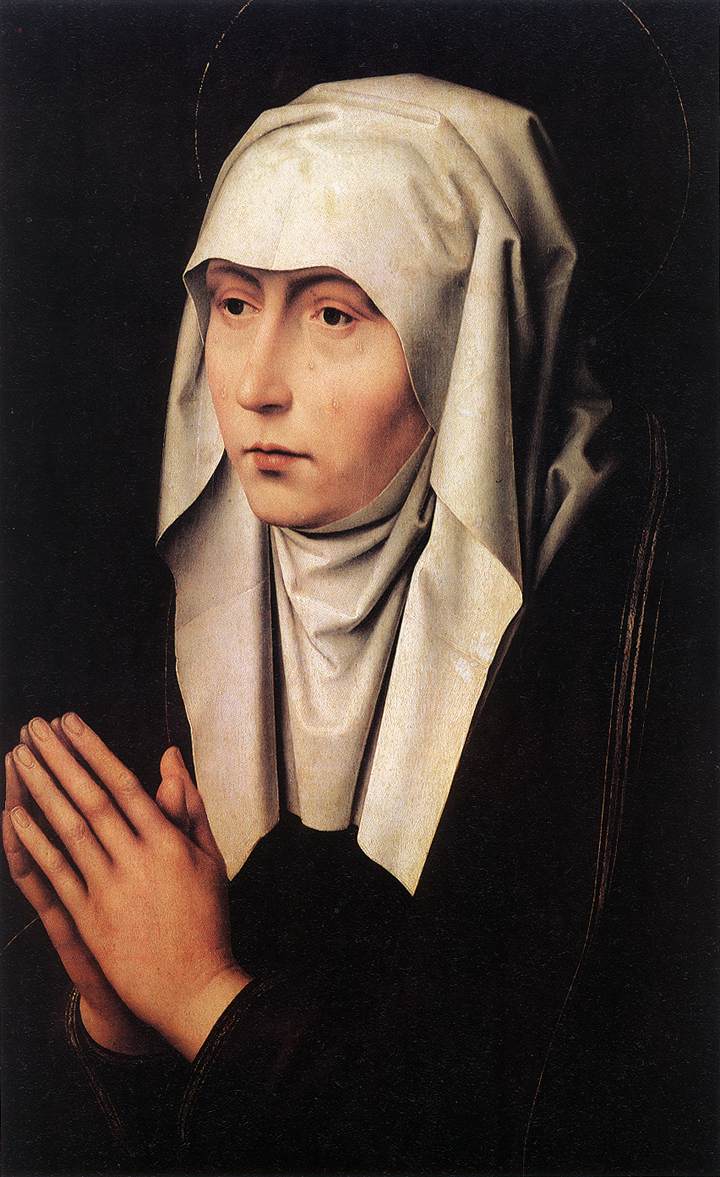 The Church’s liturgy on the Feast of Our Lady of Sorrows is very instructive on this. In the readings of the day there is a long passage from a sermon of St Bernard of Clairvaux. He describes Our Lady’s anguish at the foot of the cross as real, but arising from a genuine compassion that is born of charity ie love. He calls it a ‘martyrdom of the soul’: “We rightly speak of you as more than a martyr, for the anguish of mind you suffered exceeded all bodily pain.'Mother behold your son!' These words were more painful than a sword thrust for they pierced your soul and touched the quick where the soul is divided from the spirit. Do not marvel brethren, that Mary is said to have endured a martyrdom in her soul. Only he will marvel who forgets what St Paul said of the Gentiles that among their worst vices was that they were without compassion. Not so with Mary! May it never be so with those who venerate her. Someone may say: ‘Did she not know in advance that he Son would die?’ Without a doubt. ‘Did she not have sure hope in his immediate resurrection?’ Full confidence indeed. ‘Did she then grieve when he was crucified?’ Intensely. Who are you brother, and what sort of judgment is yours that you marvel at the grief of Mary any more than that the Son of Mary should suffer? Could he die bodily and she not share his death in her heart? Charity it was that moved him to suffer death, charity greater than that of any man before or since: charity too moved Mary, the like of which no mother has ever known.’(From the Office of Readings, Feast of Our Lady of Sorrows)
Following this is a quote from St Paul in his Letter to the Colossians in which he says directly that this sharing in Christ’s sufferings through love is a source of happiness: ‘It is now my happiness to suffer for you. This is my way of helping to complete, in my poor human flesh, the full tale of Christ’s afflictions still to be endured, for the sake of his body which is the Church.’(Col 1:24-25).
The antiphon for the Benedictus on Lauds for that day echoes this and takes it even further: ‘Rejoice grief stricken Mother, for now you share in the triumph of your Son. Enthroned in heavenly splendor, you reign as queen of all creation.’
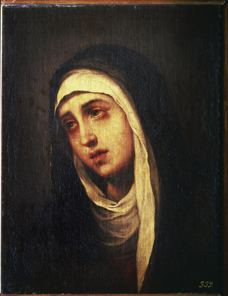
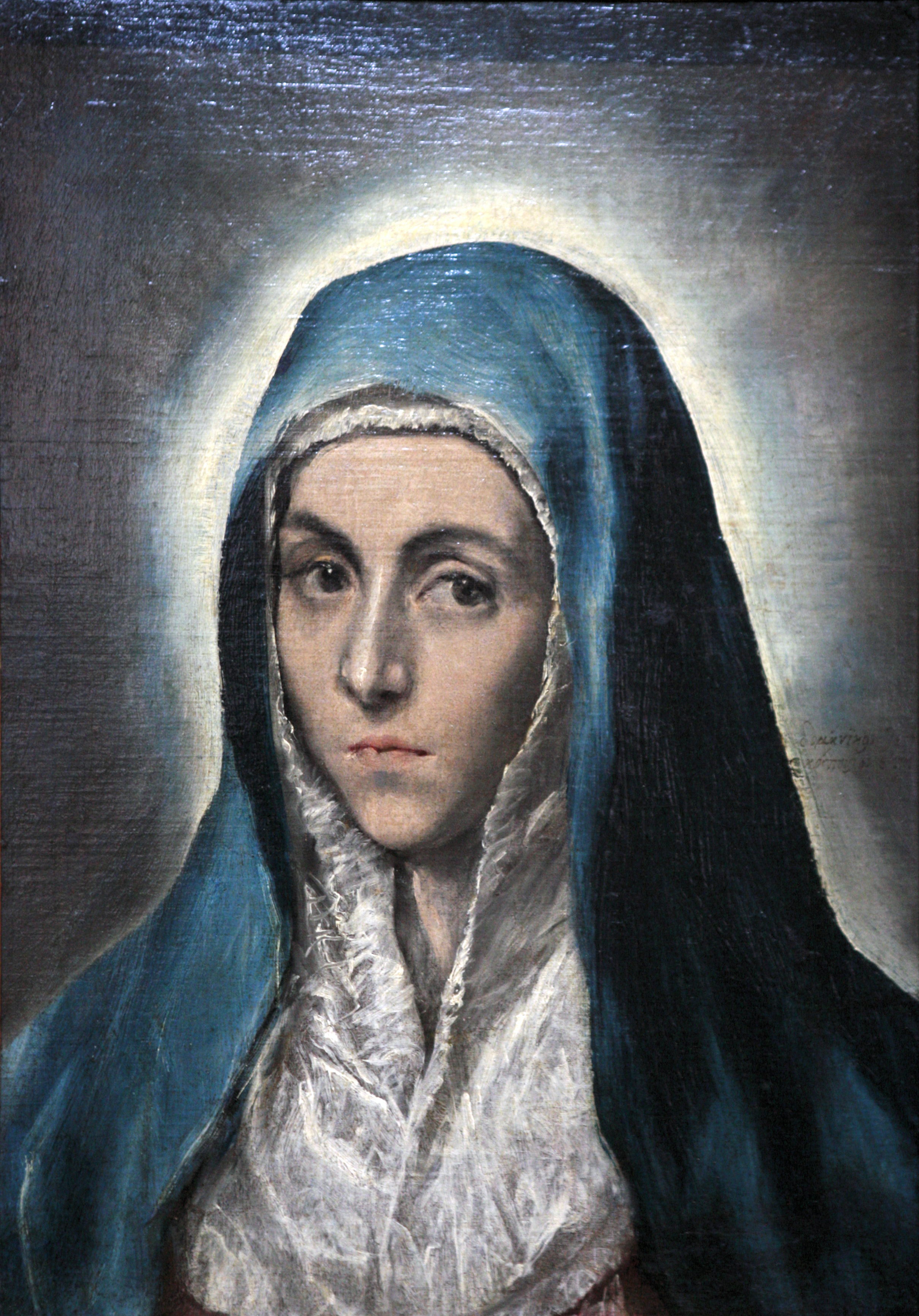
The idea of 'bright sadness' is often associated with the expression of saints in icononographic art. This ideal of a loving grief in response to the suffering of another is, it seems, a bright sadness or perhaps even a peaceful anguish – an anguish burning with the fire of love that overwhelms and transcends all before it and gives an intense joy. The first painting is 17th century by Ribera, the next three are 15th century Flemish by Dirk Bouts except for the third which is by Rogier Van Der Weyden. The next two are by Ribera and Murillo and are 17th century baroque; the final one is by El Greco, who although earlier - 16th century - conforms to baroque form in this painting.
In both sets the artist is showing constraint in portraying emotion, it is there, but there is a strong sense of peace in the expressions of Our Lady in each case.
St John of the Cross and the Artistic Portrayal of the Joyful Pilgrimage
 Office of Readings, Friday, Wk 18 the reading is from the Spiritual Canticle of St John of the Cross. In it he indicates that the saints in heaven are in union with God through love.
He tells us that, 'they possess the same blessings by participation as he [God] possesses by nature; for this reason they are truly gods by participation, equals of God and his companions. Therefore St Peter said:"Grace and peace be complete and perfect in you in the knowledge of God and of Jesus Christ our Lord, according as all things are given to us of his divine virtue for life and godliness, through knowledge of him who has called us with his own glory and virtue; whereby he has given into us many great and precious promises, that by these things we may be made companions of the divine nature." Saint Peter indicates that the soul will have participation in God, performing in him, in company with him, the work of the Most Holy Trinity, after the manner whereof we have spoken. And though this can be perfectly fulfilled only in the next life, nevertheless in this life, when the estate of perfection is reached, a clear trace and taste of it are attained.'
It is this final sentence that caught my eye. Our goal in this life, one might say, is to get to heaven in the next. Although we cannot experience heaven fully in this life, supernaturally we temporarily step into it through the liturgy and the sacramental life. This is a transforming process that by degrees takes us towards that heavenly state. And this means, in turn, that by degrees we can experience the joy of heaven in this life.
It is the gothic figurative liturgical tradition that through its form portrays this pilgrimage to heaven. (Baroque art portrays through it form evil and suffering transcended by hope; and the iconographic portrays man fully in union with God in heaven). I have talked about this before in an article: Why the Church has Different Artistic Traditions. In it I written about the theology that shapes the form of the three liturgical traditions of the Church and explain why I feel they are complementary.
 This passage of St John did cause me to reflect for a few moments on my own journey and what caused me to convert to Catholicism. As one might expect there were a number of different influences, but very important was the belief that becoming a Catholic would open up for me a life of greater joy. I went through a very unhappy period in my mid/late twenties. I don't want to get too melodramatic about the whole thing, but it was bad enough that I was even prepared to consider Christianity as an option. I was lucky during this period to meet someone who was a Catholic and I saw this joy in his life. He eventually became my sponsor when I was received into the Church. Through his example as much as through his answers to my questions, I had a clear picture in my mind of a life with a beginning, a journey and an end. The beginning was where I was before coming into the Church, suffering but with hope; the journey is the life of faith and Christian joy; and the final end is heaven. Artistically, this is a transition from the baroque to the iconographic via the gothic.
As one might expect, the the journey for me has not been perfectly smooth. In some ways I experience this grand picture in microcosm on a daily basis. It is a process of continually straying from the path, renewing that hope, fixing my sights once again on that final end and resolving once more to follow my guide on the journey. Nevertheless, the underlying trend is one that moves steadily upwards. And my overall experience is that the Christian life is a joyful one (without claiming to have reached the heights of St John of the Cross). This 'gothic' message of a joyful pilgrimage which attracted me to the Church was true.
 In his address on the saint, Pope Benedict told us that in his Spiritual Canticle, from which the excerpt above is taken, 'St. John presents the path of purification of the soul, that is, the progressive joyful possession of God until the soul feels that it loves God with the same love that it is loved by him.' The Pope goes on to make it plain that this path is open to each of us. St John, he says, had 'a hard life but, precisely in the months spent in prison, he wrote one of his most beautiful works. And thus we are able to understand that the way with Christ, the going with Christ, "the Way," is not a weight added to the already sufficient burden, but something completely different, it is a light, a strength that helps us carry this burden.'
One of the surprises for me when I entered the Church was to discover that not all of my fellow Catholics seemed to believe that happiness was really on offer to them in this life as well as the next. Aside from missing out themselves, I believe that one of the reasons that people aren't flocking to the Church, is that they don't know that do not always see joy in the lives of Christians they meet. It as seem that part of the New Evangelisation we must rediscover Christian joy.
Clearly, the idea of Christian joy did not begin or end with the gothic period. Historically, of course, St John himself came after the gothic period. However, I believe that the artistic form developed during the gothic period can play a part in directing us to a participation in that joyful pilgrimage. It seems to me that one reason that Fra Angelico resonates so strongly today is that he is communicating something to us that is needed. This is why I would like to see the gothic reestablished as a living tradition.
Remember when I speak of what the gothic communicates, I am talking of its form, it's style. The content, that is the subjects painted, is likely to be the full range that one would expect to tackle in sacred art; but its form, because it is integrated with the theology is always in the background speaking poetically to our mind's eye, as it were, encouraging us with the idea that there is joy in this life on route to the next. (Just as with icon painting: the fact that its form speaks of the eschaton - the heavenly realm - does not mean that you cannot paint scenes in salvation history.)
The art from above: Christ on the Cross, by St John of the Cross; Chaucer as a Pilgrim from the Ellesmere Psalter; 13th century, lady at prayer; and Fra Angelico's Madonna and Child.







 .
.