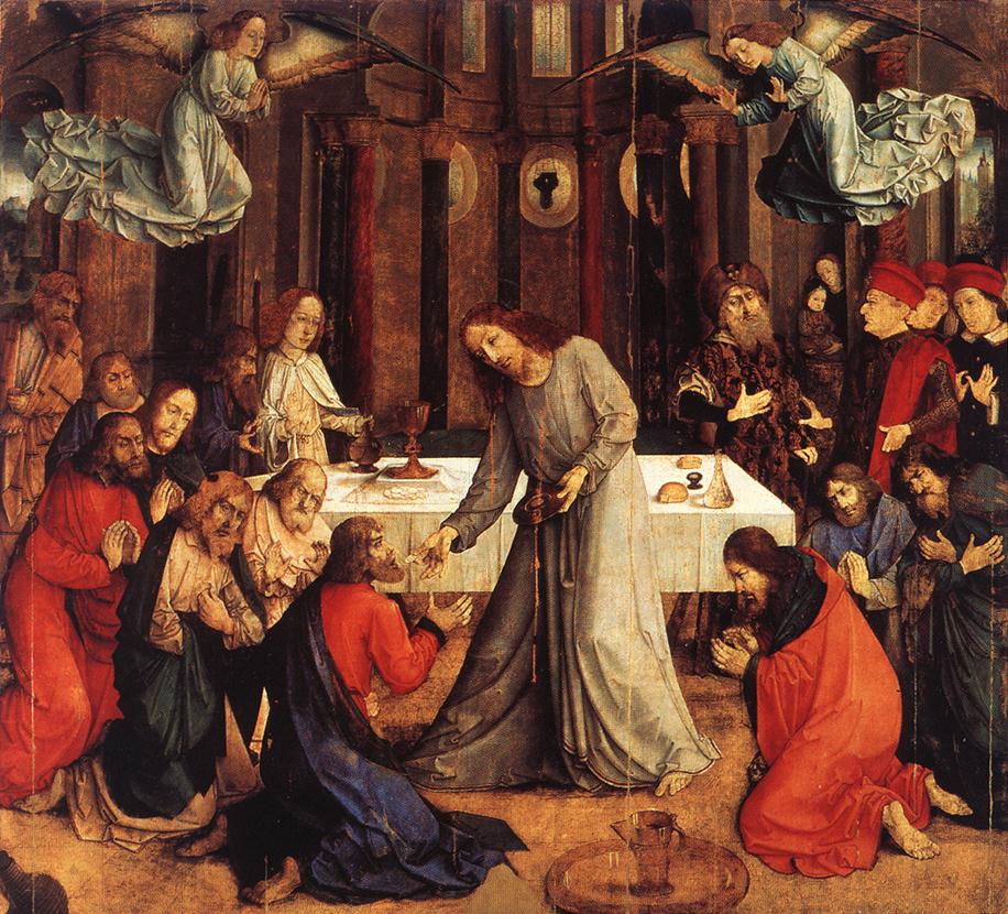
Some say if the wrong method is used, it's not a real icon even if it looks right. I was first introduced to the medium of egg tempera through a teacher at an evening class in London (this was not an icon painting class). The teacher had noticed that I liked to draw and always wanted to paint faithful to a preparatory drawing. He thought that because tempera dries quickly and with a hard edge, that I might take to the medium. He suggested that I go and look at the medieval art in the Sainsbury Wing of the National Gallery and the Courtauld Gallery to see if I liked the look of it. He told me to look out for an artist called Lorenzo Monaco. This was long before I was a Christian, but nevertheless I was astounded by the beauty of what I saw in his work and the others that I saw, such as Duccio, and wanted therefore use their medium.
The problem was that this tube tempera paint bought from the art shop was very difficult to handle and my work didn’t seem to have the same beautiful bright finish of Lorenzo’s. My teacher suggested a get a book called the Practice of Tempera Painting by Daniel V Thompson and published by Dover. This was first published in the 1930s and was an 20th century description of the methods that had, in turn, been described in an Italian art text book from perhaps the early 14th century (the exact date is not known as far as I am aware). The book is Il libro dell’arte by Cennino Cennini.
Thompson’s book is one the best textbooks on artistic method I have ever read. Written in clear prose he deals not only with the methods of making and using the paint, but also the preparation of panels, gilding, and outlines the theory of artistic techniques such as glazes and scumbles. I just followed everything he described and it transformed my work.
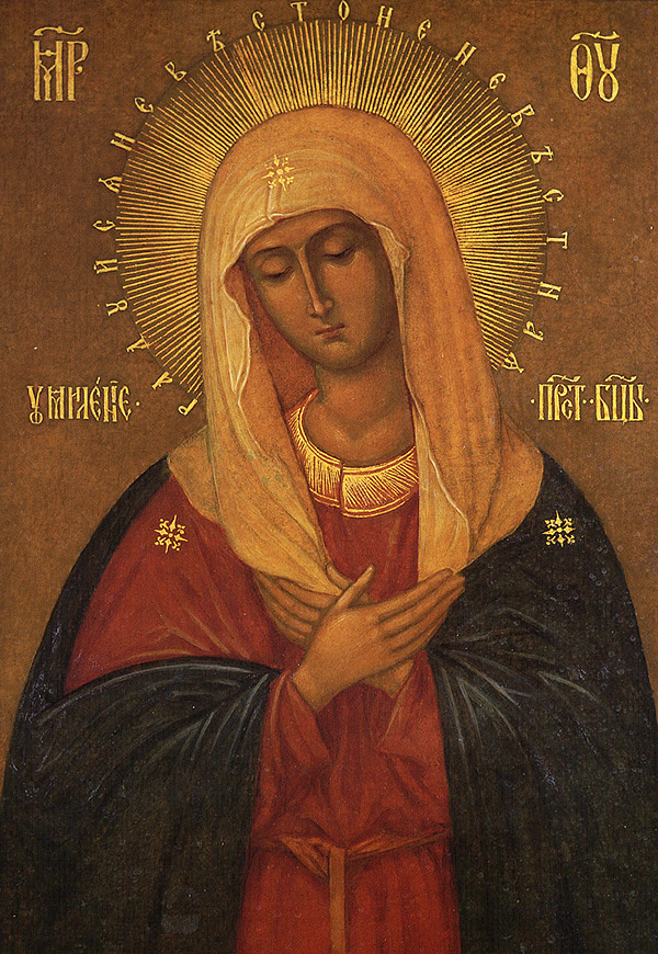
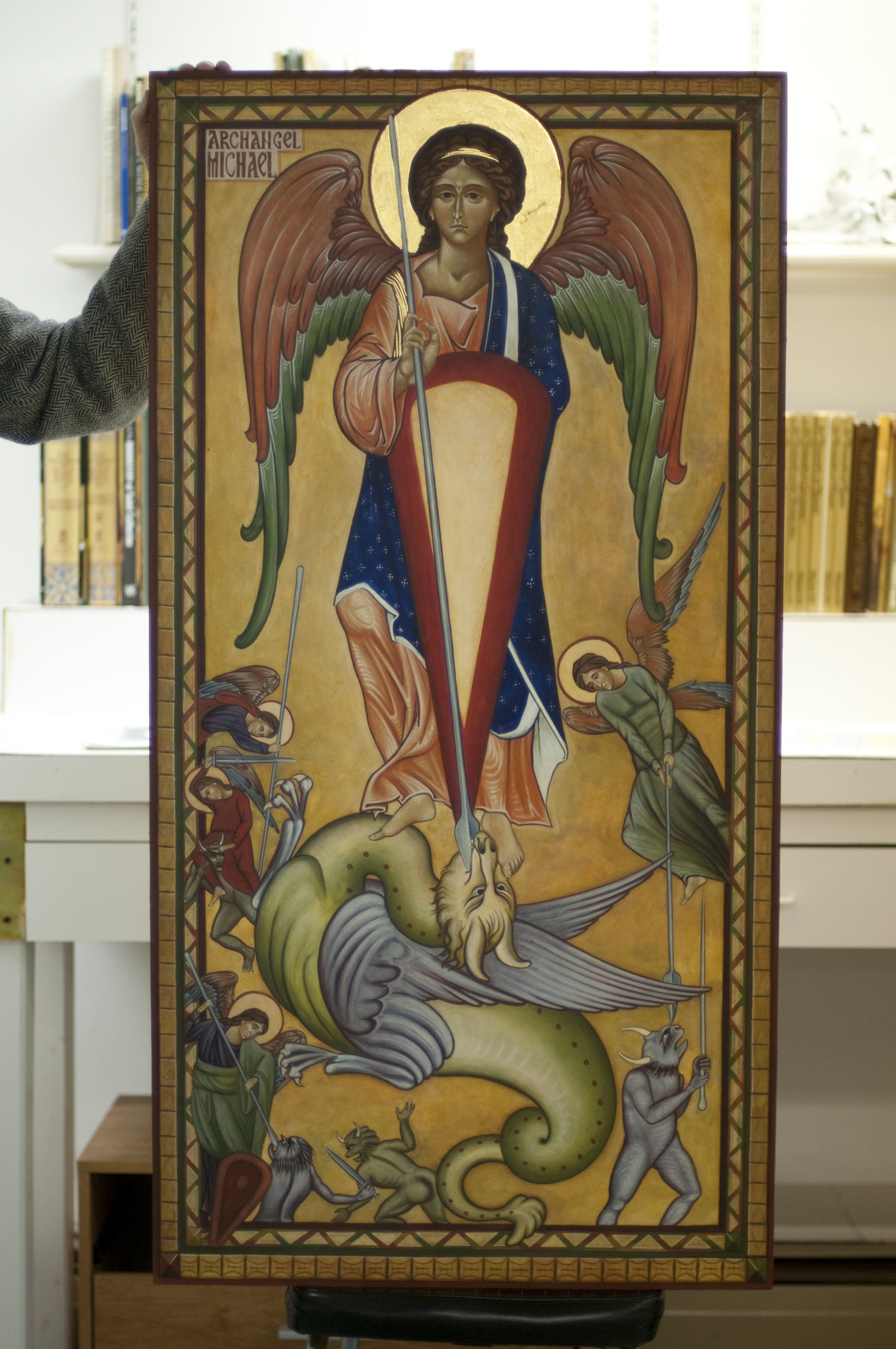
 Some time later, when I started to learn to paint icons, I brought this book along to my first class and to my surprise was told that it wasn’t relevant. Cennino Cennini, I was informed, used methods that were inconsistent with the theology of the icon. In particular, Cennini described a method in which once the drawing is transferred to the panel requires the production of a monochrome underpainting in ink – effectively painting what my laptop call a ‘grayscale’ image of the icon. Once the monochrome underpainting was created, thin glazes of coloured paint would be applied to produce the final painting. My first icon painting teacher told me that this method had developed in the West as religious images became degenerate and it was different from the method that she was going to show me. The genuine icon painting method, she told me, involved putting a darkest layer of colour down first and then gradually adding layers of lighter colour until you finish with the highlights. This process embodied the theological point that the Light overcomes the darkness.
I was happy to be told how to paint icons, so willingly abandoned Thompson and Cennini and adopted this newly introduced, theologically driven method.
I didn’t say anything at the time, but I never really understood how the theology of method could be quite so important. Surely (assuming it didn't require anything actually immoral) you could use whatever method was best in order to produce the final image? If the final product was consistent with the theology, seemed to me, then so was the method. In other words, if you couldn’t tell once the icon was done what method had been used, why did it matter? Does it really invalidate the icon if a different method is used?
 This reaction was reinforced when I read about the theology of the image developed by St Theodore the Studite, the great Eastern Father who settled the iconoclastic period in the 9th century. Theodore was clear, in my reading of him, that two things made an image worthy of veneration: one was the incorporation of the characteristics of the person, and the other was the writing of the name on the image. He attached no importance to the method used to produce such worthy images.
Fifteen years after my first icon lesson, I received a phone call from a good friend who was an Orthodox icon painter. He told me that he had just read a book A History of Icon Painting in which a number of scientific studies of very early icons were described. It turns out that the earliest icons used the Cennini method after all. The method that starts with a dark layer and then moves to light is, in fact, the more recent one. From now on, my friend said, he was going to use the Cennini method; not because it was older, but because he found that by using it he produced better icons in less time.
What about this theology of light from dark? As far as I can work out this is a modern construct applied after the fact by those who re-established the icon painting tradition in the 20th century. I am not aware of any traditional canon that stipulates this light-out-of-dark method as being preferential (I am open to hear of any, of course).
All of this serves to reinforce a basic point: that the artist can use whatever method he likes (other things being equal) if it allows him to produce the highest quality work at the end of it. This means that the process that produces the best end result is conforming to the theology of the image as this is the end to which it is directed.
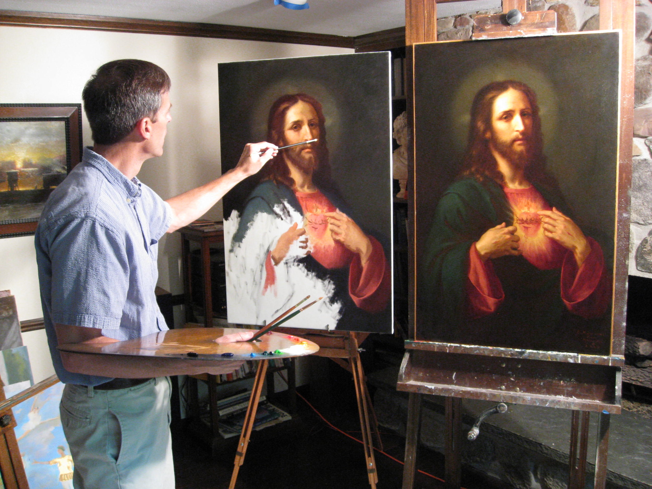
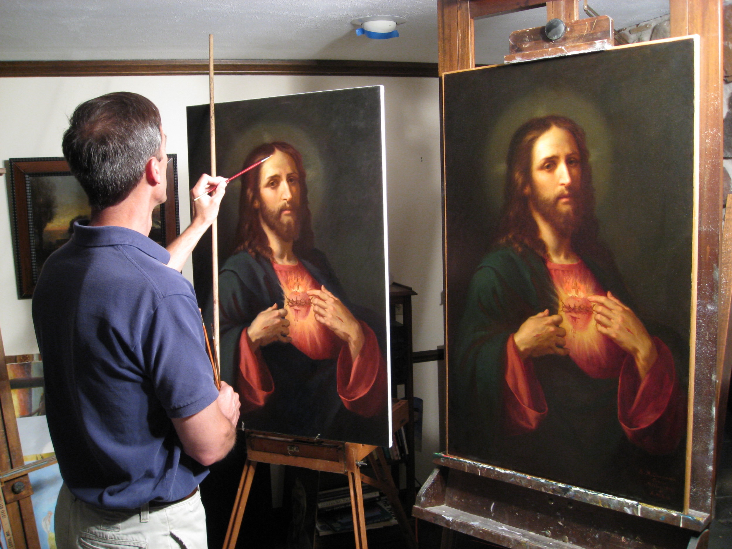
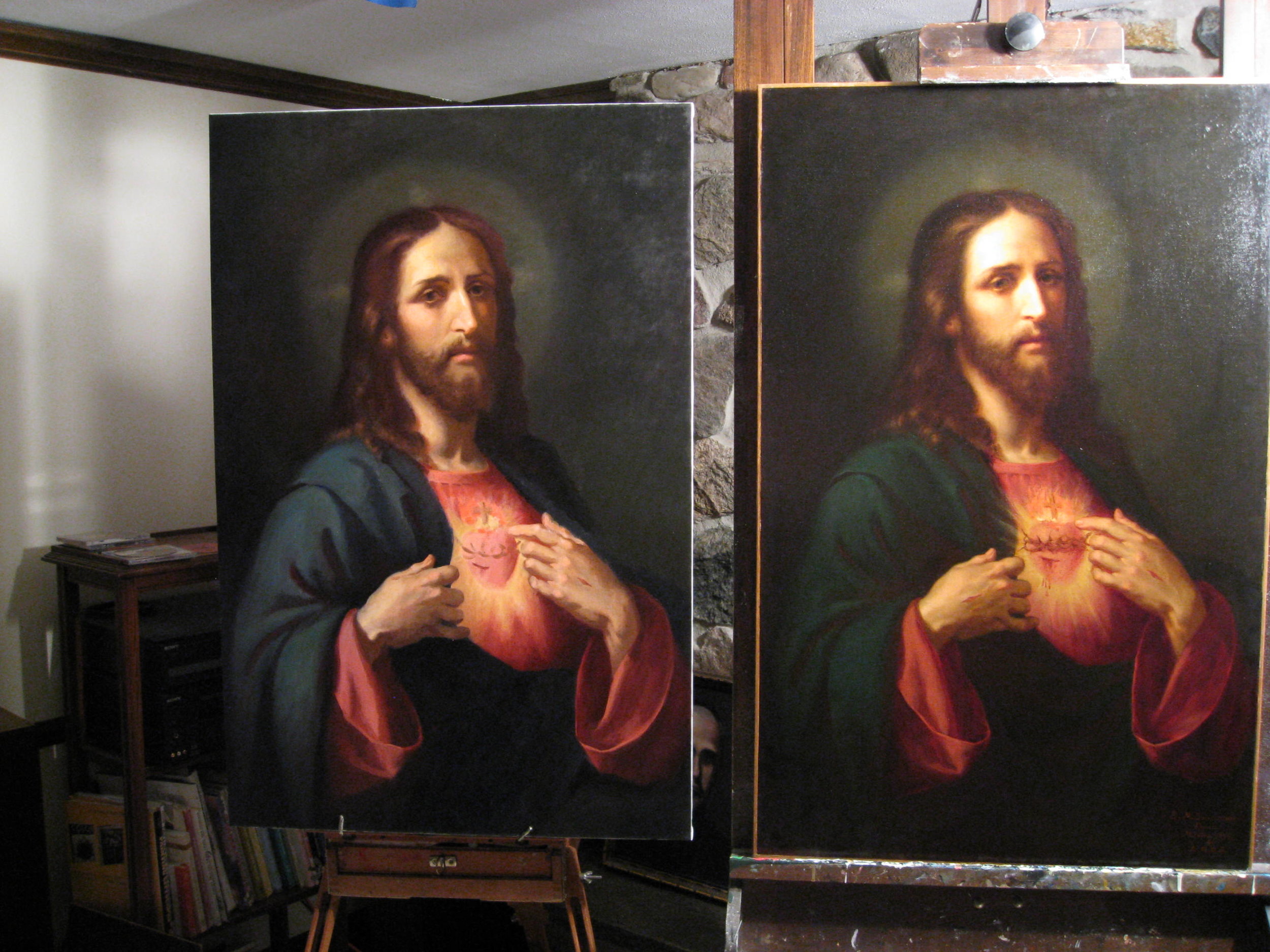
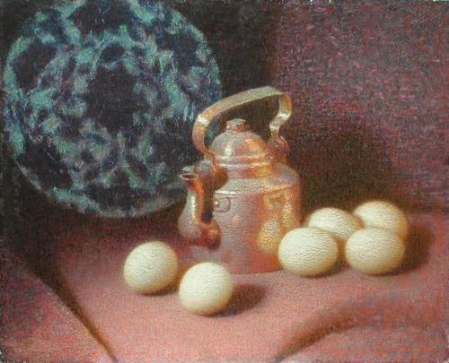
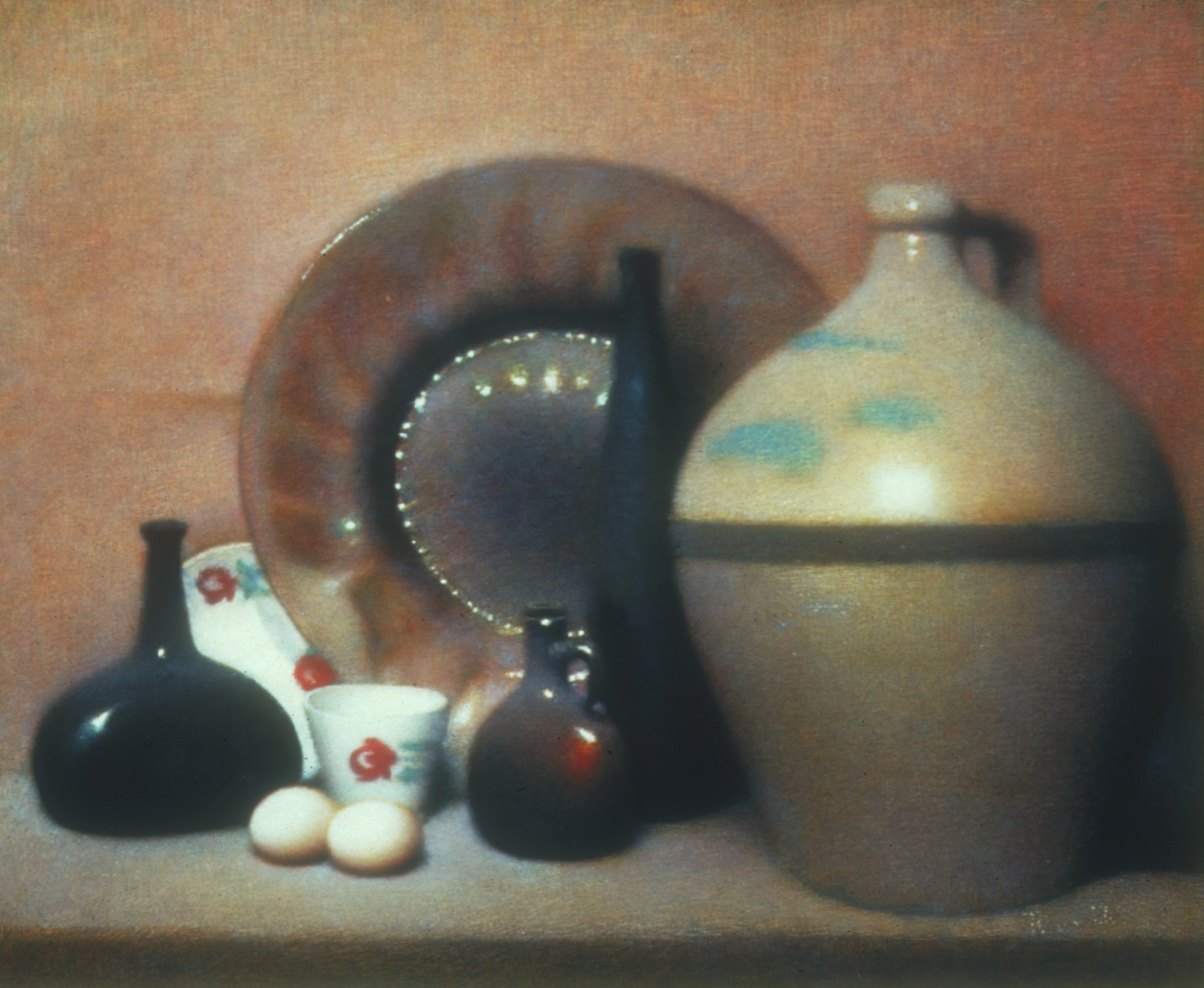
Long before I heard about this recent development, I had thought about going back to the method that uses the monochrome underpainting. I do use it selectively now (where I feel the form needs reinforcing) and sometimes use it in classes that I teach as it can be easier to use when people are just learning to use the paint for the first time (I show some examples of a series of demonstration pieces I made for such a class). However, I find that the method I prefer, ironically and unlike my Orthodox friend, especially for flesh painting in my own work is the Eastern method!
Images from top: the Coronation of the Virgin, the Flight from Egypt; and the Nativity, all by Lorenzo Monaco.
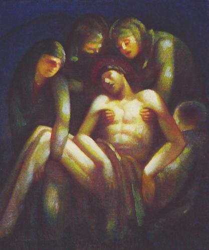
Below these are demonstration pieces that I made to show how the different stages of icon painting using the Cennino Cennini method. The image is the Mandylion.
From right: a line drawing, in pencil, is done on paper. This is transferred to the wooden, gessoed panel and the lines painted in; then a monochrome image is painted. After this, bottom, layers of translucent colour are placed over to create the final image.


 Anne Gomes, a reader of this blog brought to my attention an exhibition put on by the Royal College of Needlework of fine turn of the century embroidery of vestments which is taking place at Hampton Court and runs through to December. She tells me that 'the set of 12 is on display right now. They look to me to be turn of 20th century in Art Nouveau style. Using a very limited color palette (very baroque!), they are hand embroidered on silk in silk and gold threads. No one is sure of the makers but at one time they belonged to the Convent of the Holy Child which gave them to the Royal College of Needlework when it closed.' Those interested in reading more can follow the link here. I am no expert in the technique of embroidery but looking at the photographs my reaction is that the quality of work on display looks very high. Certainly quality of draughtsmanship is in the design is high.


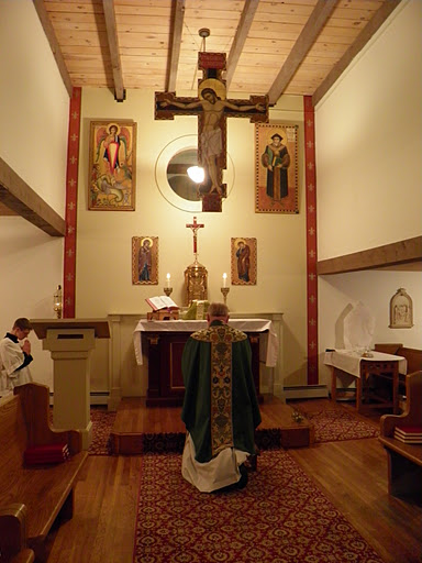

 I was contacted recently by a reader, a priest who had concelebrated a Station Mass at San Marco di Campidoglio in Rome.


 Marc Chagall’s work is very much a product of this 20th century spirit of self-expression and individualism.
 Secondly, sacred art can be good devotional art without being appropriate for the liturgy. The art that we choose to for our own private prayer is a personal choice based upon what we feel helps our own prayer life. We have to be more careful when selecting art for our churches, allowing for the fact that personal tastes vary. While for my home I would pick whatever appeals to me; for a church I would always choose that art for which there is the greatest consensus over the longest period of time. Accordingly I am much more inclined to put aside personal preference and allow tradition to be the greatest influence in the choices I make. For the liturgy, therefore, I would always choose that art which conforms to the three established liturgical traditions: the baroque, the gothic and the iconographic. I would not put Chagall in a church.
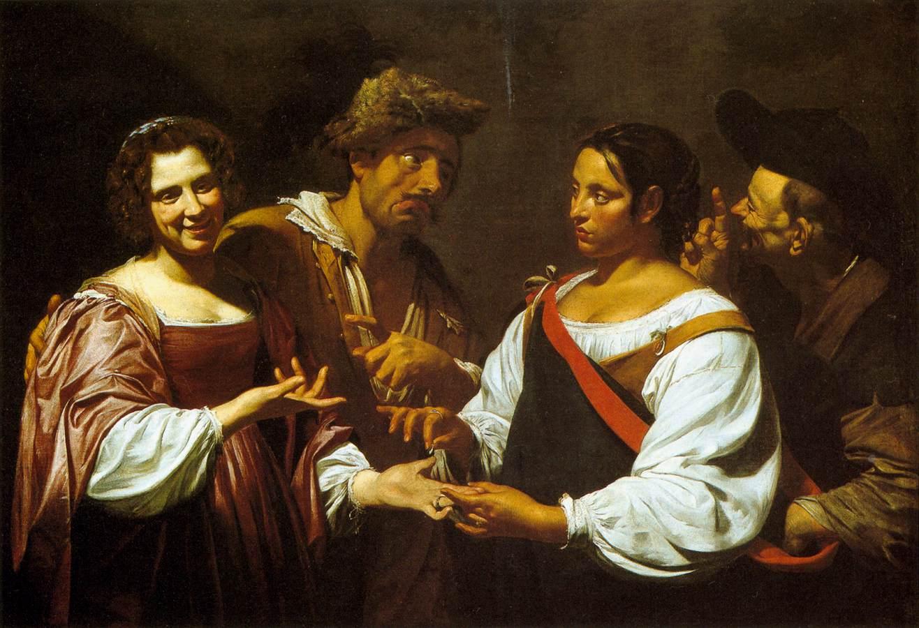
 When Caravaggio produced his work at the end of the 16th century it had such an effect on the art of the Rome that nearly all other artists modeled their work on it. However, the basis of this new style was not mysterious. He presented a visual vocabulary that was a fully worked out integration of form and theology. It was the culmination of much work done over a period of time (about 100 years) through a dialogue between artists and the Church’s theologians, philosophers, liturgists. It became the basis for a new tradition because the integration of form and content was articulated and understood, so other artists could learn those principles and apply them in their own work. It was possible to reflect that style, and develop it further, without blindly (so to speak) copying Caravaggio. They copied with understanding.


 Similarly, the artist must try to consider the wider context into which it is to be placed. Works look different when placed on dark or light backgrounds, or when there are other paintings around. Also and most importantly, the position relative to the liturgy must be considered.