Blog — The Way of Beauty

Study the Master of Sacred Arts and the Theology Doctorate (Th.D.) at Pontifex University www.PontifexUniversity.

Gothic

The Sculpture of Tilman Riemenschneider, written by Christopher Blum

Here is a second in a series about late gothic sculpture. This one is written by Dr Christopher Blum and appears in Crisis Magazine (http://www.crisismagazine.com). You can find the article itself here. One of the questions that I always think about as an artist when I see work that I enjoy is how could we train artists today to work in a similar way today. How does an artist learn to make this style his natural modus operandus. Dr Blum is a historian and his interest is as much on the spirit of the times as the technical skill of the artist. He describes the training and working environment that Riemenschnieder experienced, and focussed particularly on his membership of his town's Guild of St Luke. When guilds are mentioned nowadays there tend to be two reactions. For some it conjures up images of a culturally rich past that we hardly dare dream of emulating today. For others, they are professional organisations that flourished by imposing restrictive trade practices, rather like strident medieval trade union. For my own part, I prefer to put aside the possible negative aspects of the economic organisation of the guilds, and focus on how these associations preserved the attitude of tradition by preserving skills and creating structured environment to train apprentices and which directed their activities activities to the common good. Here is an article that has some thoughts about how the guilds might be a model for the teaching of practical skills today. As a general principle, when considering any aspect of the culture, we should always aim, I feel, to adopt the good and reject the bad.

Dr Blum makes the interesting point that this somber gothic style with its focus on the suffering of Christ was not reflective of the artist's personal character. In other words, 'self-expression' was not one of the aims of the artist (in the way that the phrase is generally used today). It would be wrong however, to think that conformity to the spirit of the times and a tradition ruled out innovation or individual stylisation altogether. What is different here is that that innovation is driven by a desire to serve the stated end, the glorification of God, in a better way, rather than to glorify the artist. As an example, in contrast to the French sculptures described in the last article, here, which were brightly coloured, . Even though they are made of wood, they had a monochrome brown glaze, which was very unusual at the time.

Images are St Barbara and the Last Supper.

Polychrome 16th-century Gothic Sculpture - How Could We Learn to Sculpt in this Style Today?

Here is some sculpture from France dating from the early 16th century. It is called The Burial of Jesus and is attributed to a sculptor who until I saw these I had not heard of called Froc-Robert. They are in the Cathedral of Saint-Corentin in the Region of Brittany. I am told that they are made from limestone although I am not certain of this, and because they are polychrome, it is difficult to tell from the photos. At a personal level I love the fact that they are highly coloured. So here's a request for all sculptors and patrons out there: can we work to reclaim polychrome for the liturgical traditions? At the moment it conjures images of sentimental kitsch plastic figurines in a Catholic gift shop? The gothic, as exemplified here, and the baroque (I'm thinking here of Spanish wood carvers such as Alonso Cano) demonstrate that it needn't be so.

If we were to colour, we have to work even harder to avoid sentimentality in the style. So how might we go about learning to sculpt in, for example, this late gothic style. One answer is to go and apprentice yourself to a master sculptor who carves in this style. If we were talking about painting, the answer would be to go through a long training of imitation. For the skilled painter whose eye and skills are already developed and has the ability to analyse well what he is seeing then he might be able to adopt a chosen style by looking carefully and working out some working principles to guide him.

I thought I would ask Andrew Wilson Smith what he did. He is a sculptor who has broken away from a neo-classical, academic style. Readers of this blog will be familiar with his work because of his commissions for Our Lady of Clear Creek Abbey. He worked out some principles and stuck to them. It is interesting to me that he analysed Romanesque art. The end result reminds me (and this is not a criticism in any way) of the work of Andrea Pisano, which I would call gothic. I suppose the division between the two styles is continuum rather than a sharp boundary. And however we classify it, I like Andrew's style. Here's what he told me when I asked him about this (you can see his work at the website accesible through his name, above):

"My preparation for my ongoing work at Our Lady of the Annunciation Abbey at Clear Creek consisted of several things. First, I had to familiarize myself with the tools and techniques of the stone carving discipline. I was lucky enough to become acquainted with two stone masons/artists who had worked on St. John the Divine Episcopal Cathedral in the 1980's when there was an effort to train a new generation of carvers and get some work done on the building. From working with these gentlemen, I was able to get started as a carver, learning the principles of the art and how it differed from my earlier training in techniques of modeling sculptures in clay, followed by casting in bronze or other materials.

During this time, I also started to study the various manifestations of Romanesque sculpture.  I realized the Romanesque cannot be reduced to a canon of set forms and principles to the extent that Gothic or classical work may be. There can be no 'Romanesque Manifesto' and the style should be thought of as a period of time including diverse bodies of work. This is liberating because it allows me to find at least one or two precedents for just about anything that I might want to do. In my opinion, the unifying principles of the Romanesque are to be found in the philosophy and worldview held by the artists and scholars of the 10th-12th centuries. Therefore, I tried to saturate myself in the literature of the period, as well as its imagery. 

One major theme in medieval thought is the idea that nature, history, and morality are all mirrors through which to study God. As we cannot study God directly, we may come to a better understanding of His nature through the created world. I have tried to keep this state of mind foremost in my approach to this work.  

When I was starting to design the actual sculptures for this project I had a major decision to make. One approach would have been to fix upon a particular sub-category of Romanesque sculpture and imitate it directly to try to make works of art that might be mistaken for things of a particular time and place. I decided against this approach, as it did not seem appropriate in the context of my work at the Abbey. Also, I do not like that approach in general, as its result tend to be rather flat and dry. (If you are doing restoration work on an antique building, by all means be as historically-accurate and principled as you can, but for new work, "Sing a new song to the Lord".)

Instead, my approach has been to channel several Romanesque idioms into my general manner of working, which is usually more classical. I try to take the elements that I find to be the most delightful and incorporate them into my own style. One example of this is the approach to faces. You will find that in most archaic modes of art, attention is given more to the individual features of a face than to an understanding of the face as a whole. As a result you end up with large eyes, noses, mouths, and ears on top of a relatively ill-defined head. The same principle is found in large hands and feet attached to small bodies. I have tried to find a balance and to make my figures reflect this attitude to a certain extent.  However, I design a figure that is more naturalistic, albeit with an overly-large head with somewhat exaggerated features.

Another element of concern is posture and the realization that the work will always be seen from a distance. I think it was the Italian sculptor Pisano who wished that he could have a 100-foot long chisel and carve sculptures from the same perspective from which they would be viewed. As this is impractical, masons working on architectural carvings have always had to do certain things to make their work plainly visible from a distance. I have tried to adopt various Romanesque techniques to deal with the perspective; these include angling the work towards the viewer, using exaggerated gestures in the pose, and shifting the proportions of a figure, gradually making the lower parts smaller and the upper body/head larger than they are in nature. "


Giusto's Institution of the Eucharist

This article is by Dr Caroline Farey of the Maryvale Institute. She and I worked together to design the Institute's degree level diploma (6 US credits): Art, Beauty and Inspiration in a Catholic Perspective. A distance learning course requiring one residential weekend, this can be taken either by application tothe Institute in Birmingham, England; or in the US through their centre based at the Diocese of Kansas City, Kansas (link here). Dr Farey writes:

Between 1465 and 1474, Giusto executed the Communion of the Apostles (The Institution of the Eucharist) which Vasari has described, and is now in the museum of Urbino. It was painted for the brotherhood of Corpus Christi at the bidding of Frederick of Montefeltro, who was introduced by Caterino Zeno, a Persian envoy at that time on a mission to the court of Urbino. Giusto is Joos van Wassenhove who was a Netherlandish painter, part of whose career was spent in Italy, where he was known as Giusto da Guanto (Justus of Ghent). He brought to Italy some of the characteristics of Dutch painting and combined them with the local Italian style.

This painting unites Jesus Christ, the Church and the Eucharist in a single harmonious illustration of the Catholic faith. It is perhaps important to begin with an initial teaching point: it is worth helping people realise that such a painting as this is has both an historical and a contemporary dimension to it. We do not need to believe, therefore, that the artist wishes us to see every part of the painting as an historical depiction. He is not necessarily wishing to communicate to us that the upper room really looked like this, or that the table was historically laid out like this, or that the apostles necessarily knelt to receive the body and blood of Christ as he has painted it here. Of course, they may have done. However, what the artist is also trying to show us in the painting is that what Christ did at the last supper with the apostles he, personally, still does for his disciples today at Mass.

One way to introduce this painting to those whom we are catechising is to begin by teaching about the Gospel accounts of the Last Supper from this piece of art. Then we can continue by explaining what the painting reveals about Mass today.

Christ at the Last Supper

Let us look at this painting first of all as depicting an event in the life of Christ.For this we can follow the Gospel accounts, especially that of St Luke.

  • In the Gospel of Luke chapter 22 we read that, during the Last Supper, a dispute arose amongst the disciples as to who was the greatest. Jesus replied to them ‘which is the greater, one who sits at table or one who serves? Is it not the one who sits at table? But I am among you as one who serves’(Lk 22:27).Much in this painting depicts this dialogue. The Persian in the turban and the members of the confraternity in the red hats are disputing and Christ is portrayed as the one who is not sitting at table now but is among his disciples, serving.Look at the bending figure of Christ, beautifully depicting the reality of Christ the Servant.
  • We can also see here an artistic depiction of the central truth of the Faith, that God condescended to be born and to live among us, that the divine Second Person of the Trinity took flesh for our sake In the General Directory for Catechesis the part on the Pedagogy of God opens with a quotation from Hosea, ‘I became to them as one who eases the yoke on their jaws, and I bent down to them and fed them’ (Hos 11:4, in GDC 137). The bending figures of the apostles around Christ also emphasises this mystery. By contrast, the Persian in the turban stands erect, with his head and shoulders thrown back. The painting is also showing us the amazing truth that Christ only ever serves himself to us – ‘This is my Body’. The Church, in her Tradition, follows this truth without deviation, accepting that Christ gives his whole self to us.
  • Christ, the one who serves, is portrayed as ‘greater’ by his stature and centrality in the picture. You can see that Christ is painted disproportionately larger in height than any other figure.
  • Directly in front of Christ on the floor we can see the jug of water and basin.The Gospel of Lukes tell us that the disciples were to meet a man carrying a jar of water and to follow him into the house which he enters (Lk 22:10).
  • John’s Gospel also links the Last Supper scene to water: ‘He rose from supper, laid aside his garments …poured water into a basin and began to wash the disciples’ feet’ (Jn 13: 4-5). It seems that in this painting this may have already happened – look at the bare feet in the picture!
  • John’s Gospel also speaks of Judas as the one with the money box, or bag (Jn 13:29), and we can see him in this painting clutching a moneybag in both hands, looking back into the room as he edges out of the open doorway into the night with dawn breaking already in the distance.
  • Eleven reverent apostles remain, three kneeling on the right and eight on the left. One in white at the back, perhaps the young John, still holds a bottle as though he had been serving, too, with his other hand raised as he gazes adoringly at Christ.
  • The one next to him is quite different. See how he seems to be staring intently at the disputants.He is holding a lighted candle, representing perhaps the light of faith, of truth, of Christ. He has seen the truth of Christ as the greater who has come among them as a servant and longs for the disputants to be enlightened by this same truth!

Christ in His Church

Let us look now for every indication that the painter is portraying Christ as present and active in his Church. What does the picture tell us about the Mass as it is celebrated in the Church?

·The building is the first sign, with its pillars and its windows portrayed like the apse of a Cathedral Church.

·The sanctuary lamp hangs directly above the figure of Christ, in shadow in the central round window between the pillars of the apse where the tabernacle would usually be found.

·The table is painted as though an altar, and the chalice and sacred hosts are placed as though on the altar at Mass.

·The apostle in white at the back on the left hand side acts like a server acolyte at Mass and the one beside him carries a tall candle.

·The jug and basin directly in front of Jesus remind the congregation of the sprinkling of water that can take place before mass on Sunday to remind us of our Baptism.

·Christ takes up the position that we normally associate with the priest.The priest is called ‘in persona Christi’, ‘in the person of Christ’ at this moment of distribution of the sacred species and throughout the Mass.

  • The apostles are painted kneeling and receiving the body of Christ on the tongue, as they would have done for most of the Church’s history until recently, as a sign of the holiness of the moment, hence the use for many centuries of the name ‘holy communion’.

This is the greatest moment possible on this earth of communion with Jesus, the Son of God, and it is the holiest moment possible, receiving the body and blood of Christ himself. The angels kneeling and adoring above the scene help to indicate this holiness.


How Do We Revive the Gothic?

When I was given the courage to follow my dream of being an artist (by some inspired vocational guidance 20 years ago) I wanted to paint like the Italian gothic artist Duccio. My reasons were based upon personal preference rather than a deep knowledge of Catholic liturgical art. It was just that I loved what I saw when I went to the National Gallery in London: it had enough naturalism to make it accessible, and enough idealism that gave it a sense of the sacred. It was later that I read The Spirit of the Liturgy in which the then Cardinal Ratzinger wrote of the gothic an authentic liturgical tradition. Once I had decided I wanted to paint like him, it raised the problem of how to learn to do so. I didn't want to create pastiche, but to learn in such a way that it might become my natural way of painting and so if required, I could paint new works of art in this style. The problem was that as far as I was aware, this was not a living tradition and there wasn’t any practising artist who could teach me.

I had a sense that historically, the gothic was a transitionary phase between the iconographic and the classical naturalism of the High Renaissance/Baroque (transmitted through the ‘academic method’ of the academies and ateliers). The methods of both of these traditions were still just about alive, I knew, if not always applied in the full glory of the past. So I decided to seek a training in both traditions and hoped that through this, somehow, I would be able to take elements from both and patch together my own gothic style.

This twin training was extremely valuable to me to this end, but not in the way I had imagined. Rather than learning stylistic elements from two traditions that I could combine to create a hybrid, I learnt how a tradition preserves and passes on its core principles and so was able to see how the gothic could be reestablished as a tradition in its own right, without reference to the other two if necessary.

Both the academic and iconographic methods emphasized the importance of two aspects in the training: first the observation from nature and second the copying, with understanding, of masters in that tradition. The balance of these two aspects was different in each tradition (with the emphasis on observation from nature much stronger, as one would expect, in the naturalistic tradition).

This aspect of understanding when copying is important. Aidan Hart, my teacher, always stressed this strongly. When we studied an icon, he would relate the form of the painting to both the natural form and the theology. Take the example of the eyes: he pointed out that the eyes in an icon have no glint. This is because a glint is reflected light, and this is absent in the icon because it portrays eschatological man who shines with uncreated light which is stronger than the reflected light.

Sometimes he would point out features that might seem at first glance to be an arbitrary stylization but were in fact related to natural form. For example, the dark line above the eye is the deepest point. Below it, the eyeball is curving forward out of the orbit and above it the skull coming out from the orbit towards the brow. (This line only appears in nature if we have deep set eyes.) To accentuate this as a shadow line it is often painted as a red or red-brown shadow line. A warm, reddish shadow is often used in the deepest shadow of flesh even when painting naturalistically (this is what I was taught to do when I was studying in portrait painting in Florence).

So from this lesson I learnt that if I want to learn any tradition, I must learn to draw skillfully from nature as well as copy masters. If I want to paint figures in the style of musclebound superheroes, I would sign up for life drawing classes and copy lots of pictures of Spiderman and Superman. Similarly, if I want to paint like Duccio I can copy his work, while considering how the style relates to the theology; and (as we know the gothic masons did from their surviving manuscripts) draw from nature.

The study of iconography taught me that a tradition can be reestablished as living tradition successfully, even if the line of tradition has been broken. The Enlightenment affected the culture in both East and West and this caused a break in the iconographic tradition. The iconography which we see today is a living tradition that was reestablished in the 20th century through the devoted work of Greek and Russian iconographers and scholars. These pioneers analysed the tradition for its essential elements, and then sought to account for these by relating them to theology of eschatological man. (The work has not been done yet. It has been developing and changing even in the time that I have been exposed to icons over the last 20 years.)

A similar process is now going on in in the West, both in regard to re-establishing the Baroque and gothic traditions; and in taking a discerning look at the Orthodox interpretation of the iconographic tradition, which is at times limited by its focus on the Greek and Russian traditions to the exclusion of other iconographic forms, for example the Romanesque or the Celtic forms of iconography.

I am confident therefore of a flowering of Catholic culture, especially when one sees how it is underpinned by the liturgical renewal that is taking place under the guiding hand of the Holy Father.

Images from top: Madonna and Child, Duccio; detail of Christ Pantocrator, 6th century; detail from triple portrait of Charles I, Sir Anthony van Dyck, 17th century.

Below: first, a portrait by yours truly in which the eyes are not deep set and so the line above the lids is not visible. Nevertheless, I used a deep red-brown, as instructed, to give the shadow tone in this naturalistic style. Below those we have large scale, full images of those above.


Why the Church has Different Artistic Traditions

The iconographic, the Gothic and the Baroque are Complementary Here is a passage taken from the Office of Readings, Saturday, 6th week of Eastertide. It is part of St Augustine’s Commentary of the Gospel of John: "There are two ways of life that God has commended to the Church. One is through faith, the other is through vision. One is in pilgrimage through a foreign land, the other is in our eternal home; one in labour, the other in repose; one in a journey to our homeland, the other in that land itself; one in action, the other in the fruits of contemplation.

The first life, the life of action, is personified by the Apostle Peter; the contemplative life, by John. The first life is passed here on earth until the end of time, when it reaches its completion; the second is not fulfilled until the end of the world, but in the world to come it lasts for ever….”

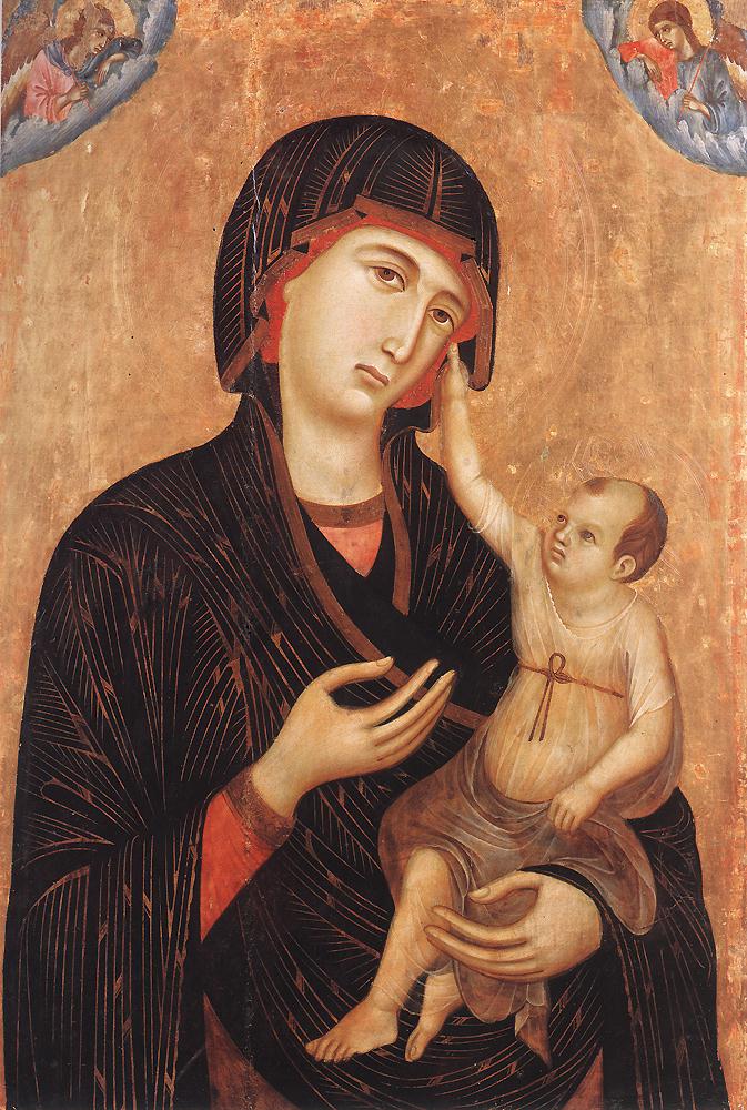
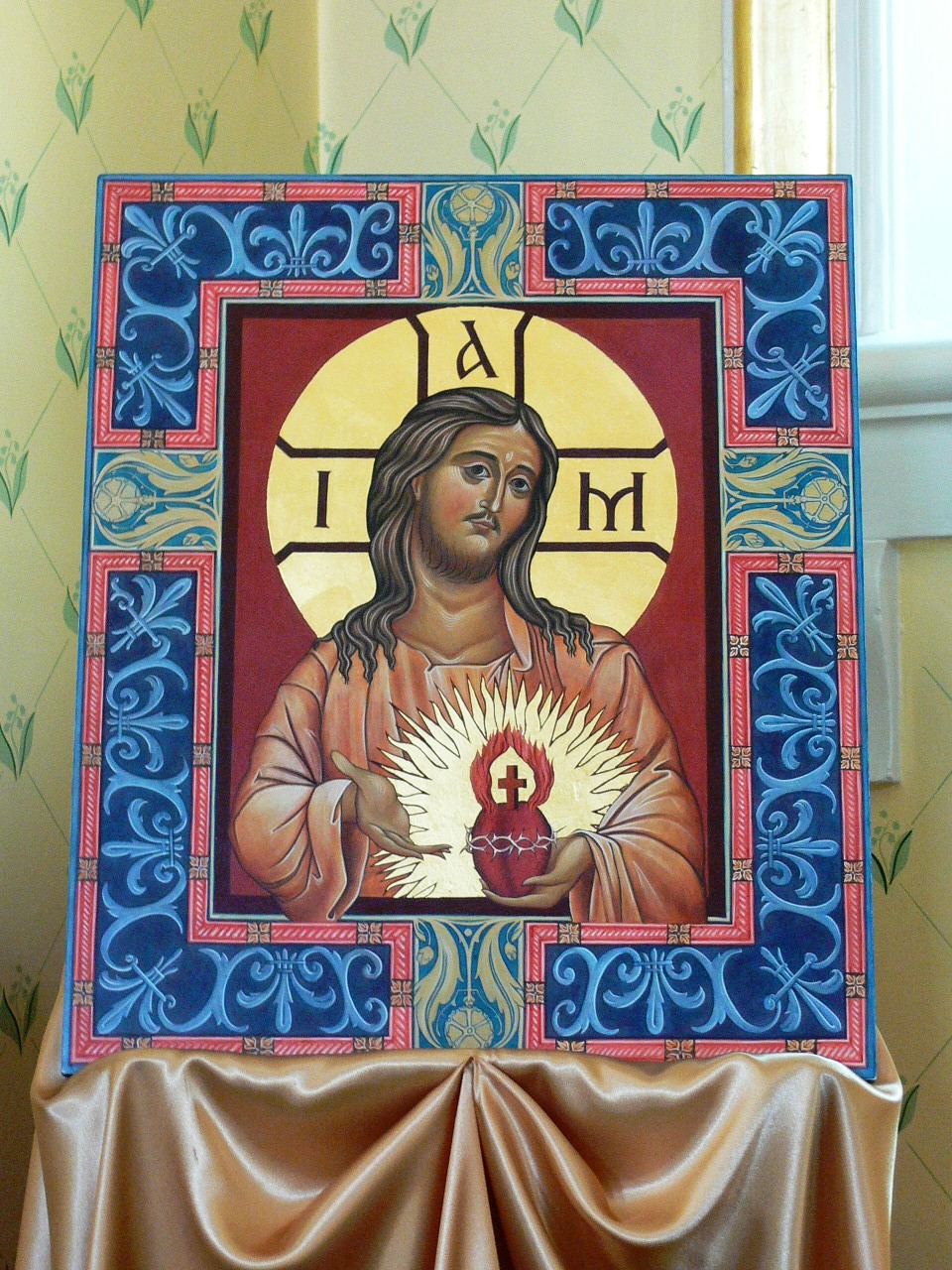
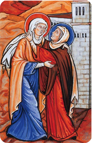
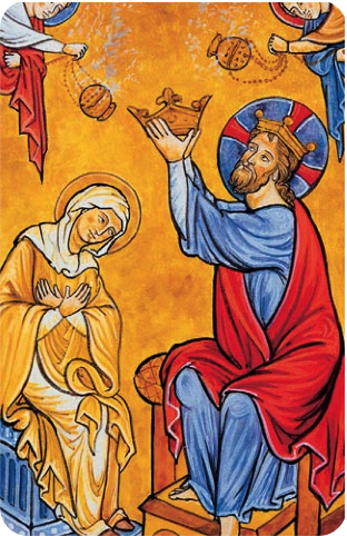
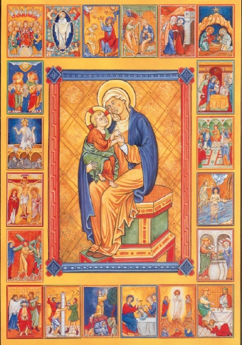
This passage seems to me to describe very well why the Church has different liturgical artistic traditions. The form of the iconographic tradition is governed by the theology of the ‘world to come that lasts forever’ symbolized by St John.

Gothic is art of the ‘pilgrimage through a foreign land’, as Augustine puts it. Stylistically the Gothic is a naturalized iconography. I have written about this here. However, the fusion is not arbitrary. This is a naturalization that is integrated with the theology of pilgrimage that Augustine describes. In this regard it should not be confused with the degenerate forms of iconography that dominated the Eastern Church from the period of the 18th century. (It was not until the 20th century, with figures such as Ouspensky, Gregory Kroug and Fotis Kontoglou that the iconographic prototype was re-established in the main churches of the East.)

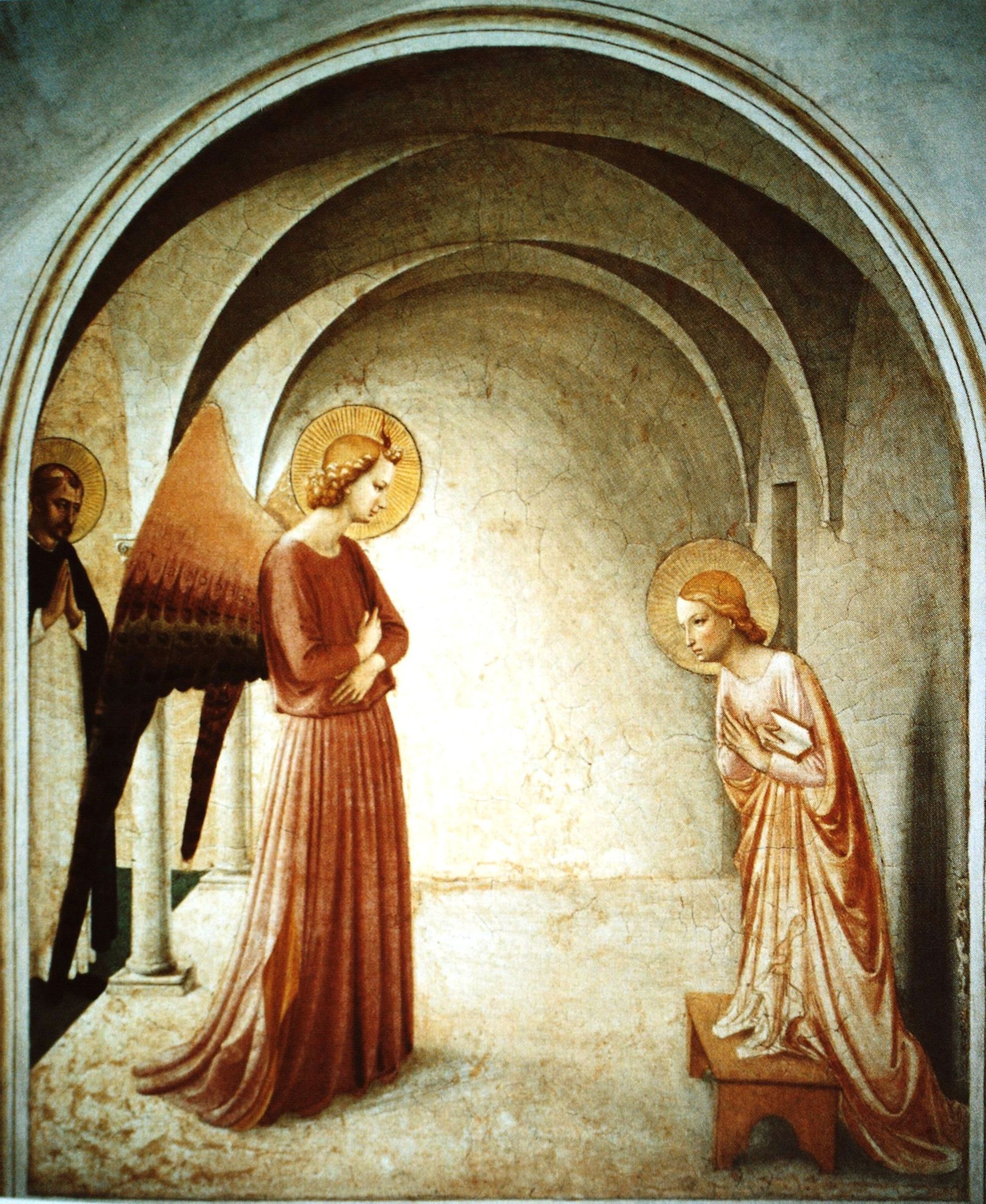
Historically, the Gothic can be seen as something that develops gradually from the Romanesque (a Western variant of the iconographic form). It is almost as if the art form gradually appears from heaven, descending down to earth to join the pilgrims. Duccio, for example, who lived in the late 13th and early 14th centuries has a style that is very closely related to the iconographic. Fra Angelico, in the 15th century, uses both the iconographic visual vocabulary as well as naturalistic ones (such as perspective and shadow) in a theologically coherent way.

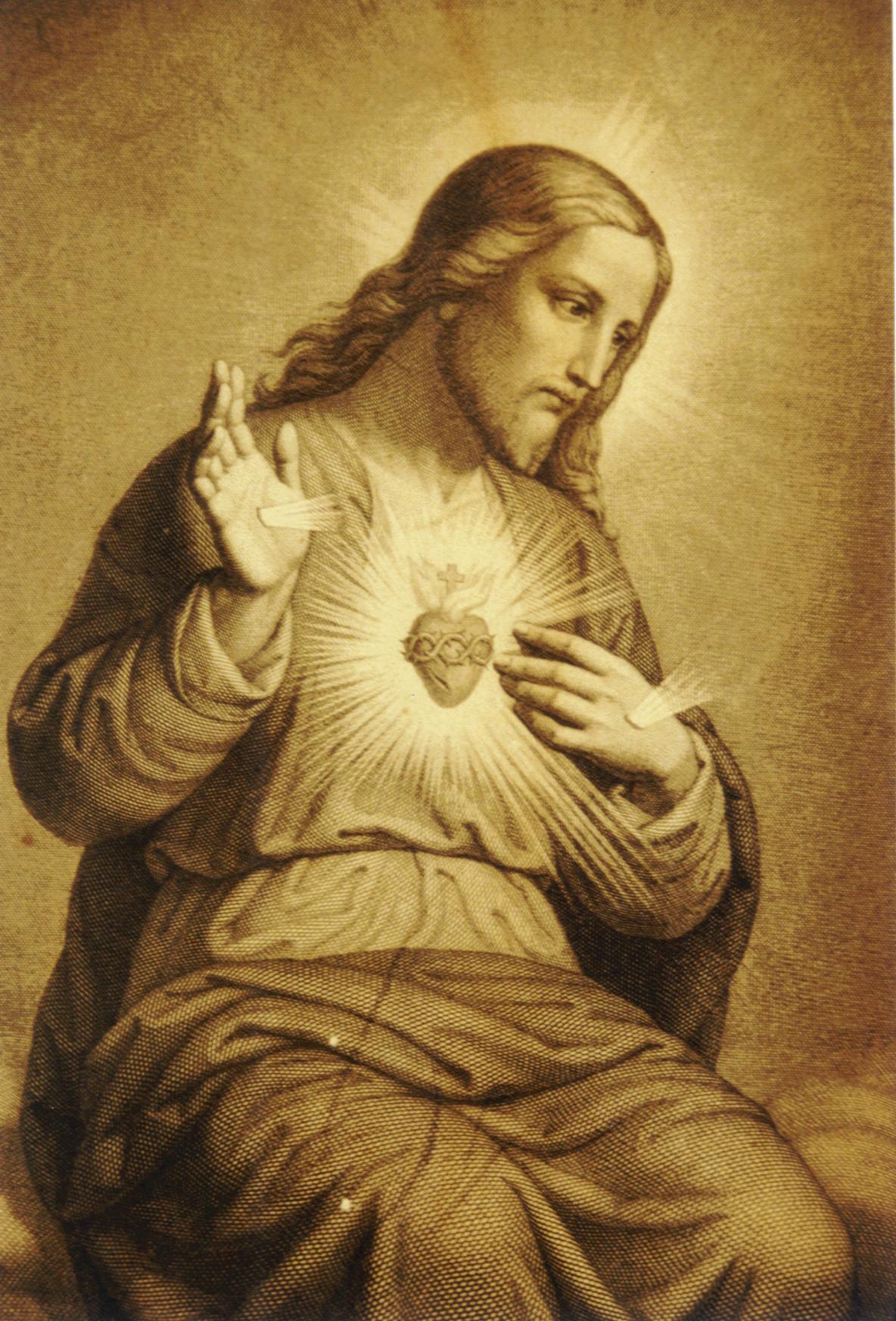
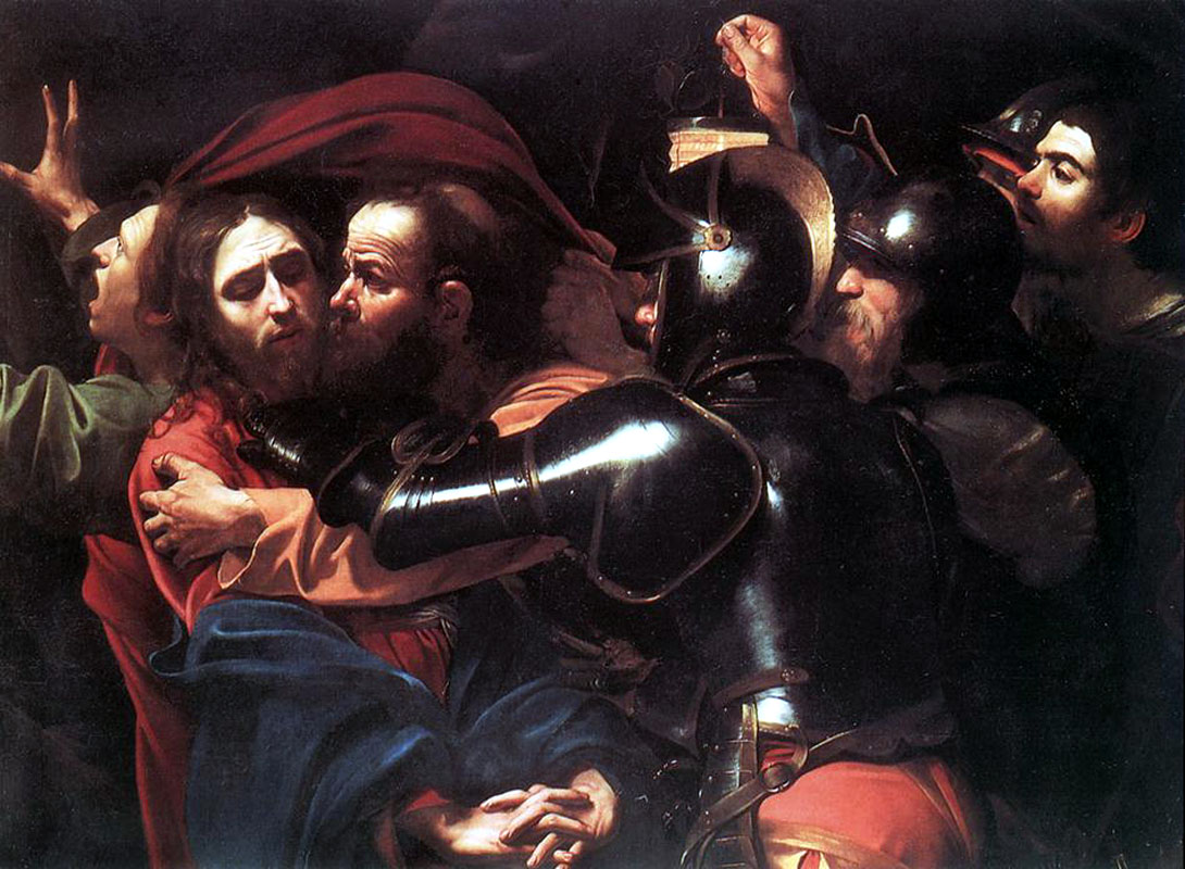
Where does the third authentic liturgical tradition of the Church, the Baroque, sit with these? It was during the Baroque of the 17th century that the integration of theology and form in the most naturalistic of these styles occurred. The controlled variation in colour and focus (described in more detail here) were given theological meaning: we live in a fallen world, with evil and suffering present, but there is hope because God is present – in Baroque art contrast of light and shadow is always painted so to communicate the idea that the Light overcomes the darkness.

Although we cannot reach heaven fully in this life, supernaturally we partially and temporarily step into it through the liturgy and the sacramental life. This is a transforming process that by degrees takes us towards that heavenly state.

In this context, the Baroque is the ground zero, the starting point of our pilgrimage, and the gothic describes the partial and gradual ascent to that heavenly state in this life, before reaching the final repose. The Baroque and the Gothic together represent that aspect of our life in faith symbolized by St Peter in the picture that Augustine paints.

Therefore, these three styles are not in opposition to each other but are complementary. In the light of this I hope to see all three traditions. As each tradition develops, if it bears the mark of a genuinely living tradition, it will be consistent with the timeless principles that define it will, without deviating from the core defining principles, to reflect the time and place that it comes from. Those aspects that are subject to change will be the common ground for each of these traditions. It is possible to envisage a church containing all three traditions that are distinct, yet because they bear the mark of their time, yet containing aspects of form that are common and through this participate in a unified artistic vision.

In regard to the idea that both the Johannine and Petrine aspects of Christian life should be communicated, I leave the last word to St Augustine. Here is the closing passage from the same reading:

“We should not separate these great apostles. They were both part of the present life symbolized by Peter and they were both part of the future life symbolized by John. Considered as symbols, Peter followed Christ and John remained; but in their living faith both endured the evils of the present life and both looked forward to the future blessings of the coming life of joy.

It is not they alone that do this but the whole of the holy Church, the bride of Christ, who needs to be rescued from the trials of the present and to be brought to safety in the joys of the future. Individually, Peter and John represent these two lives, the present and the future; but both journeyed in faith through this temporal life and both will enjoy the second life by vision, eternally.

All the faithful form an integral part of the body of Christ, and therefore, so that they may be steered through the perilous seas of this present life, Peter, first among the Apostles, has received the keys of the kingdom of heaven, to bind and loose from sin. And also for the sake of the faithful, so that they may keep the still and secret heart of his mode of life, John the evangelist rested on Christ’s breast.

It is not Peter alone who binds and looses sins, but the whole Church. It is not John alone who has drunk at the fountain of the Lord’s breast and pours forth what he had drunk in his teaching of the Word being God in the beginning, God with God, of the Trinity and Unity of God — of all those things which we shall see face to face in his kingdom but now, before the Lord comes, we see only in images and reflections — not John alone, for the Lord himself spreads John’s gospel throughout the world, giving everyone to drink as much as he is capable of absorbing.”

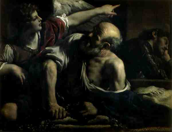
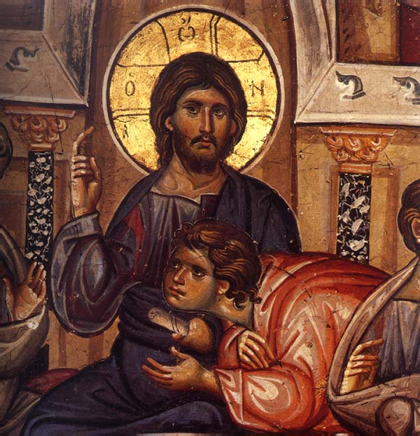
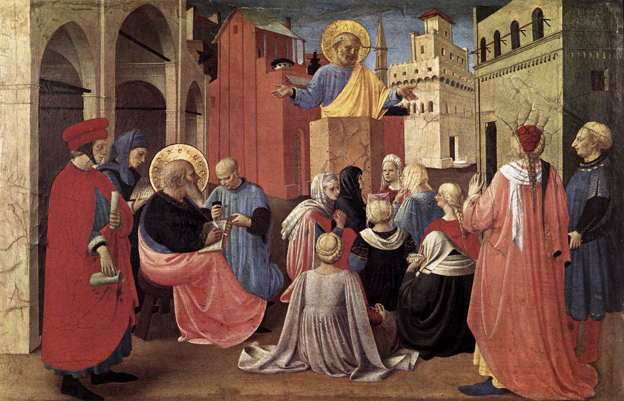
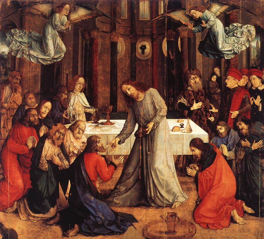
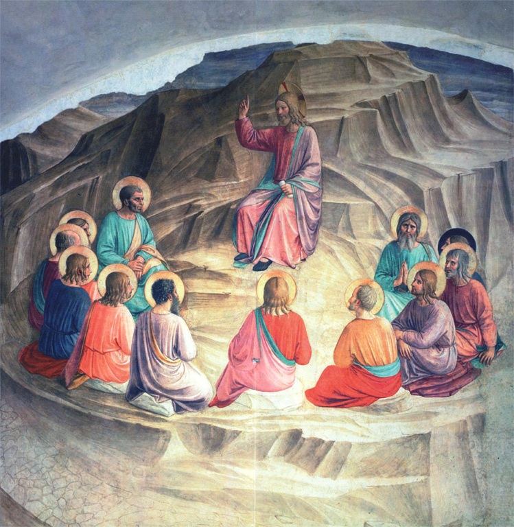
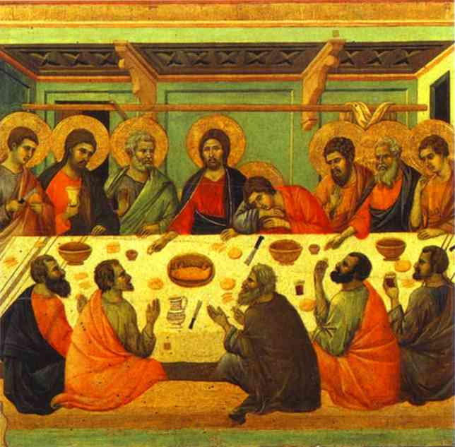
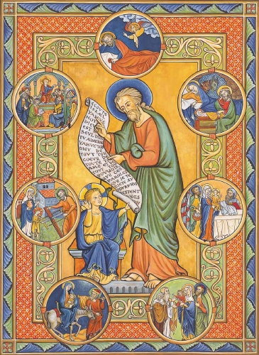
Images from top: Baroque -  St Peter being Freed by an Angel (Guercino); iconographic - St John with Christ at the last supper; Gothic - St Peter preaching (Fra Angelico)
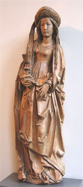
 

The Proportion of the Ark of the Covenant

And how it can be a principle of design of buildings. Most of my reading of scripture comes through the liturgy – that is the readings from both the Mass and the Liturgy of the Hours. I do my best to do some lectio divina each day (reading Shawn Tribe’s wonderful piece on the ‘Four Pillars’ of the new liturgical movement has given a recent boost to this effort) and even for this I draw on the liturgy, tending to use the readings from Mass for that day. What is amazing is how often the scripture or the commentary by the Church Fathers speaks to me about something that is on my mind. I have always thought that perhaps this is because the principles contained within scripture are applicable in every area of life and so any given passage is likely to contain lessons for my particular concern, if I am ready to look for them. Scripture is rooted in Truth, which is a single jewel, so to speak, but one that is seen that is seen as a multifaceted prism and one facet will be facing me square on no matter which direction I observe from. Enough of my musings of scripture – I am already out of my depth here. The point is of this article is not a profound lesson in life, but of one of a little help to my art. A passage from the Office of Readings for Friday of the 3rd week of Lent caught my eye in regard to, of all things, principles of proportion in gothic cathedrals; which in turn become a consideration for me in the composition design of works of art. The passage was Exodus 37 and it described the dimensions with which the Ark of the Covenant were to be constructed by an extraordinarily talented man called Bezalel (who seemed to good at just about everything to do with fine art). In cubits these were: 2.5 x 1.5 x 1.5. Similar dimensions were proscribed for the mercy seat on which it was to stand. The same week I heard a description of measurements of gothic cathedrals in which the ratio of 5:3 appears very often (within the bounds of accuracy when measuring the dimensions of a cathedral).

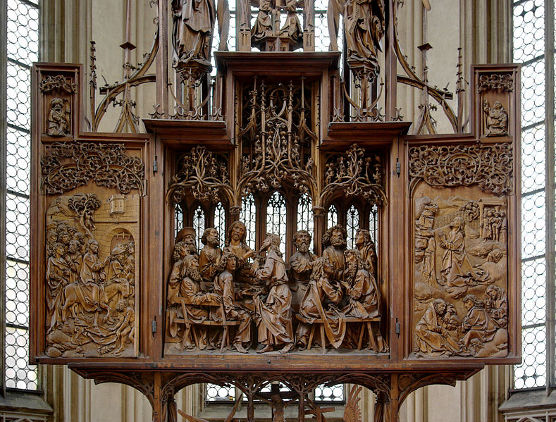
Interestingly, this ratio (5:3) appears also in the description of the construction of the Noah’s ark. St Augustine directly links the dimensions of Noah’s ark to the perfect proportions of a man, exemplified he says, in Christ. This echoes the classical proportions of the perfect man as described by the Roman Vitruvius in his textbook for architects. Furthermore, Boethius, in his book De Arithmetica, lists a series of 10 perfect proportions that he says came from Pythagoras, Plato, Aristotle and ‘later thinkers’. The final proportion of the series, called the Fourth of Four contains right at the beginning this ratio. (The references for these can be found in an article Harmonious Proportion in the Christian Tradition, here.)

Does this mean that this is the reasoning the gothic architects had in mind when they used this proportion? Perhaps. I am not aware of a gothic architect’s manuscript in which the connection is made directly so am hesitant to say so definitively. But we do know that geometry and proportion were important to them and they did use tradition which in turn drew on scripture, arithmetic and observation of nature to govern the use of those proportions. This all amounts to pretty strong evidence that, at the very least, it might be so.

Some suggest that as this ratio approximates to that contained within the Golden Section, and that this was what the gothic masons were aiming for. Again, this might be the case although I have not read of any account dating from this period or before that indicates that this proportion had symbolic meaning at the time or was used by masons. I would be very happy to be directed to any that readers might be aware of.

And does this mean that we should use the ratio 5:3 now? All of this does suggest to me that we should give it a try. If we accept the idea that some proportions are objectively more beautiful than others (as all architects did up to the 20th century), then this points to the idea that due proportion would include this ratio.

The final and most important test when deciding this is as follows: are things that are constructed to incorporate this dimension beautiful? That is down to each person to answer. I for one, when looking at those gothic cathedrals would say yes (whatever the symbolism in the mind of the architect was); and this is why is seek to use it in the design of my art. If I was an architect, I would incorporate it into my designs too.

Images: above, The Sacrifice of the Old Covenant, by Rubens; and below: Leornardo's rendition of the Vitruvian man; and details of Amiens cathedral.


Relief Carving - Painting in Shadow

The tradition of the Eastern Church is not to have statues in its churches. A statue occupies three-dimensions of space, unlike a painting, which only occupies two-dimensions (but can create the illusion of a third). Given that the iconographic form, which is the only artistic liturgical tradition that the Eastern Church will permit, seeks to eliminate as far as possible even the illusion of a third dimension, that is depth, it is hard to imagine how statues (in which the third dimension fully exists) could be created in accordance with the iconographic form. The development of statues for churches came in the West in tandem with the desire to create the illusion of space in two-dimensional representations, generally identified with the beginning of the gothic period in about the 12th century. This did not cause the tradition of relief carving to die out in the West. It has always flourished in both Eastern and Western churches

Relief carving in effect, is a monochrome painting in shadow. So although there is a physical deviation from a strict two-dimensional representation not as a statue does, by imitating the three-dimensional shape, but rather by creating the illusion of depth by altering the tone of the shadow. Where the shadow is to be black (or darkest) the cut is deep and the surface angle close to perpendicular to the broad plane of the image. Where a grey or mid-tone is required, the cut is less deep and the surface angle somewhere in between, depending on how dark or light the artist wishes to make it appear. Where the tone required is white (or lightest possible) the surface faces us directly and is parallel to the broad plane of the image.

The conventional classification of relief carving is a division into bas relief (bas in French is low) and alto (ie high) relief. In the first the cut is shallow and there is no undercutting so that representation is never more than half in the round. Alto relief is where there is undercutting and so there are some elements that are carved more than half in the round. Sunken relief, or intaglio, is where the negative space around the figures is flat and the figures are cut out from it below that surface. For more information on this see article here.

Some might point out that the reason we can perceive form in a conventional statue that is not painted, for example all marble is due to shadow too. This is true. But the difference here is that the shadow is revealing is the true shape of the statue, which in turn imitates the idea in the mind of the artist. Whereas, in relief carving it paints, so to speak, the illusion of depth.

As with all these things, the division between the different techniques is never absolute. Bernini, the great baroque sculptor used to deviate from a strict representation of appearances in his statues and exaggerate certain elements by cutting deep into the stone and creating sharper contrast. He would say that as he didn’t have colour to manipulate the gaze of the viewer, shadow was the main tool that he had.

Below and above, Byzantine 10th century, St Demetrios


6th century Armenian, Virgin and Child

The Magi, Amiens Cathedral, 13th century

From the baptistry doors in Florence, early-mid 15th century, gilded bronze by Ghiberti.

Station of the Cross: the English artist, Eric Gill, 20th century, Westminster Cathedral


Four talks on Sacred Art at Kenrick Seminary, St Louis

This autumn I was invited to address the seminarians at the Kenrick Seminary in St Louis. I gave four lectures on sacred art and liturgy. Here are four podcasts, posted on the seminary website. They are enhanced -  you hear my voice and see the slides I am describing. Harmony and Proportion - linking culture to the cult

Iconographic art

Baroque art

Gothic art

Halo, halo!

Following on from last week’s article Heart to Heart, about the commissioning of the Sacred Heart paintings, there were two points that I raised for discussion. The first is the suitability of the iconographic form for a Sacred Heart painting. A number of people who spoke to objected to this (some quite forcibly!). If I have understood their points properly, then it seemed to be based upon the idea that the iconographic form is necessarily an Eastern (and one person even said an Orthodox form) so the portrayal of a Western devotion is not appropriate. The first point to make is that the Sacred Heart, although originating in the West, is no longer restricted to it. I was told by a Melkite priest that the Sacred Heart is a popular devotion in the Eastern Church too. Second, this view of icons as being an exclusively Eastern form is contrary to the Catholic view. I have written before, here and here that what characterizes the iconographic form is that it is a style that is consistent with an image of eschatological man – mankind, redeemed, in heaven, so to speak. There are variants of the iconographic form that emanate from the Eastern Church and the Western Church (for example Carolingian, Ottonian or Romanesque art). Therefore, if it is right to represent Christ in the iconographic form at all (and of course it is) then it is right, I would argue, to paint images of the Sacred Heart in that form too. (The same could be said in regard to the other liturgical forms – just as it is appropriate to paint Christ in the gothic and baroque styles, it is appropriate also to paint images of the Sacred Heart in those forms.)

Similarly, the iconographic style is not communicating a message restricted to any particular time in history. It is communicating the timeless realm of heaven. So the time in history when the devotion arose is irrelevant to the discussion. (Although, in fact, the Sacred Heart devotion might even have begun, according to my research as early as the 11th century, which would place it in the period when the standard art form in the West was Romanesque, which was iconographic anyway, also, though not specifically linked to the Sacred Heart devotion, there are a few older images of Christ's heart as a symbol of love. I found one going back to 450AD).

The other point relates to how we show the light emanating from the heart. The concern of someone, whom I respect as being very knowledgeable on the tradition, that a halo was not appropriate for the heart, although this is a representation of uncreated light, within the tradition the nimbus of light, the halo, has only been applied to the head. Therefore, rays (as one might see in a monstrance) were better. This is a strong argument and worth of further consideration. While we should never say that just because it hasn't been done before we can't now, we must be respectful of tradition and try to consider why it hasn't. On reflection, however, I feel that it is appropriate to use a halo if the artist chooses, but I am still open to persuasion and would love to see any thoughts that readers have on the matter.

Here are the points I would make in response: it is certainly the case that the halo has a strong symbolic meaning beyond simply the pictorial representation of uncreated light. It is telling us something about the person – that this is a saint or the glorified person. When we see a person their head is the place most appropriate visible part that represents the person – we naturally tend to look at the face as of a person as a ‘window to the soul’; and most would not consider for a moment, for example, putting a halo around the hand to say something about the person. However, tradition does say that the heart, perhaps even more than the head, symbolizes a person. The heart is the human centre of gravity, our very core that incorporates body and soul. It is the place that represents the whole person, the vector sum of all our actions and thoughts. This is why the heart represents love. We are made for love and so the place that represents the person is also the symbol of what the person is made for. This is even more the case for the person of Christ, who is not made for love but rather, as God He is Love.

Normally the heart is not visible, so the question as to whether or the artist should apply a halo to it does not come up. However, in this case it is, and I would argue therefore that it is not inappropriate, at least, to put the halo around the heart.

Another point that was raised is that it seems to disembody the heart. It is a matter of opinion as to whether this is a problem, I think. My response to this is that the heart has been no more disembodied by putting a halo around it than it has by placing rays around it. The Maryvale image, which is based upon the visions of St Gertrude in the 13th century, has Christ presenting his heart to us in the palm of his hand, this is quite a disembodying action, it seems to me!

The discussion so far has been concerned with general principles. It does not account for individual taste or the quality of the images portrayed. Even if consistent with the principles that constitute a particular tradition, a painting can still be poorly executed. And I have to say that most of the Sacred Heart images I see are, to my eye, sentimental and unattractive. (There are exceptions. I have included some that appeal to me, including once again the 18th century stain-glass window in the Maryvale Institute in Birmingham.)

Images inserted into text,  from top: from St Patrick's El Paso, Texas; the Maryvale stain-glass window; a modern icon of the Sacred Heart.

And images below: an 18th century engraving; a 15th century woodcut of the Five Wounds of Christ; a heart and cross from 450AD.

Heart to Heart

I have been commissioned to paint two Sacred Heart images and each time it raised some interesting questions in relation to tradition. One relates to the style in which one ought to paint the image, given that this is a relatively recent devotion – is it legitimate to use an iconographic style which predates the devotion, for example? The second is in regard to how the light emanating from the image of the heart itself should be portrayed, should it be tongues of light or a halo for example? A recent visitor to Thomas More College recently asked me about both these points. Fr Seraphim was very knowledgeable and had well thought out views on each issue, so it forced me to sit down and think again about the reasons for doing what I had done in each case, and to reflect on whether I had made the right choices, especially in the consideration of applying a halo to the heart. This week I will describe the story of each commission, so that readers can get a feel for how these dialogues run. Next week I will present the arguments as I see them surrounding these two concerns. The first was for the Maryvale Institute, in Birmingham, England, which as well as being an internationally known Catholic college is the national shrine of the Sacred Heart. They have a beautiful little side chapel, right, separate from the main chapel. The central focus of the side- chapel is a stained glass window, above, which was imported from Rome at the beginning of the 19th century, and is the oldest image of the Sacred Heart in the UK. I was asked to paint an image of the Sacred Heart based upon this window to commemorate the 25th anniversary of the founding of the college. Since its founding like any educational institution seeking to be orthodox, it has had to counter efforts to undermine what it is doing and Fr Paul Watson, the president of the college, explained to me that they felt sure that much of their success could be attributed to the protection of Christ through devotion to his Sacred Heart.

I was asked to paint an icon based upon the window. In discussion, it became apparent that any image that conformed to the iconographic prototype would not retain the distinctive qualities of the window, which is in the baroque style. What I aimed for, therefore, is more gothic than iconographic – a naturalized iconographic form. The pose is obviously taken from the window. Deviating from Western naturalism, there is no cast shadow, and it is painted in egg tempera, so has the flat look of the medium. Also, I painted a conventional halo around his head. To his heart I applied radiating, monstrance-like, tongues of light (the form of which was also taken from the window).

The abstract design around the border is taken from the window. It is not usual to incorporate such designs into Eastern icons. However in the West, in all forms of art including the iconographic, there is a strong tradition of abstract art and especially that which uses flowing graceful lines. The fleur-de-lis incorporates the lily, the symbol of purity and, by virtue of its threefold design the Trinity. The red and yellow design incorporates vine leaves, the symbol of wine the Eucharist. The blue-green design, which forms the arms of the cross give a sense of a flower coming into bud. Within the root there is a triangle and the within the bud a pentagonal design. Five symbolizes living creation (and in this context, I thought, man). I do not know the intentions of window maker, but I interpreted the combination as a symbol of the Incarnation, God is made man.

It was presented to the college at the Silver Jubilee Mass celebrated by the then Archbishop of Birmingham, now Archbishop of Westminster, Vincent Nichols, a supportive patron of the college during his time at Birmingham.

The second is at Thomas More College in New Hampshire. Like the Maryvale Institute, it was asserting its Catholic identity and fidelity to the Magisterium. Shortly after I arrived, under two years ago, I was struck one day by the words of the psalmist in None: ‘Vain is the builder’s toil, if the house is not the Lord’s building; vainly the guard keeps watch, if the city has not the Lord for its guardian.’{ Ps 126(127)}. Recalling also, my experience at the Maryvale Institute, I immediately suggested to President William Fahey that we have an image of the Sacred Heart for our chapel too. It seems he had been thinking along similar lines for he told me that in fact his intention was, starting that Fall, to dedicate the college each year to the care of the Sacred Heart of Jesus. This has been done twice now.

This time I chose to create an image in a more iconographic style. Clearly, this is not part of the iconographic tradition, so I based the pose on the Pantocrator, blessing Christ. Again, I used egg tempera painted onto a gessoed panel as the medium. As this is a Western devotion and I am a Roman Catholic, I incorporated some Romanesque (ie Western) features by having the geometric patterned border and also, putting a geometric pattern into the background around the figure. This time I painted halos around both the head and the heart of Christ.

Part II next week.

Above: the Maryvale Sacred Heart; and below, the Thomas More College of Liberal Arts Sacred Heart

The Symbolism in the Content of Fra Angelico's Frescoes

The Sermon on the Mount Rather than talking about form, my usual interest in painting, I thought that this time I would focus on the symbolism of the content contained in an example of gothic art by focusing on a fresco of the Sermon on the Mount, once again by Fra Angelico (1395-1455). It is in cell 32 in the north wing of San Marco in Florence and was painted between 1440 and 1450. I should mention that I am indebted to a lecture given by Dr Lionel Gracey who was my colleague when I was teaching at the wonderful Maryvale Institute in Birmingham, England for much of the detailed information here. First of all there is the symbolism of the colours of Jesus’s clothes. The red under garment or tunic is red, which is a symbol of blood and a sign of his humanity; while the blue outer garment or cloak symbolizes his divinity. I was told that originally in this fresco the blue of the cloak matched precisely the heavenly blue of the sky. Fra Angelico often uses this colour symbolism for Christ and it is seen in all three liturgical traditions (although it is certainly not true to say that depiction of Christ is limited to these colours). Shown below is the Last Supper of an earlier gothic master, Duccio; a modern icon of Christ by Gregory Kroug, the 20th century Russian émigré; and The Kiss of Judas by Caravaggio from the early 17th century. All have the same colour scheme for Christ's robes. Judas is depicted in Fra Angelico’s painting as well, indicated by the black halo – an aura of darkness representing evil.

Dr Gracey pointed out how unusually shod Jesus is, in a slipper of some sort rather than sandal or barefoot. He speculates that this is an allusion to the Eucharist because during Passover the Isrealites were required to be shod.

What strikes me about the composition of this fresco is the vertical dynamic in colour, light and composition that sweeps the eye up and down the painting through the geometric centre, which is somewhere around his knees. Our eyes sweep continually from earth to heaven and back, so to speak.

The colour dynamic comes in the match (when still bearing the original colours) between the blue shawl on Christ to the blue of the sky above. This causes our eyes to sweep upwards. Also, Christ’s hand points directly upwards. At this point commentaries often say that he is telling us figuratively that his kingdom is ‘not of this world’ (John 18:36). The light takes us down in the other direction. As described last week, the upper part of Christ is dark and the lower portion is light. The eye is taken from here to the brightly lit rock plateau beneath him.

A link is often made between the Sermon on the Mount and the 10 Commandments. Christ resumed these Commandments in the double precept of charity -- love of God and of the neighbour; He proclaimed them as binding in the Sermon on the Mount (Matthew 5). The mount upon which Jesus is preaching echoes Mt Sinai on which Moses was given the commandments. This parallel is emphasised by the bright illumination of the rock. Also Peter, whom Christ appears to be addressing, to his right, is ‘the rock’ upon whom He would build His Church.

Given Fra Angelico’s masterful manipulation of light (as I described last week, here) Dr Gracey suggested to me that this was the perfect painting for contemplation of the third Mystery of the Light in the Rosary, the Proclamation of the Gospel.

This is the third short article about Fra Angelico and the gothic that have been written for the New Liturgical Movement. The second was last week, already referred to and the first is archived here.


Fra Angelico's Theology of Light

I thought I would do a short series (I intend three at this stage) of articles focussing on paintings by the gothic artists, looking at two of my favourites Fra Angelico and Duccio. Fra Angelico, the 15th century Florentine artist is normally considered late gothic in style. Duccio, from Siena, worked earlier, in the late 13th and early 14th centuries. Duccio's work represents the more iconographic based style and Fra Angelic the more naturalistic. Looking at these two exemplars of early and late gothic art gives us a good sense of what characterises this tradition. This is not just for the purpose of an art history discussion. I think that there is much to benefit from artists today who are trying to spark the ‘new epiphany of beauty’ by looking at the gothic tradition. First, it is one of the three authentic Catholic liturgical traditions cited by Pope Benedict XVI in The Spirit of the Liturgy. Also, I often find in conversation that his work appeals to people who have a similar understanding of the Faith, the liturgy and Catholic culture as I do. It seems that for many, Fra Angelico in particular has the balance of naturalism and idealism that nourishes the prayer of modern man. John Paul II gave him a special mention in his Letter to Artists. I think therefore that perhaps this could be a good starting point for artists to study and from which a distinctive art of Vatican II could develop in the future (just as the baroque, which developed from the base of the stylistic developments of the High Renaissance, might be considered the art of the counter-Reformation and of the Council of Trent). Only time will tell if I am right in this regard, of course.

The gothic style arose from a different understanding of man's perception of the natural world through his senses. The ideas that drove it developed from about 1000AD onwards with the rediscovery of the philosophy of Aritotle and the subsequent incorporation of his ideas into Christian thinking by figures such as St Thomas. The love of nature of Franciscan spirituality was also influential in popularizing the ideas. I have written more about this here.

As I wrote in a commentary on his Annunciation, Fra Angelico working late in the period is very interesting to study for his selective use of the features of the well observed naturalism such as perspective, shadow and figures in profile; and his retention at other times of those features of iconographic art.

If we look his Resurrection a fresco from one of the cells in the monastery of San Marco in Florence, we see Christ rising in an almond shaped mandorla, the traditional symbol of His glory, carrying the red and white Resurrection penant. The background is shadowy and dark and we see the tomb drawn with naturalistic perspective. The angel is in profile, which would never be seen in an iconographic painting, though shining with uncreated light which one would expect in iconographic art.

There is one stylistic feature that Fra Angelico uses that interests me greatly. This is his habit of putting the face of Christ in shadow. On first sight this is strange, since he shows the rest of the person of Christ shining with light and the face of the angel, a great, but nevertheless lesser being is totally in light. When I first noticed this I wondered why? A Dominican friar in England told me his interpretation of this: Fra Angelico is showing a light that is brighter still. In fact it is so bright that it blinds us - it is too much for us, fallen human beings who are observing Him, to bear. I find this explanation convincing, especially because we see in in other paintings by Fra Angelico, for example the Transfiguration and the Sermon on the Mount have the same feature.

Prayer Cards and Prints from St Joseph's Flamigny

I would like to bring to your attention work from the Abbey of St Joseph de Clairval in Flamigny in deepest Dijon, France. Their workshop produces prints of prayer cards and devotional art of modern works in the style of French early gothic 13th-century illuminated manuscripts. When I first decided I wanted to paint for the Church it was to the gothic that I was first attracted. I was not aware at that stage of anyone producing modern works in the gothic style so went first to the iconographic. Perhaps if I had known about these, I might have found myself in France rather than New Hampshire. You see these and others at their website, here.

The Assumption is shown left.The Annunciation

The Visitation

The Crowning of Mary

20 Mysteries of the Rosary

Seven Sorrows of St Joseph

The Glorious Mysteries of the Rosary

The Luminous Mysteries of the Rosary

Mary, Mother of Mercy!

Fra Angelico and the Gothic

When I first decided that I’d like to try to paint in the service of the Church I decided I wanted to paint like Fra Angelic (or perhaps Duccio). I suppose you might as well aim high! Fra Angelico, who worked in the 15th century, had the balance of naturalism and idealism that appealed to me. It seemed just right for prayer. It’s just an anecdotal observation, but when I meet people who have the same outlook in regard to the liturgy and orthodoxy in the Church, it seems that invariably they feel the same about him; and John Paul II described him in his Letter to Artists as one whose painting is ‘an eloquent example of aesthetic contemplation sublimated in faith’. Unfortunately, the late-gothic style of Fra Angelico is not a living tradition and I couldn’t find anyone who painted that way who could teach me. I decided that as it appeared to sit stylistically between the Romanesque (which is an iconographic form) and the baroque and these were forms that are taught today, to some degree, I would learn both and try to work out how to combine the two. I am still working on that now!

What is it that characterizes gothic figurative art? We start to see a change in figurative art around 1200AD. The departure from the iconographic prototype occurred due to a different sense of the reliability of human experience. Information received through the senses was seen much more as a possible means of the grasping of truth. Tied in with this is the belief that the world we live in, although fallen and imperfect, is nevertheless good, ordered and beautiful. So there may be evil and suffering in the world, and it may not be as good and beautiful as it ought to be, but it is nevertheless God’s creation and still good and beautiful.

This change caused both the rise of naturalism in art and the development of science fostered by the Church. I have read of two main reasons for this. One is the incorporation of the philosophy of re-discovered works of Aristotle (who trusted the senses more than his teacher, Plato) into Christian thinking, by figures such as Albert the Great and Thomas Aquinas. This provided the intellectual basis for the development. Second is the spirituality of St Francis of Assisi. He loved nature as the work of God and as Franciscan ideas spread so did an enthusiasm for, and curiosity about, nature.


Let’s look at a very famous fresco by Fra Angelico of the Annunciation on the walls of a cell at San Marco in Florence. He consciously employs some of the developments of the new naturalism: there is cast shadow, there is single-point perspective creating a sense of depth in the covered cloister; the archangel is in profile. But there are also stylistic aspects that we are accustomed to seeing in iconography: the figures are painted in the middle distance, the edges of each shape are all sharply defined and the colour is evenly applied (unlike the baroque which has selectively blurred or sharp edges and selective use of colour or monochrome, usually sepia, rendering).

If we examine the further, we can see that the light source that is casting shadow is from the left. If cast light were the only source, the face of the Archangel would be dark, yet it is bright. Fra Angelico is showing the face of the Archangel glowing with the uncreated light of holiness, which is what we are used to seeing in the Byzantine iconographic form.

I was giving a lecture once about this painting and a student asked me about the shadow. He pointed out that Our Lady is a saint, he could see that her face wasn’t in shadow and there was strong halo, representing he uncreated light coming from her. But also pointed out that there is a strong cast shadow on the wall behind her. Wouldn’t you expect her radiance to obliterate that, he asked? I agreed with him, you would. But I couldn’t say why Fra Anglelico had painted it like this. I speculated that perhaps it was due to the fact that there were two light sources from the left – the natural light and the uncreated light from the angel and that the combined intensity of light would cause the shadow against the wall. I had to admit even as I said it that my answer sounded contrived. Nevertheless, it did seem deliberate. Another Annunciation, shown below, has the same shadows.

He suggested an answer: Fra Angelico was a Dominican, and not a Franciscan. At this time the question of her Immaculate Conception had not been decided and the Dominicans did not accept the Immaculate Conception and were in dispute with the Franciscans over the issue. Perhaps Fra Angelico was making a theological point to the Franciscans, he suggested by dimming her light ever-so slightly. This was an ingenious suggestion, and I couldn’t say that it wasn’t what Fra Angelico had in mind. I certainly preferred it to my answer!

Later, someone in another class, a priest, gave the most convincing reason so far. Luke 1 tells us that the words of the angel Gabriel were:, “The Holy Spirit will come upon you, and the power of the Most High will overshadow you.”