Geoff Yovanovic is a young architectural intern (with an architecture degree from the University of Miami who came to our Way of Beauty summer program last year. He recently attended a course of proportion run by the ICAA (The Institute of Classical Architecture called Theory of Proportion: A Perennial Pathway of Beauty. What he described sounded interesting so I asked him to give us a brief write up about it. If you want to know more about this, then do contact him on g.yovanovic@gmail.com. He is especially keen to here from any architects working in a traditional field who are looking to take on an intern!
Before we read it a couple of things are worth pointing out. First that word 'Perennial'. This is referring here to a particular worldview - the Perennialist philosophy. This is a modern analysis of traditional cultures which seeks common principles based upon the premise that each is offering alternative routes to the same God. Perennialists tend to join one religion or school of thought and take a traditionalist path, in order to follow what they seek to be the pure, original revelation, as it was presented before man diluted it. I have met Christian, Islamic and even Platonist perennialists. In my experience, Plato and Platonists such as Plotinus, are presented as authorities. However, for all the fact that they outwardly look like very traditionalist adherents to a religion to the degree that they hold to the perennialist philosophy, they sit outside the religions that they claim to follow (certainly this true for Christianity).
Geoff Yovanovic is a young architectural intern (with an architecture degree from the University of Miami who came to our Way of Beauty summer program last year. He recently attended a course of proportion run by the ICAA (The Institute of Classical Architecture called Theory of Proportion: A Perennial Pathway of Beauty. What he described sounded interesting so I asked him to give us a brief write up about it. If you want to know more about this, then do contact him on g.yovanovic@gmail.com. He is especially keen to here from any architects working in a traditional field who are looking to take on an intern!
Before we read it a couple of things are worth pointing out. First that word 'Perennial'. This is referring here to a particular worldview - the Perennialist philosophy. This is a modern analysis of traditional cultures which seeks common principles based upon the premise that each is offering alternative routes to the same God. Perennialists tend to join one religion or school of thought and take a traditionalist path, in order to follow what they seek to be the pure, original revelation, as it was presented before man diluted it. I have met Christian, Islamic and even Platonist perennialists. In my experience, Plato and Platonists such as Plotinus, are presented as authorities. However, for all the fact that they outwardly look like very traditionalist adherents to a religion to the degree that they hold to the perennialist philosophy, they sit outside the religions that they claim to follow (certainly this true for Christianity).  It can be confusing at times, because they will draw heavily on the authorities of the religion in question when it is consistent with the philosophy (for example often citing scripture) but in their own interpretation (through a perennialist prism so to speak), and not fully consistent with the magisterium (although they will often give the impression that they are in agreement with each religions). The people to look for who formulated this perennialist outlook are names such as Titus Burckhardt, Rene Guenon, Ananda Coomeraswamy and Frithjof Schuon. Because of their great respect for tradition and the religions of the world, they have done much good work in redirecting many genuine adherents to their own traditions. For example, It was perennialists at the Prince of Wales's school of tradition arts in London who made me aware of traditional Christian ideas of harmony and proportion. The teacher of the course below, incidentally, was taught at the Royal College of Art in London by the founder and first principal of the Prince's School.
Second, consistent with the fact that this is a modern philosophy they will tend, in my view, to overemphasise the importance of the Golden Section in traditional design. Those who are interested to more about my views on this can read the article 'Golden or Fallen - a Note on Phi' in the articles page of this blog.
With these caveats in mind, the course Geoff describes seems to be worthy of consideration. Here is what he wrote:
'I attended recently a one day intensive on the theory of proportion presented by the Institute of Classical Architecture and Art. It was called Theory of Proportion: A Perennial Pathway of Beauty. The ICAA describes itself as an organization which is "dedicated to advancing the classical tradition in architecture, urbanism and their allied arts". With chapters throughout the USA, the ICAA presents educational opportunities ranging from the Beaux Arts Atelier in New York City to walking tours through historic neighborhoods to a variety of classes like the one on proportion which I attended in Atlanta hosted by the Southeast Chapter.
The intensive was taught by Steve Bass an architect from New York City, and a Fellow at the Institute of Classical Architecture and Art. Mr. Bass was trained in the modern practice of architecture, but soon
found it empty, he told us, and searched for a deeper meaning in design. This lead to study at the Royal College of Art in London which has a focus on the ancients such as Plato and Plotinus (a Platonist from the 3rd century AD) and their ideas on geometry, presented through the prism of the modern Perennialist philosophy.
Starting with a rapid survey of ancient history and philosophy, the class soon settled on a discussion of beauty and its importance. Drawing from the writings of Plotinus, connections were quickly made
between beauty and the good: "This is the soul's ugliness, not being pure and unmixed, like gold, but full of earthiness; if anyone takes the earthy stuff away the gold is left and is beautiful, when it is singled out from other things and is alone by itself."
For the ancient Greek, described by Plotinus, beauty was the memory of unity. It was the joyous state of the soul as it remembers unity. In our Christian tradition, beauty is our recognition of God.
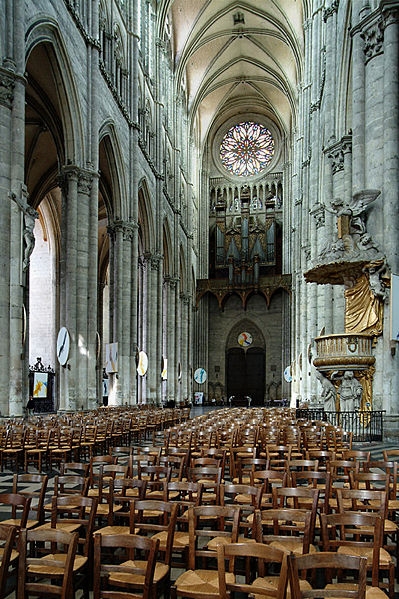
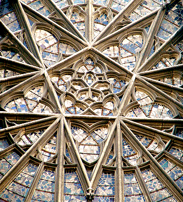
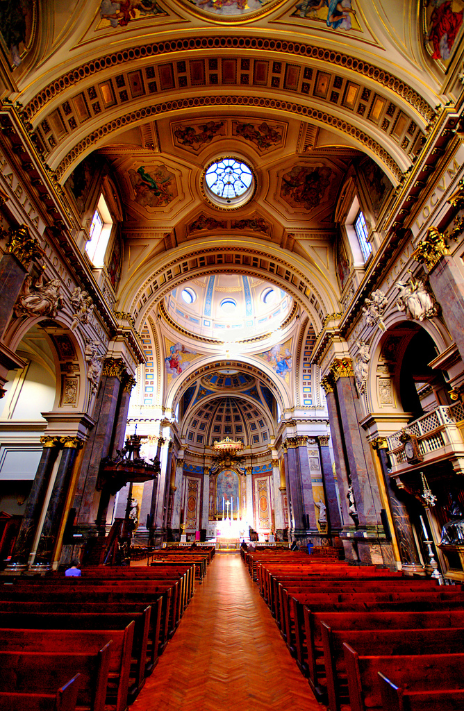
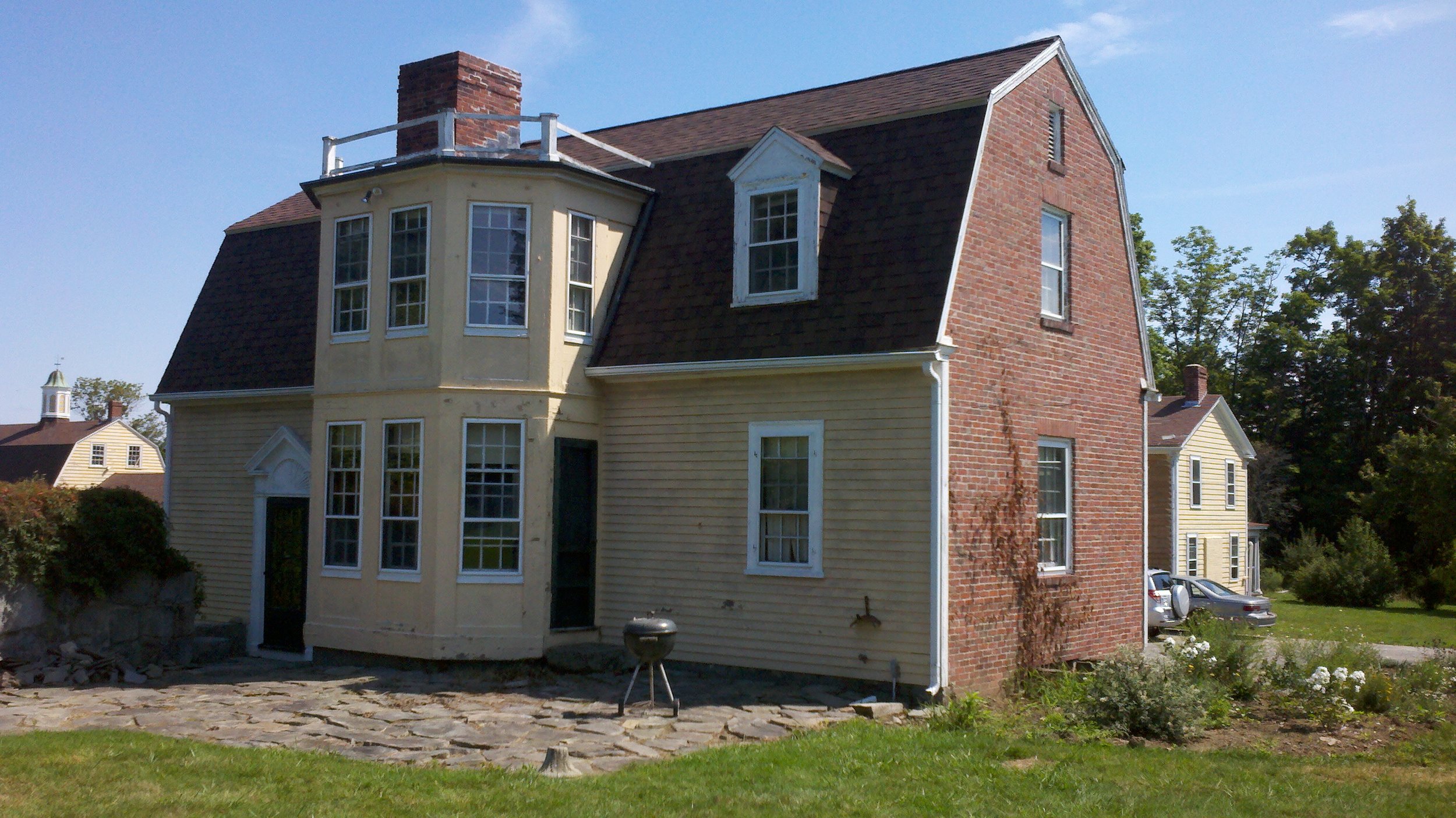
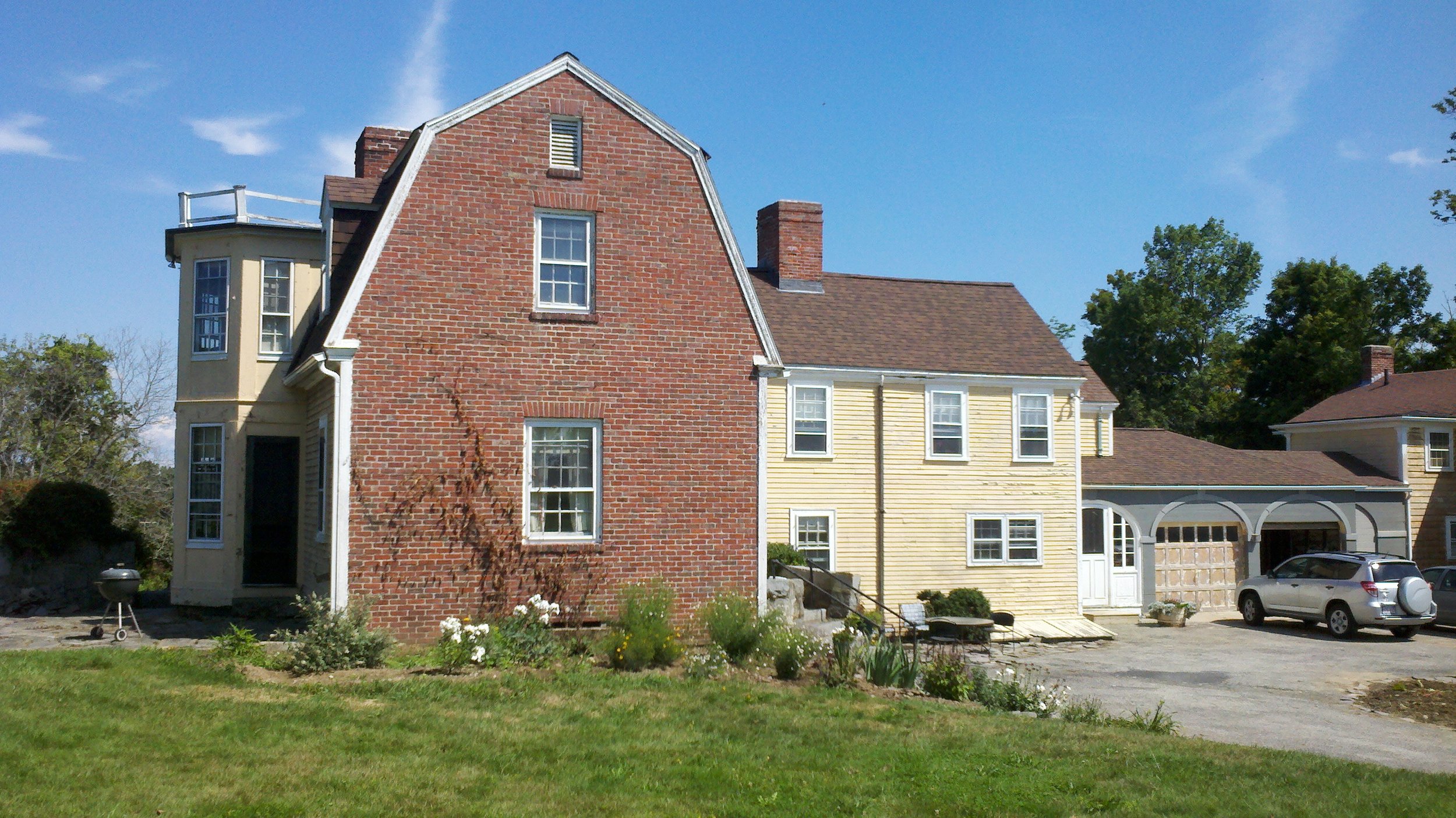
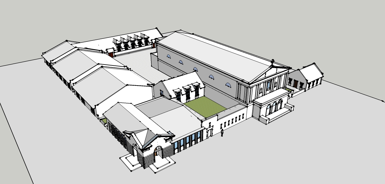
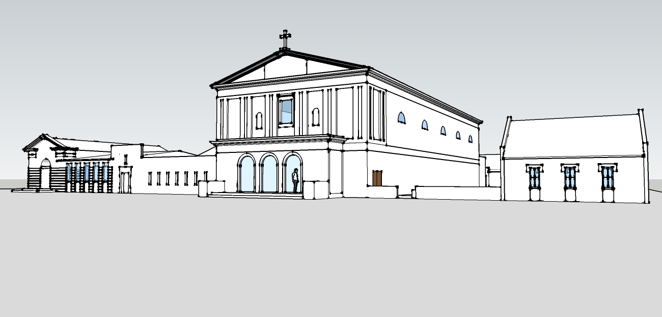
The foundation for the rest of the class was laid with an introduction classical number theory described in detail by Plato and attributed to Pythagoras. Using this theory and tying it to Genesis and Plato's Timaeus, Mr Bass presented a symbolic story of creation using the arithmetical ideas of the monad, oneness, the dyad, twoness, the triad, threeness, and on through the decade. For example, fourness or the tetrad was connected with the fourth day of creation in Genesis. On the fourth day, "God said, Let the waters under the heaven be gathered together unto one place, and let the dry land appear." Geometrically, the tetrad or fourness is represented by the four sided polygon or a square. Applying these theories into recognizable form in architecture, we can look at a dome in a church especially an early Christian church such as the Hagia Sophia. A dome is a sphere resting upon a cube. In an even simpler geometric study, we see a circle and a square. Geometrically, the dome is composed of a square, the tetrad, meeting a circle, the monad. Applying Genesis to the dome in a church, a dome is the location where heaven, the monad or oneness, meets the dry land, the tetrad or square. Therefore, the geometry symbolizes the meeting of Heaven and earth, or the meeting of the Communion of Saints which occurs during each Mass. In some early churches, this union of Heaven and earth was emphasized by the decoration on the pendentives which were the four triangular transition supports between the vertical columns and the dome. Depictions of this unity such as the Annunciation of Mary, the Nativity, and other Christmas scenes were painted on the pendentives to emphasize this symbolic geometric parallel.
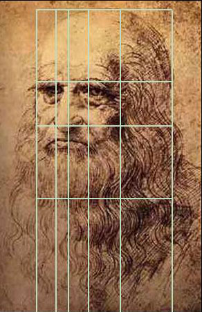
The class transitioned into a study of the evolution of different geometric creations and their integration into architecture. From a circle, different geometric creations were derived such as the
45-45-90, 30-60-90 triangles, .618 or phi, and finally arriving at the golden section. Using the golden section as the primary tool, it was proposed that the ancient Greek temples were designed through
geometric derivations of a circle. Demonstrations using a few simple drafting tools such as a 45 degree triangle, a compass, and a scaler showed the evolution of a Doric, Ionic, and Corinthian temple
originating from a circle. The entire temple from the overall recognizable temple form to the acanthus leaves in the Corinthian capital were derived starting with a single circle.
While the primary goal of the class was to emphasize the importance of beauty in design, it was not presented through a Christian perspective. It focused on many ancient ideas which, for a large part, were eventually baptized by St. Augustine and integrated into Christian thought. Despite the differences, both schools of thought present proportion and geometry as a path to beauty. And beauty is an essential thing.


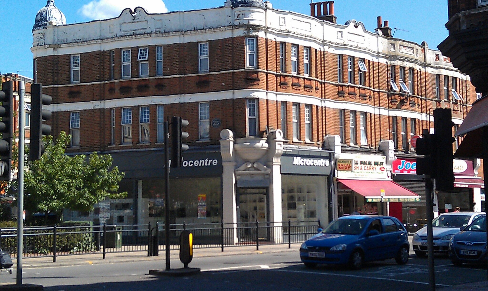
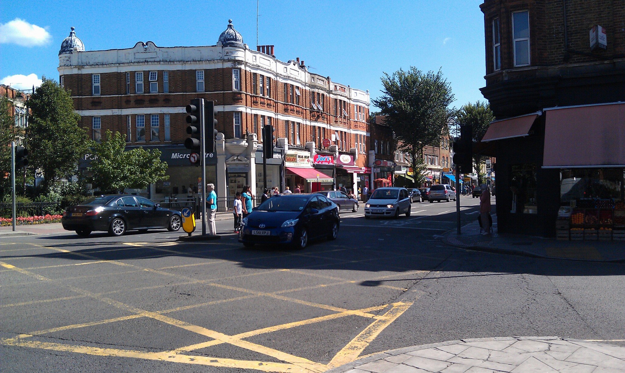 After the last view of Nashua, NH mainstreet here are some views of Hanwell in west London. They were taken over the summer when I was on my way to Heathrow airport.
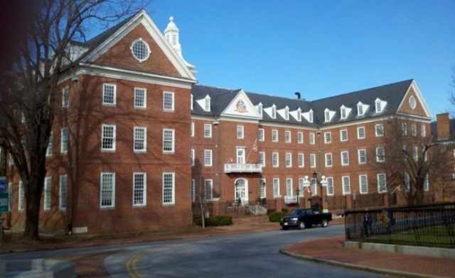
When I teach the class on harmony and proportion in architect at Thomas More College, we do study the traditional principles as manifested in the great buildings of the past, but I am as anxious to establish in the idea also that this is not just something for cathedrals and grand civic buildings. Even the buildings that we use in everyday life - affordable mass housing, the shops, offices, businesses and factories can conform to these simple principles and create a beautiful and livable environment. I believe that cities are where most of us are meant to live - the future is not, and nor ought to be, one of a new high-tech agrarianism. However, I do not believe that modern cities need be the inhuman places that we tend to think is inevitable. This is where the consideration of the beauty of ordinary things and places becomes so important.
After the last view of Nashua, NH mainstreet here are some views of Hanwell in west London. They were taken over the summer when I was on my way to Heathrow airport.
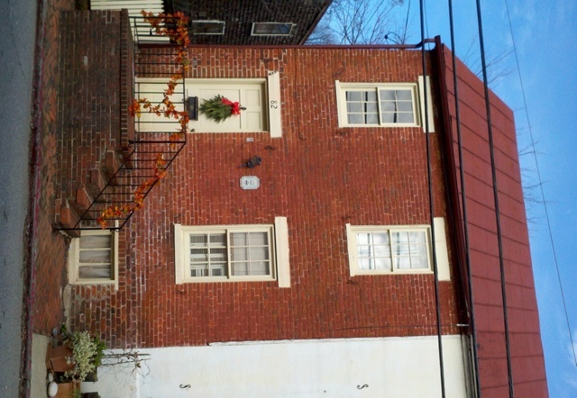
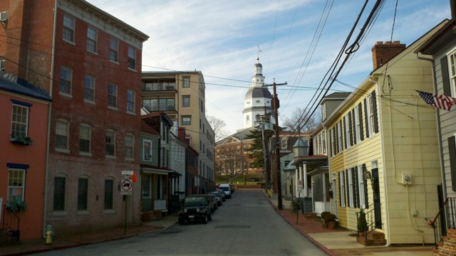
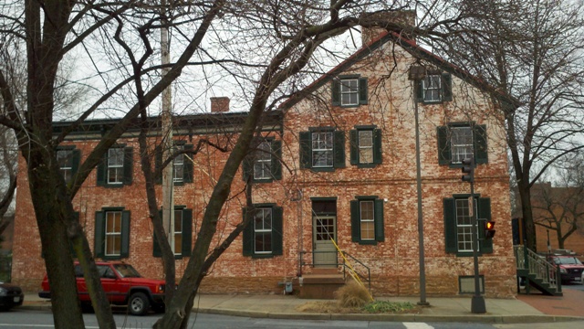
When I teach the class on harmony and proportion in architect at Thomas More College, we do study the traditional principles as manifested in the great buildings of the past, but I am as anxious to establish in the idea also that this is not just something for cathedrals and grand civic buildings. Even the buildings that we use in everyday life - affordable mass housing, the shops, offices, businesses and factories can conform to these simple principles and create a beautiful and livable environment. I believe that cities are where most of us are meant to live - the future is not, and nor ought to be, one of a new high-tech agrarianism. However, I do not believe that modern cities need be the inhuman places that we tend to think is inevitable. This is where the consideration of the beauty of ordinary things and places becomes so important.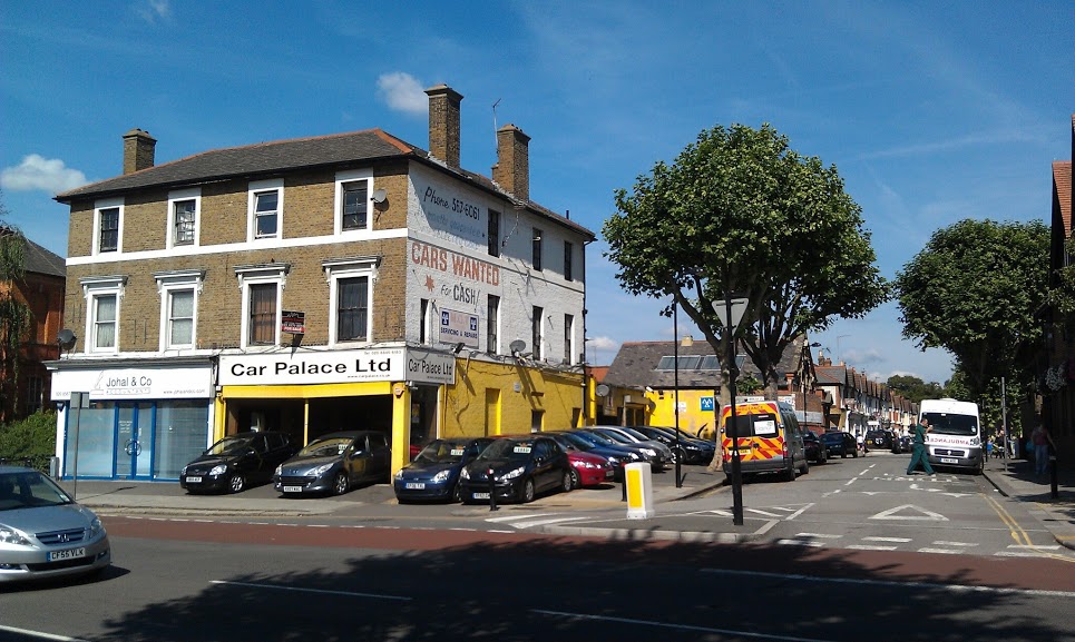 I stopped at a roadside cafe for an English breakfast on my to catch my plane home and it was a sunny morning. What was interesting to note was that the basic structures of the all the buildings conformed to traditional harmonious proportions. I am guessing they were built around the turn of the last century. As you look at each one you can see the triple layered proportion with each storey a different size in the traditional manner. These were never grand buildings, just ordinary high street buildings built for every day use. Even though the modern businesses that occupy them have made no attempt to accentuate or conform to the harmonious proportions in their modifications, what remains still makes Hanwell High Street nice enough for the Big Bites Cafe to put tables outside so that patrons could enjoy the sunshine. I would always maintain that if they knew it, they would attract even more business if only they would take this into account. The beautification of the high street is one of the main ways that towns seek to preserve the town centres and fight against the out-of-town malls to maintain a community feel. This is known, but rarely is this aspect of how it might be done understood.


 Interestingly, this ratio (5:3) appears also in the description of the construction of the Noah’s ark. St Augustine directly links the dimensions of Noah’s ark to the perfect proportions of a man, exemplified he says, in Christ. This echoes the classical proportions of the perfect man as described by the Roman Vitruvius in his textbook for architects. Furthermore, Boethius, in his book De Arithmetica, lists a series of 10 perfect proportions that he says came from Pythagoras, Plato, Aristotle and ‘later thinkers’. The final proportion of the series, called the Fourth of Four contains right at the beginning this ratio. (The references for these can be found in an article Harmonious Proportion in the Christian Tradition, here.)